

case study
Travel and stays
Winzy
Booking a stay should feel like the trip has already started.
- Client
- Winzy
- Sector
- Travel and stays
- Year
- 2025
- Scope
- Brand, website, campaign
From one windmill to the whole journey.
Not just a place to stay, a place to belong.
Winzy connects travellers with local hosts for unique stays and experiences. The brand had to feel like the good part of a trip, not the booking part.
Where Every Stay Feels Like Home.
A windmill, and one red.
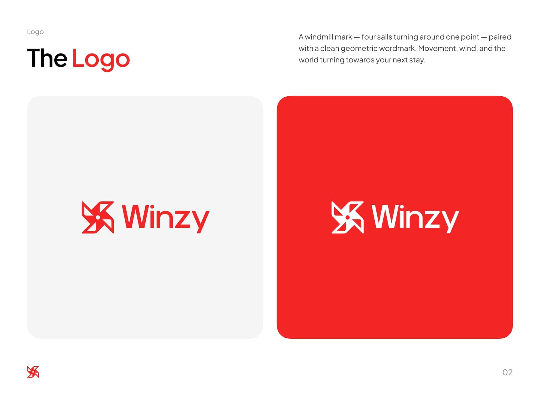
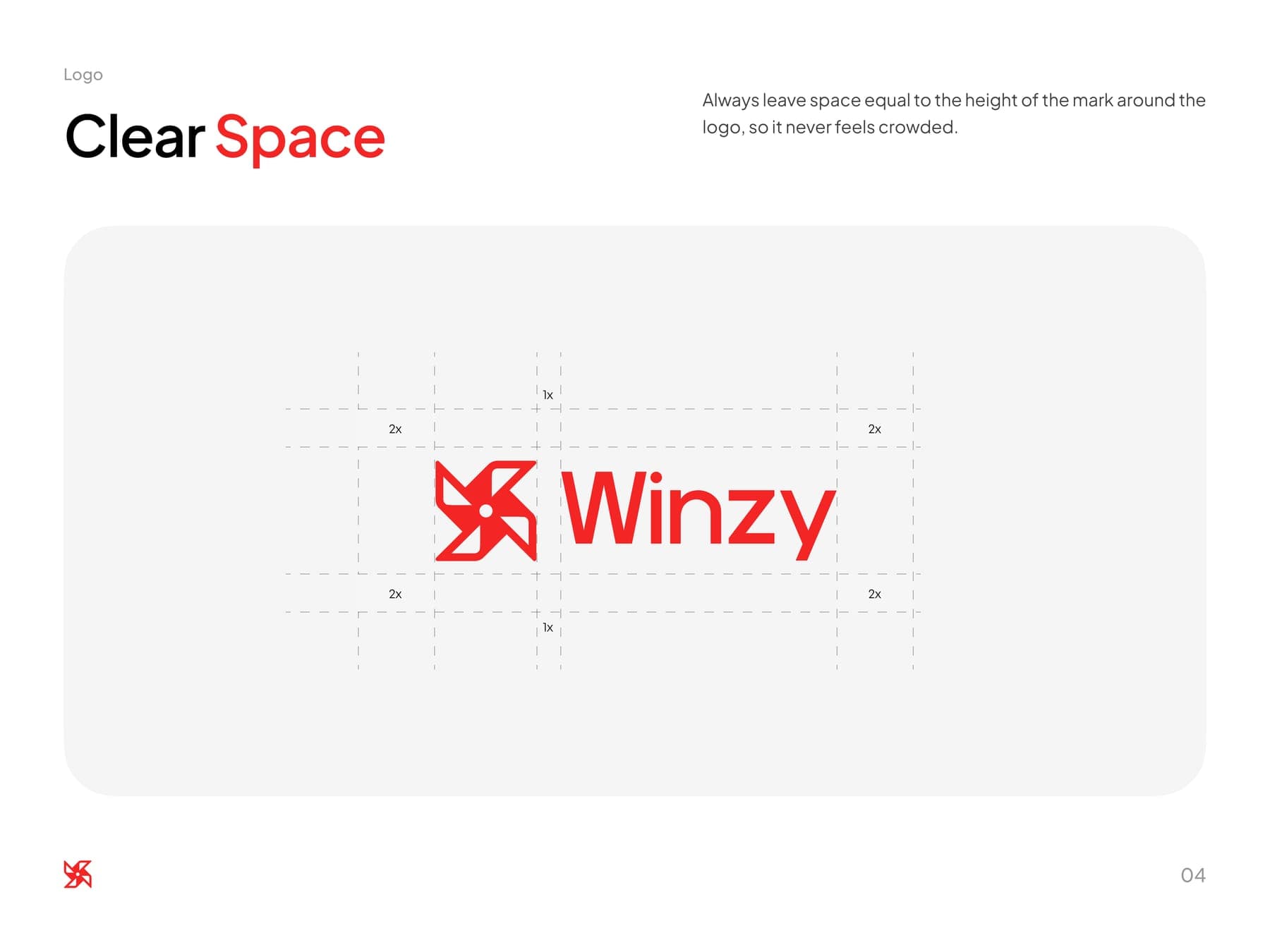
First the guidelines. Four sails turning around one point, for wind and movement, and a red that's rationed: the mark, one word, one button.
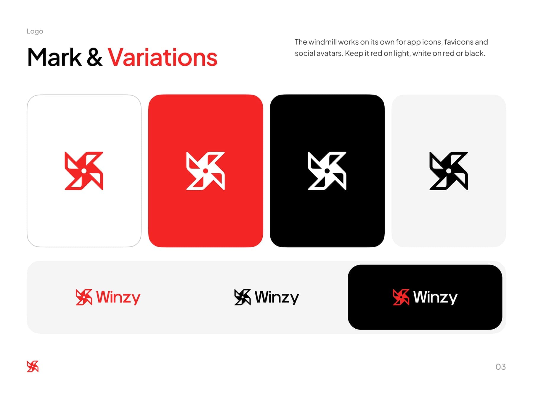
the mark
Red on light, white on red or black. Never crowded.
the colour
Red is for the moments that matter.
Hover to open a colour, click to copy it.
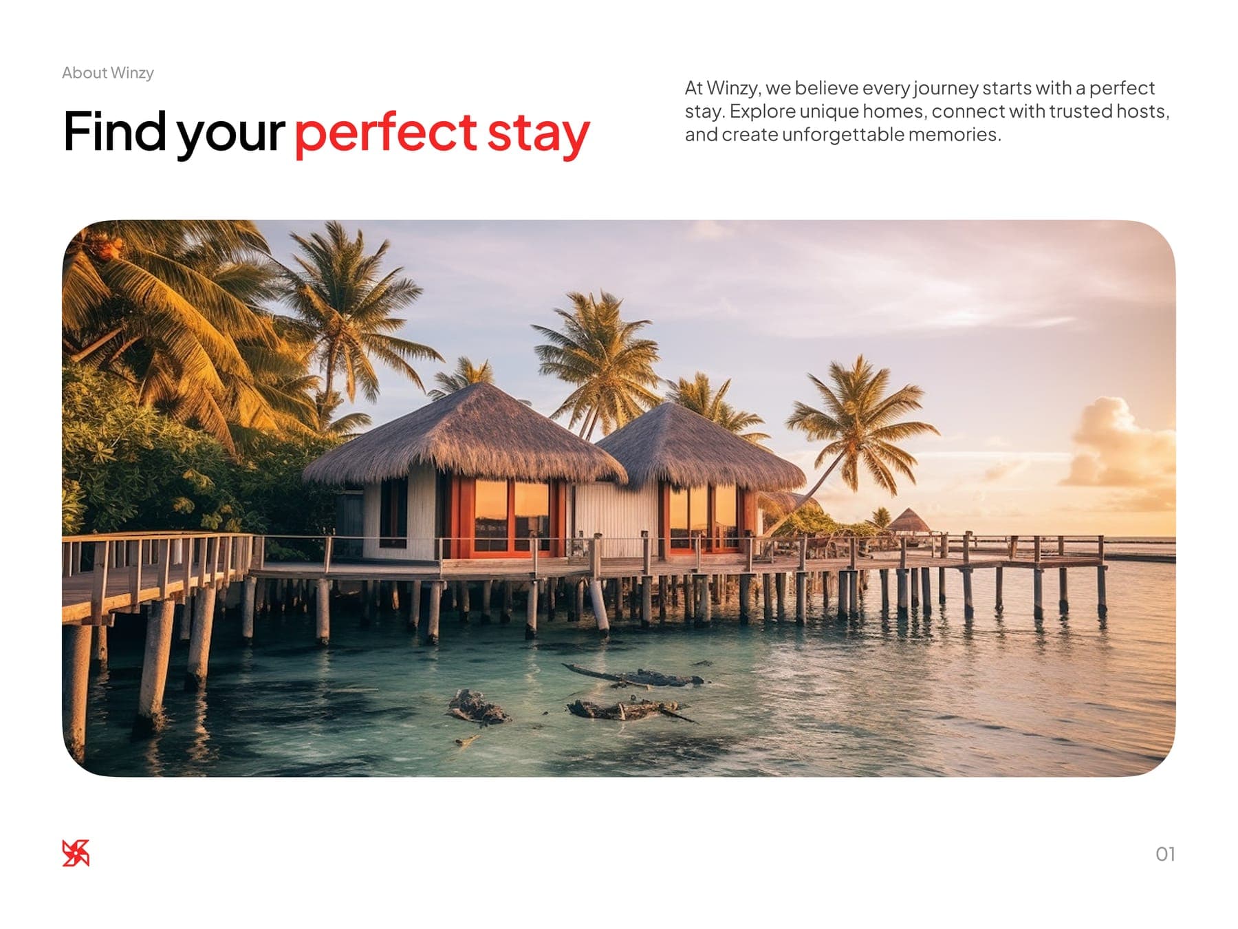
Find your perfect stay
the brand book
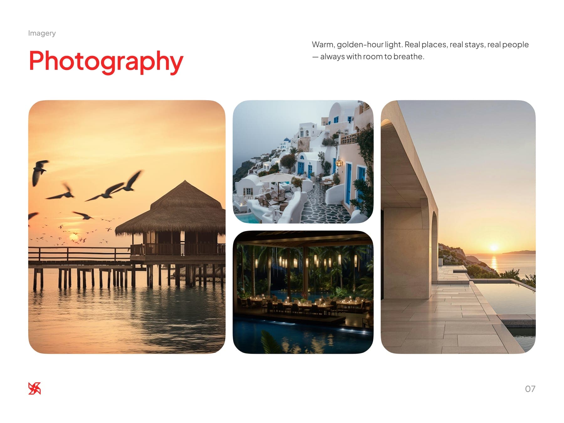
Nine pages. Golden hour in every photo.
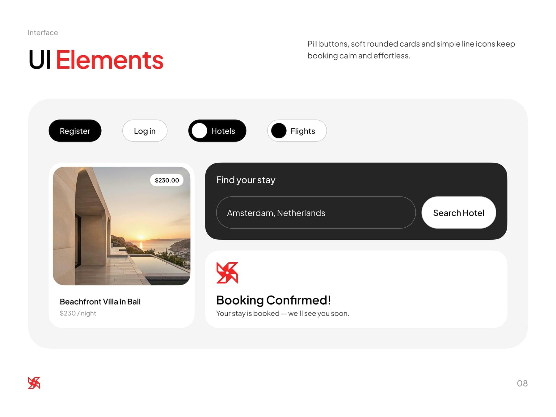
Every screen, one red button.
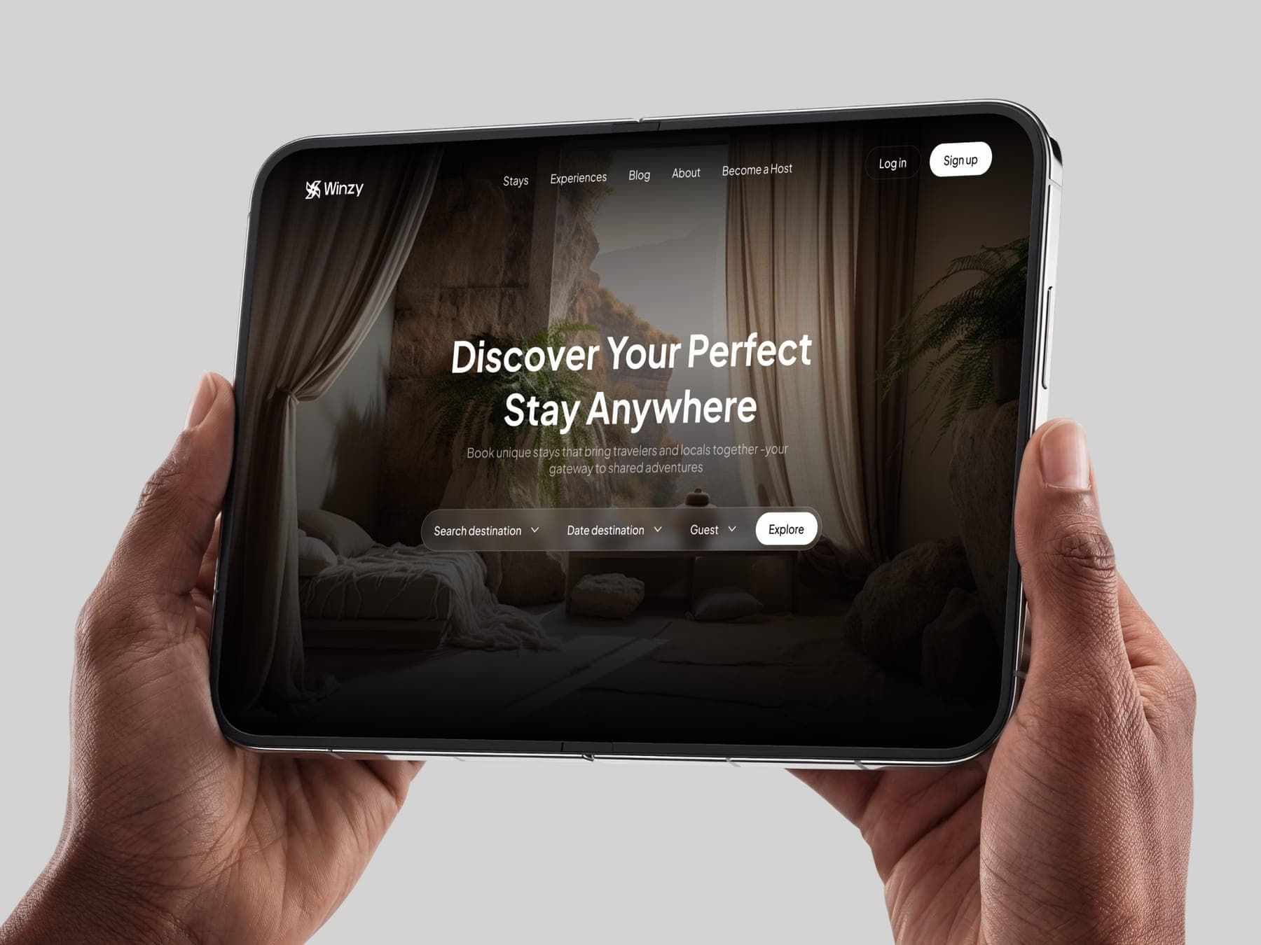
Then the site: stays, experiences and a way in for new hosts. Plus the quiet screens that make trust work, like sign-in, ID checks and messages.
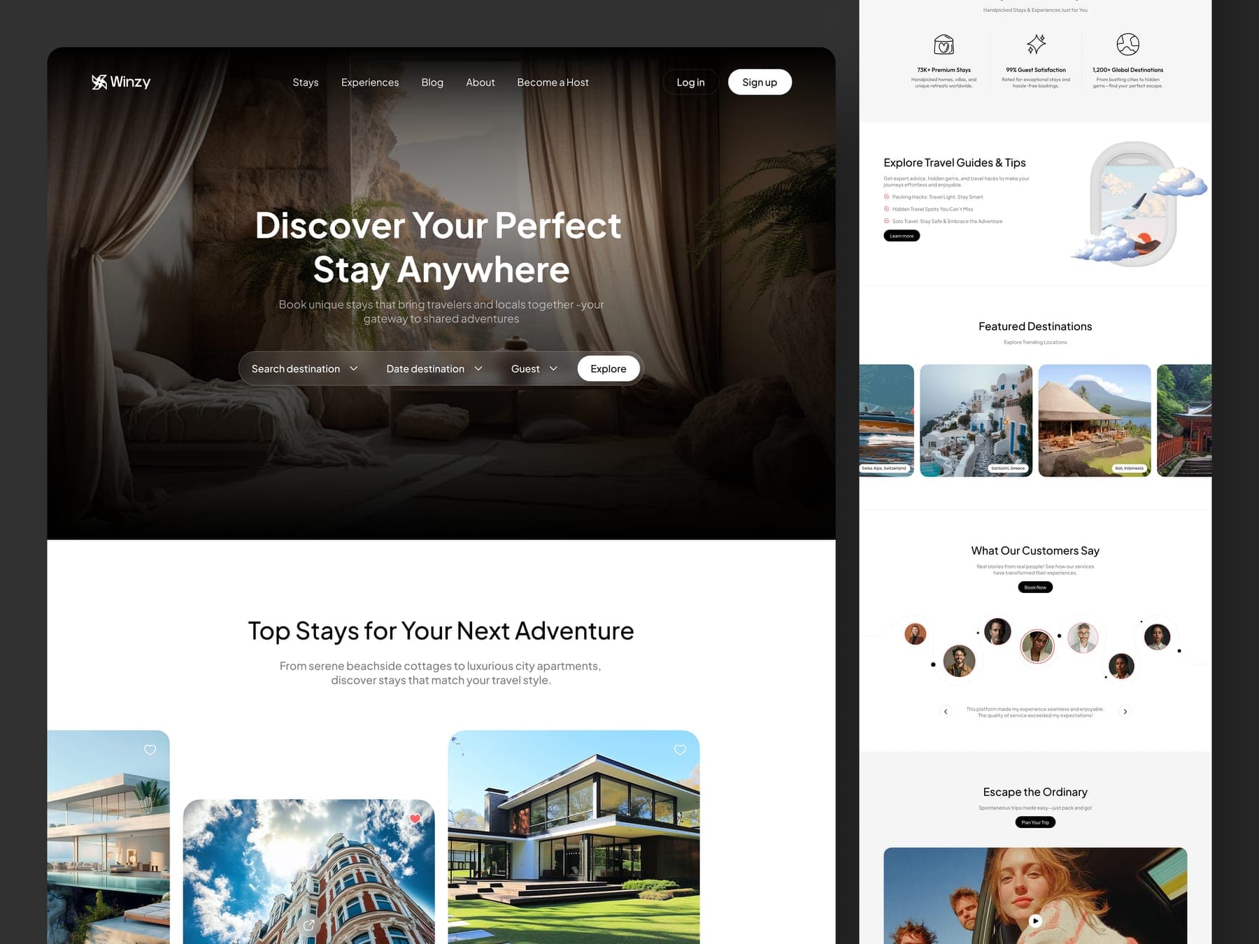
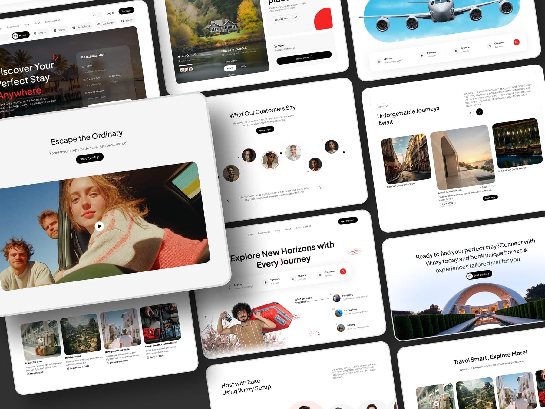
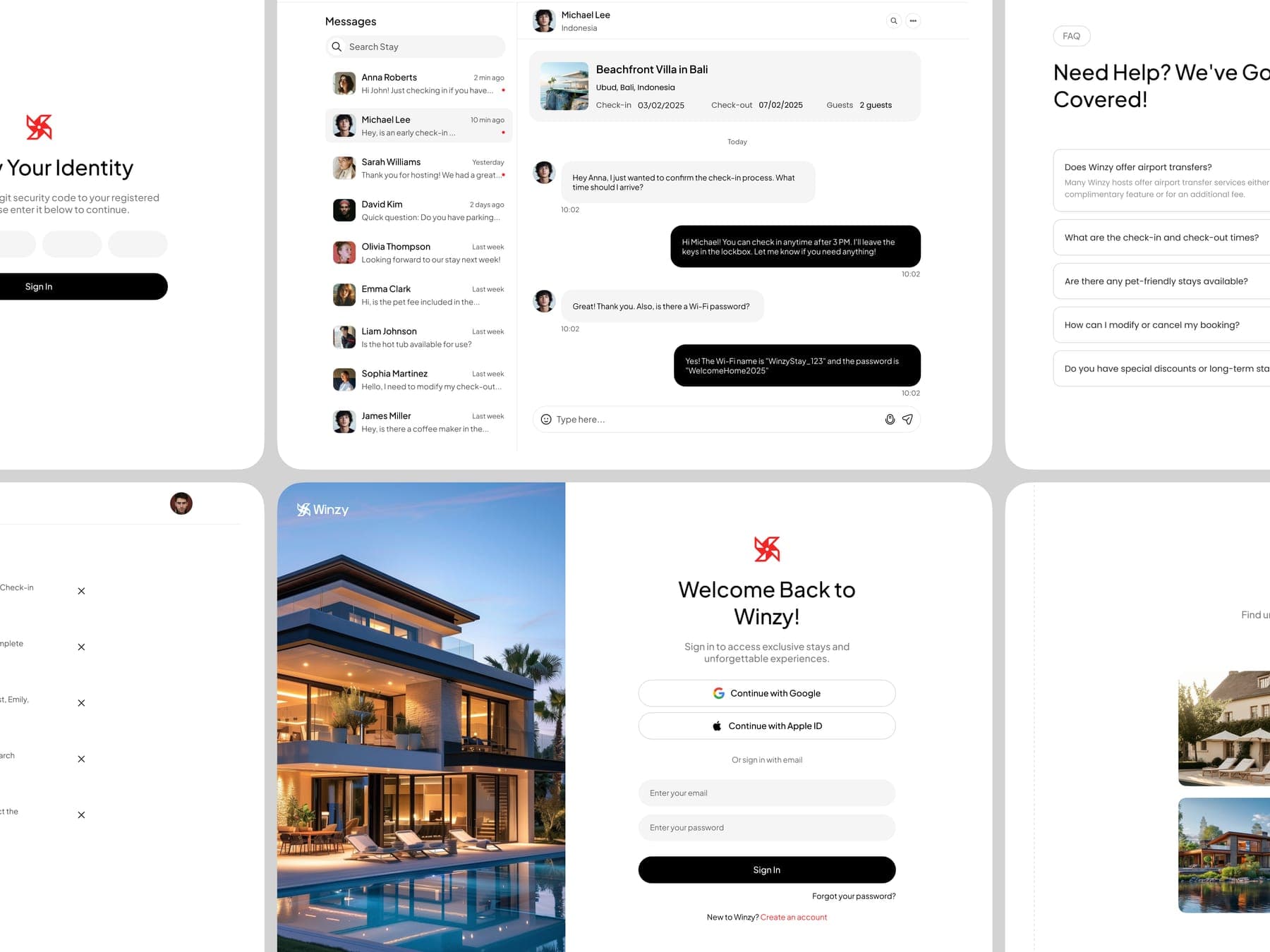
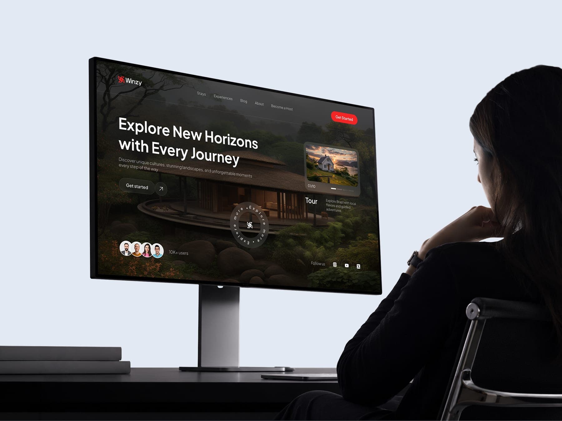
- 01 Home
- 02 Sign in
- 03 Verify identity
- 04 Messages
- 05 FAQ
5 page types
Packed for the trip.
A luggage tag, a passport cover, a room key and a tote. The windmill travels light.
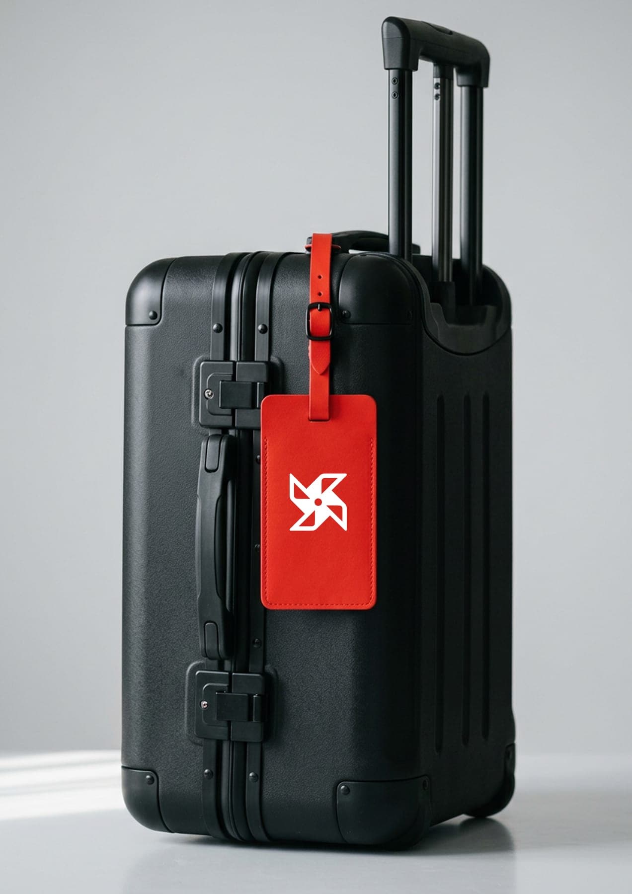
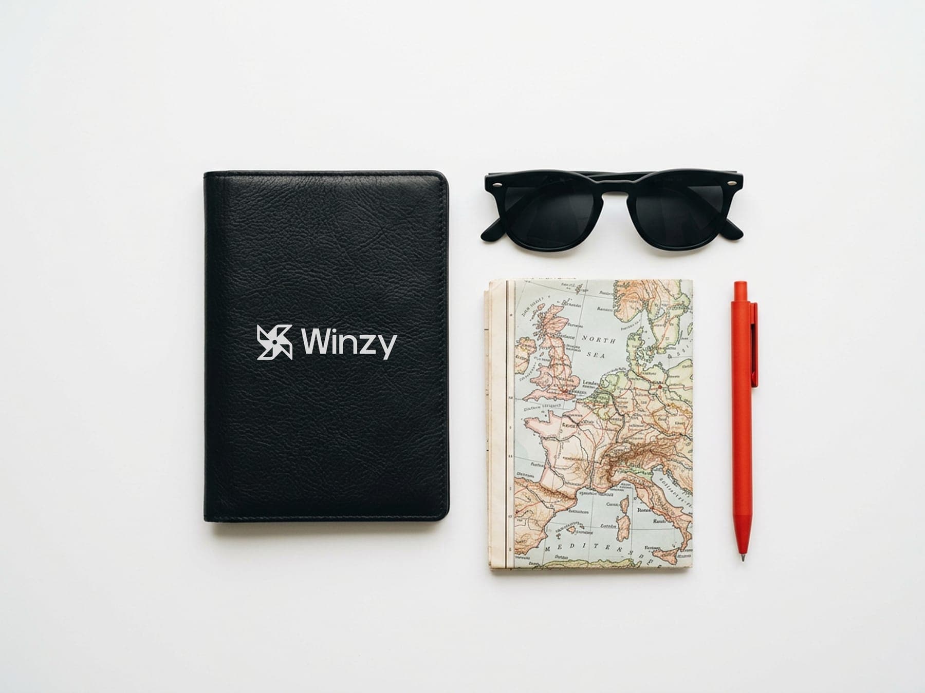
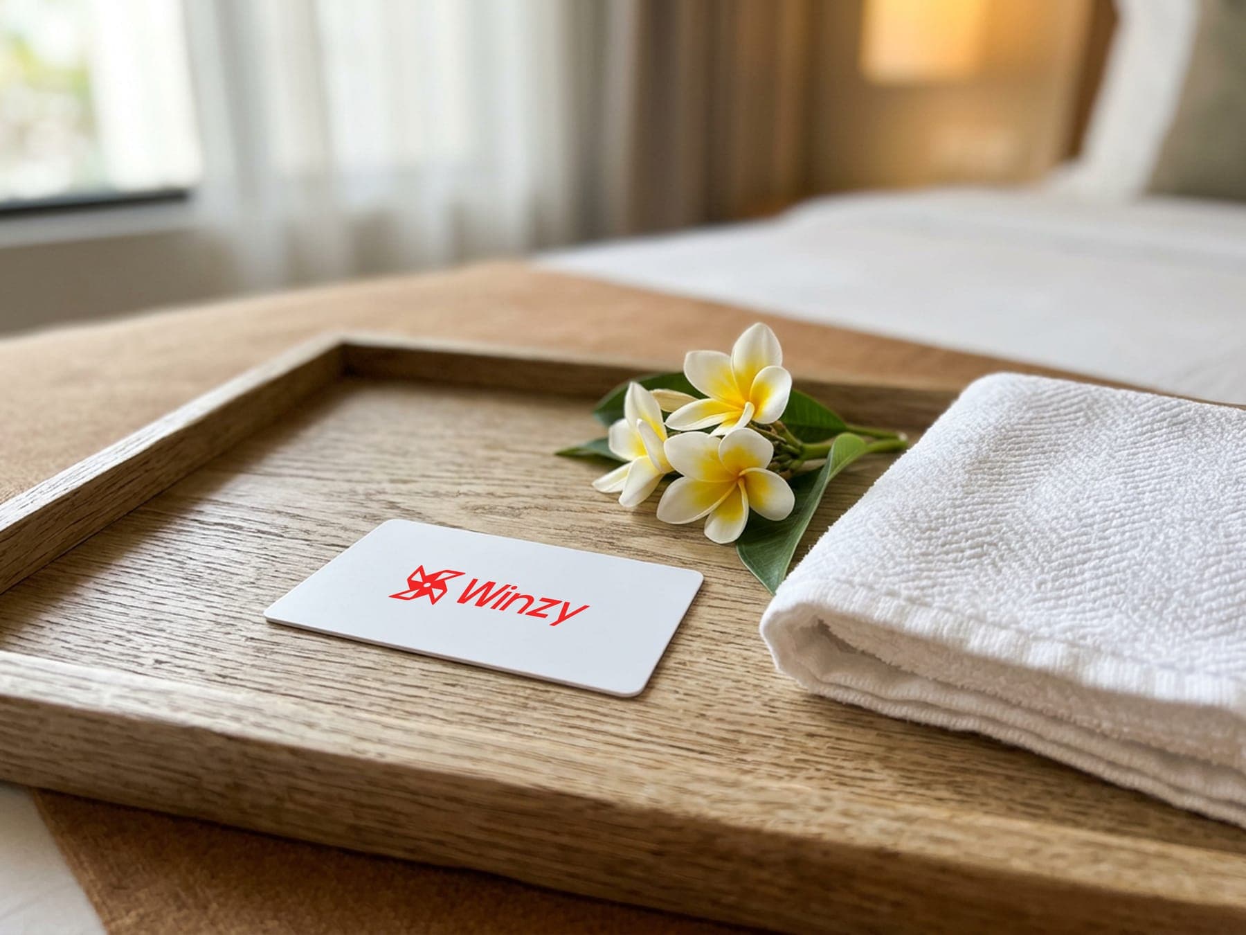
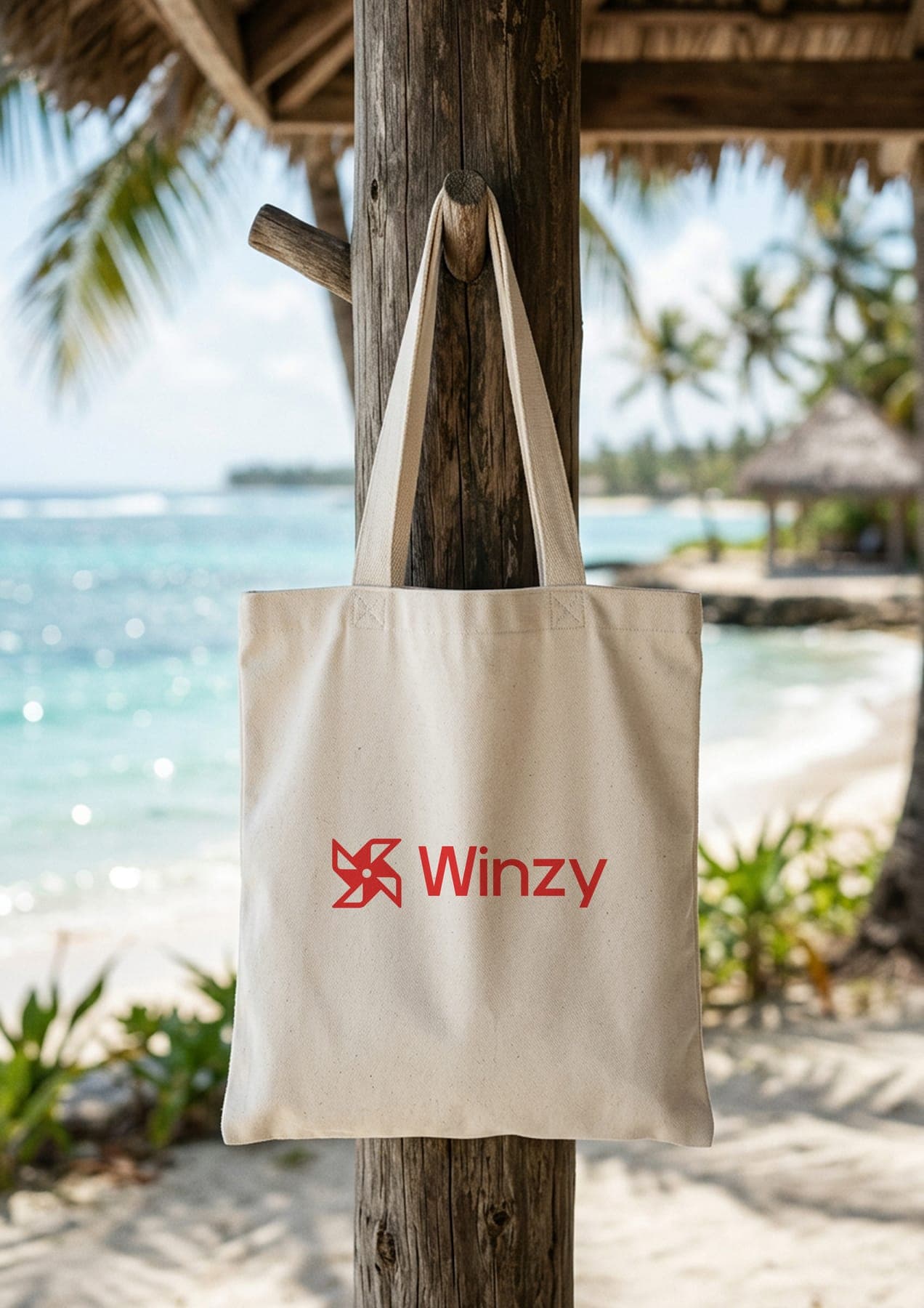
One red word per headline.
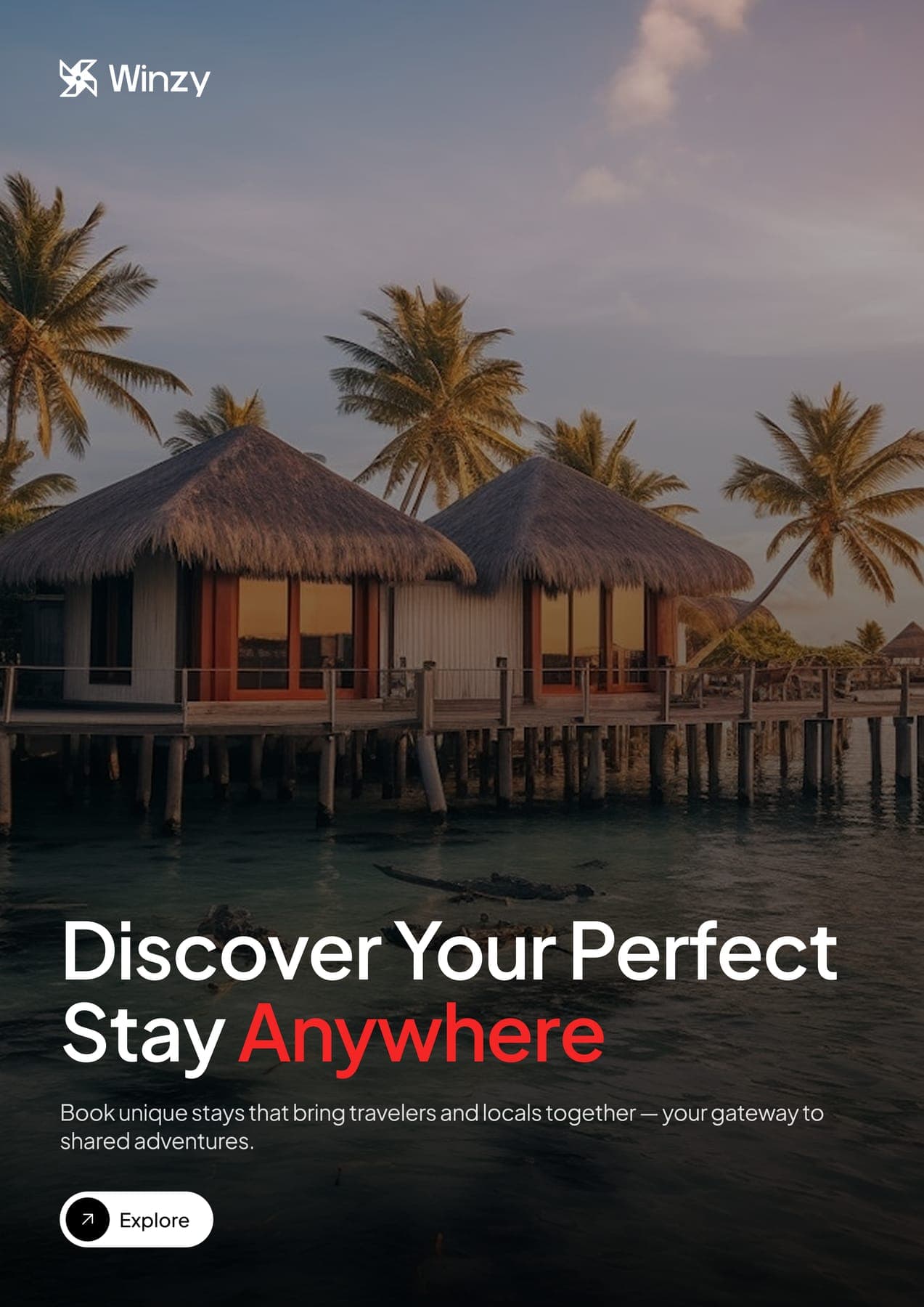
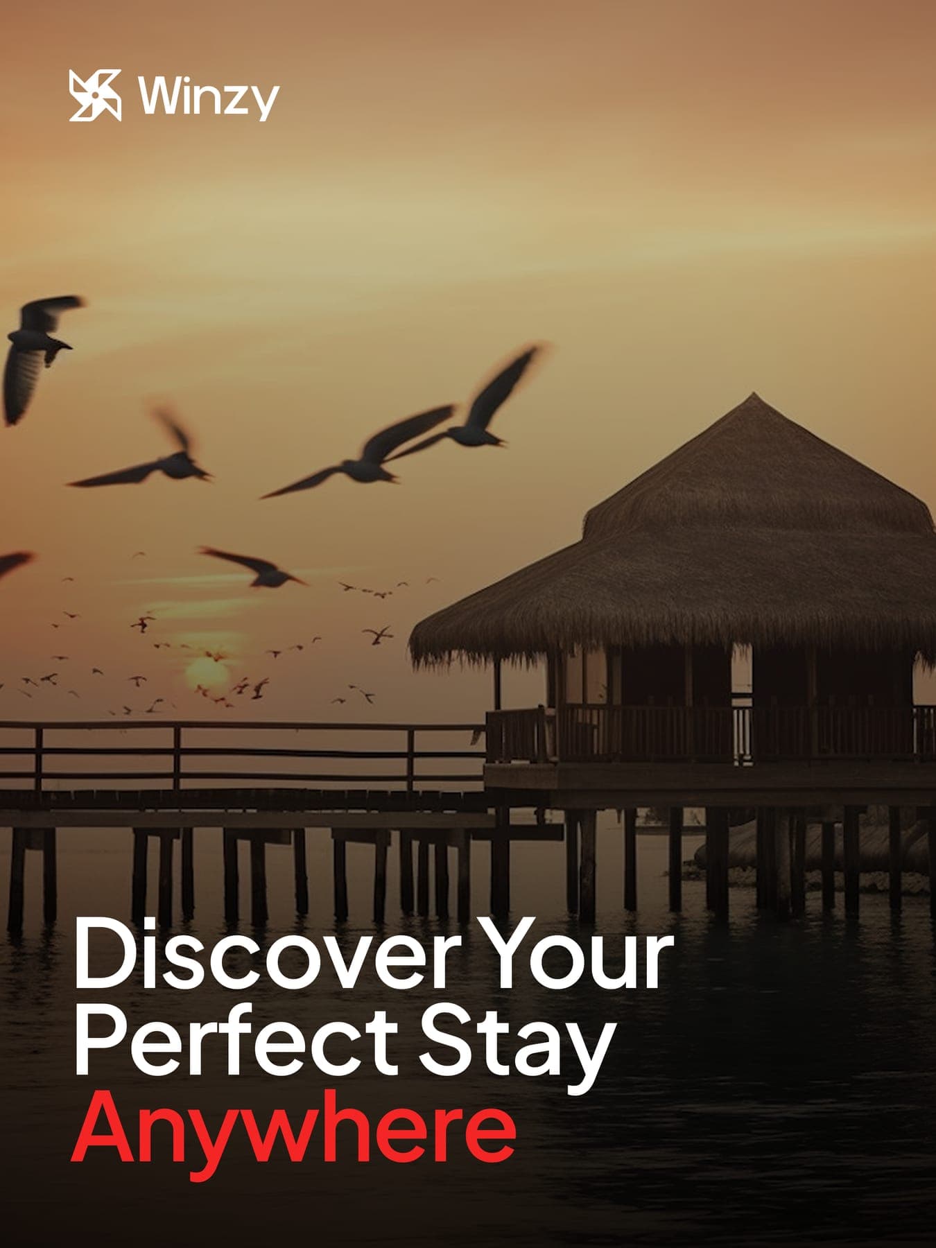
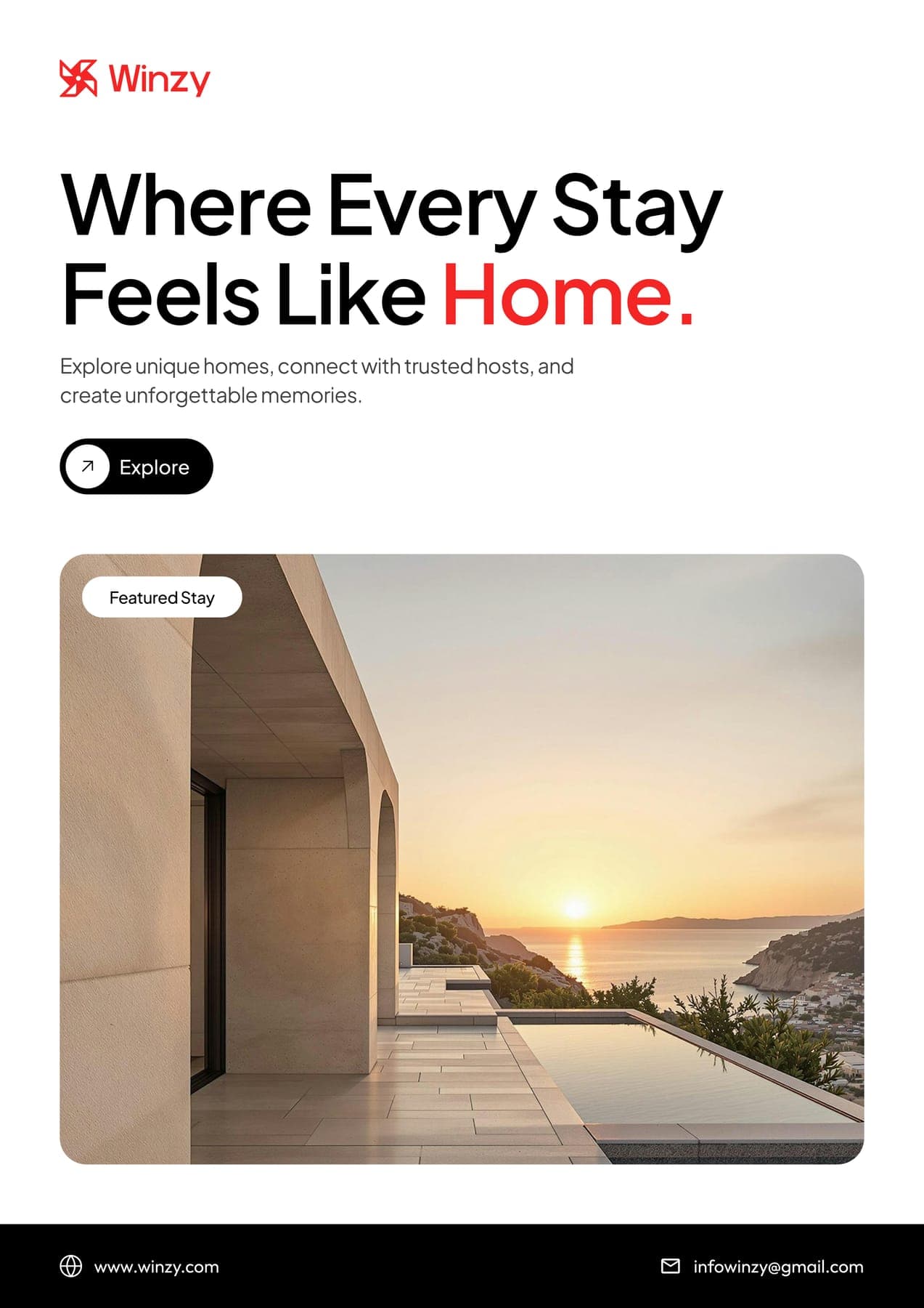
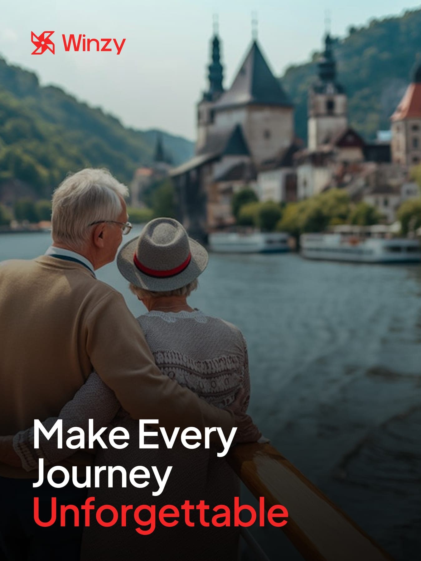
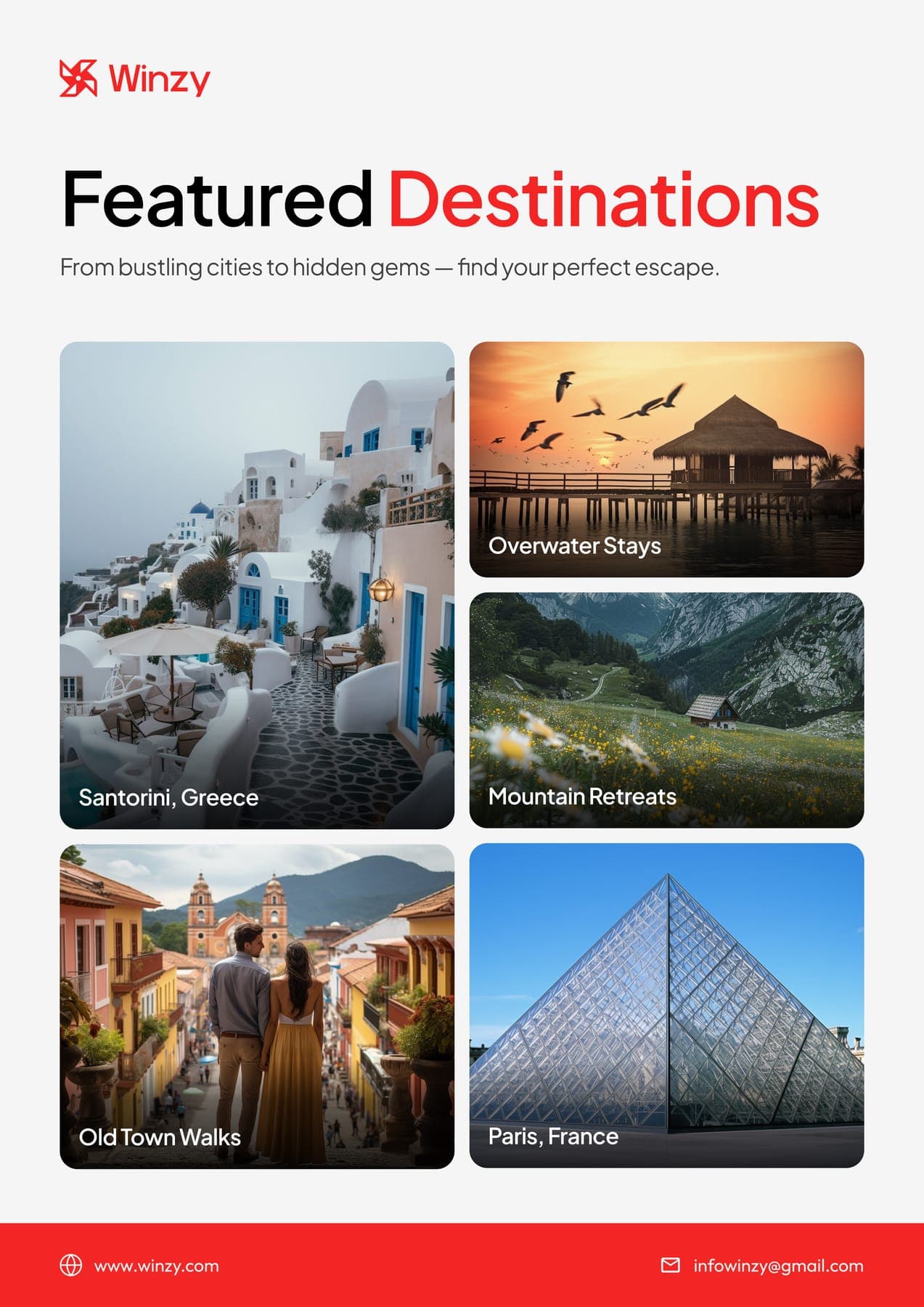
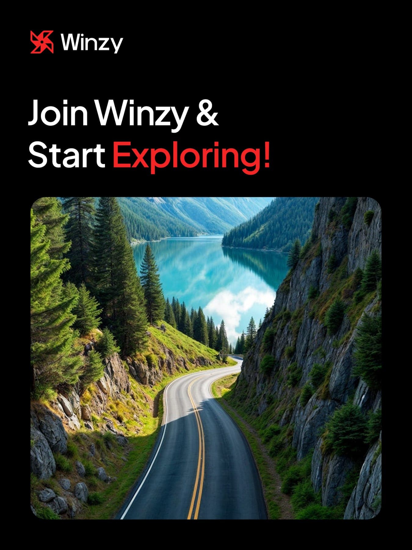
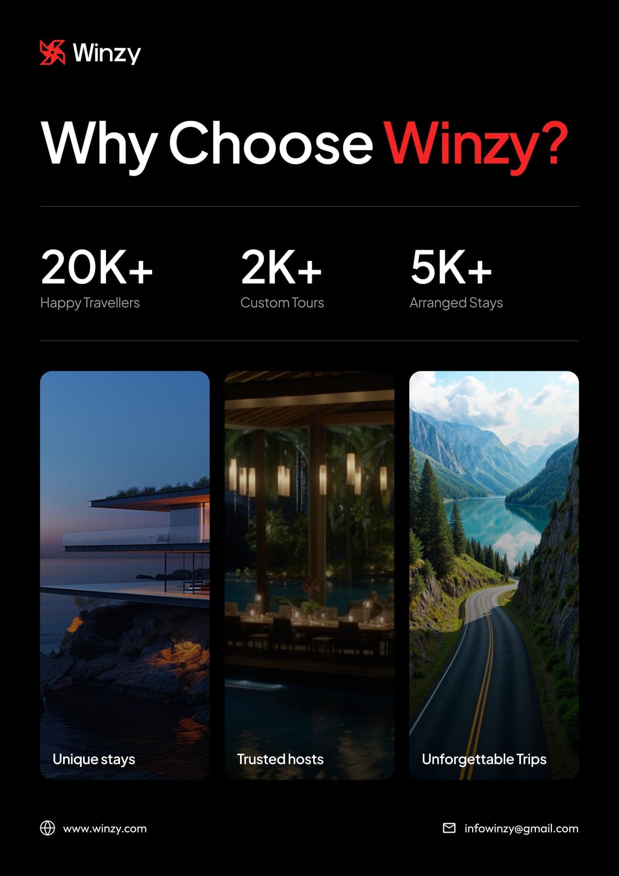
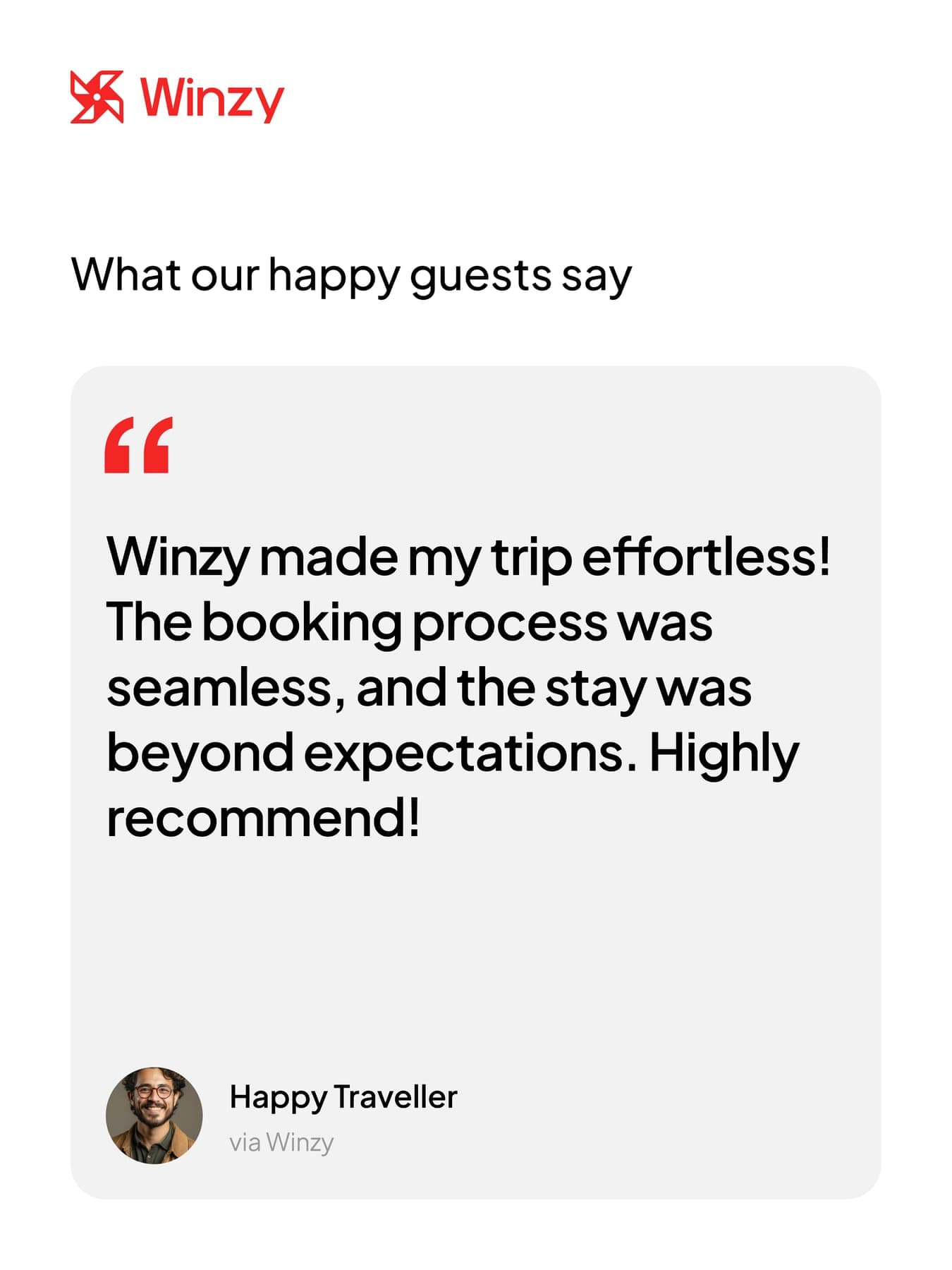
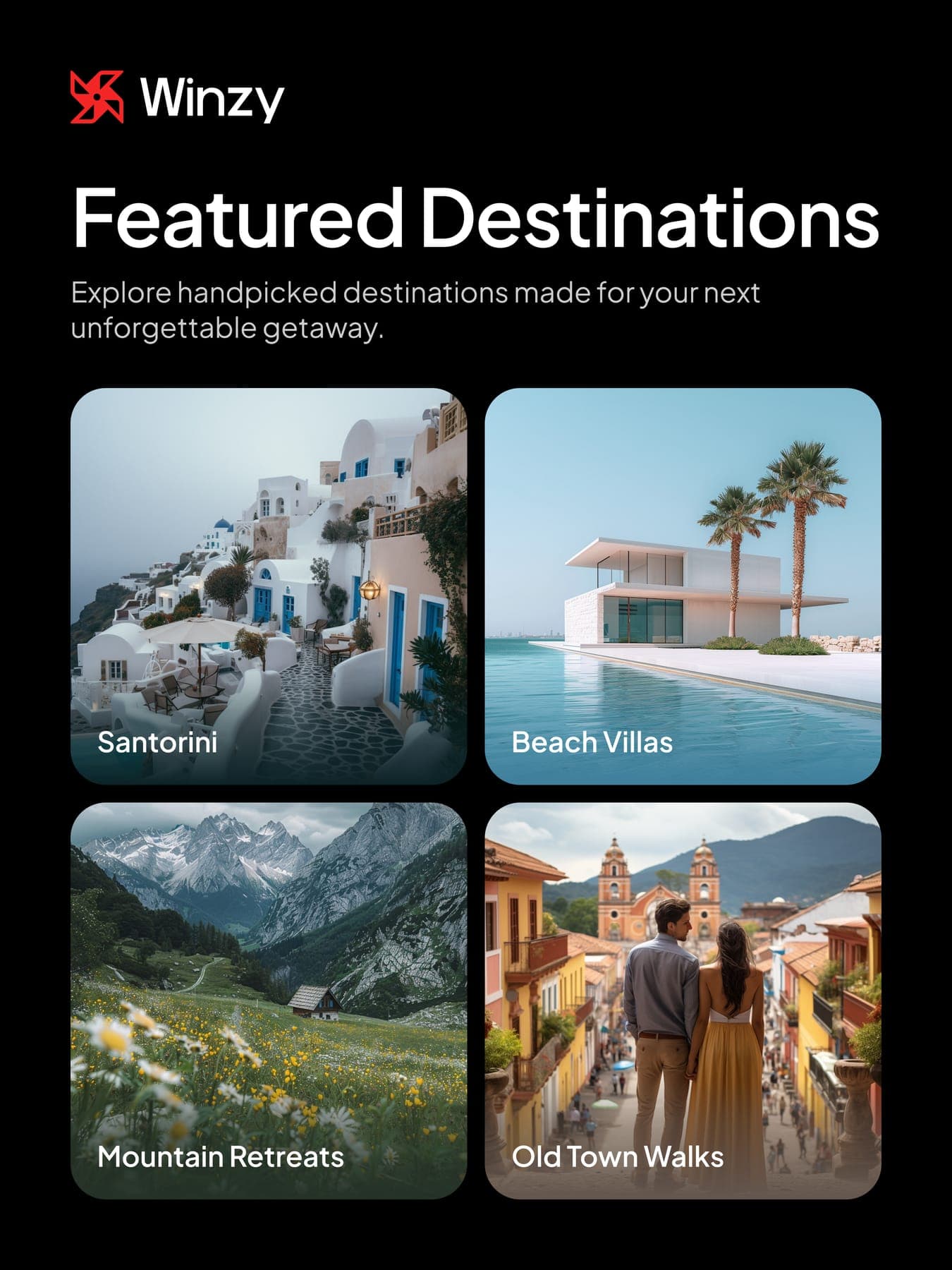
Four flyers and five posts, shot at golden hour. The red always lands on the word that matters.
the headlines
The red word, in white here.
- flyer
Discover Your Perfect Stay Anywhere
- flyer
Where Every Stay Feels Like Home.
- post
Make Every Journey Unforgettable
- post
Join Winzy & Start Exploring!
Four sails, always turning.
0guideline pages
0colours
0web mockups
03D renders
0flyers
0social posts