

case study
Logistics tech
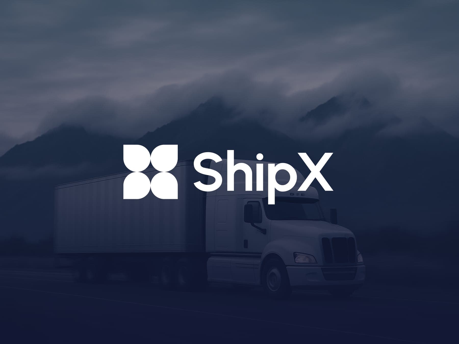
ShipX
Freight is chaos. ShipX needed a brand that feels calm and on time.
- Client
- ShipX
- Sector
- Logistics tech
- Year
- 2025
- Scope
- Brand, website, product, campaign
From one question to a fleet in uniform.
Every parcel comes with one question.
ShipX moves freight by land, sea and air, and tracks all of it live. Every one of its customers is asking the same thing.
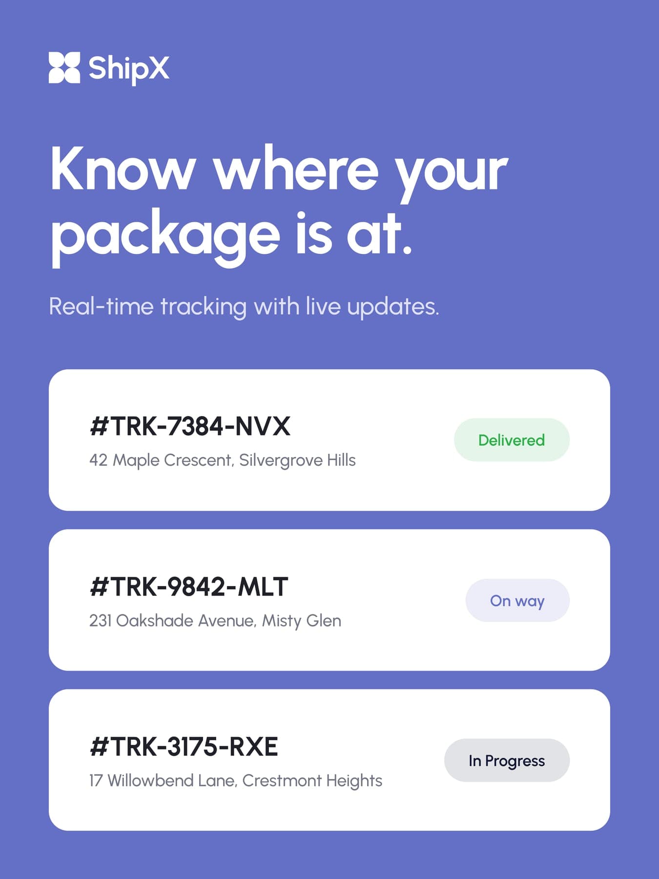
Know where your package is at.
Ship
The whole job. Get it there.
X
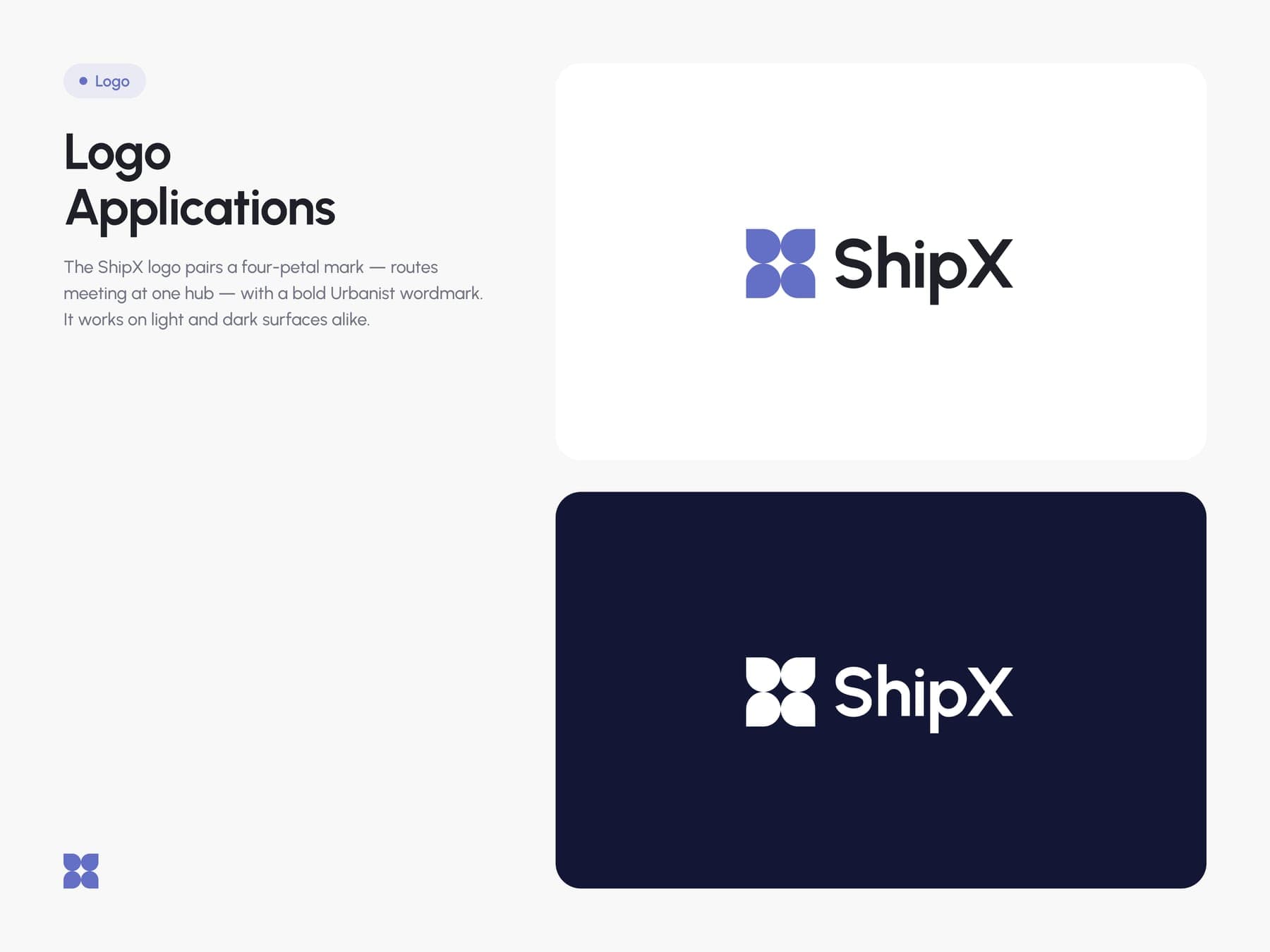
Where the routes cross. Look closely at the mark.
ShipX
Guidelines first, screens later.
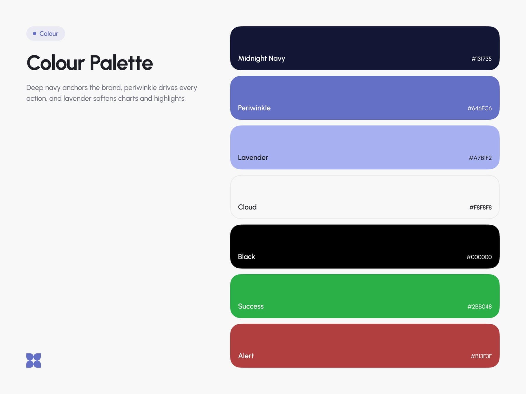
Nothing got designed until the rules were down. One mark, one typeface, a navy that anchors and a periwinkle that moves.
the mark
- 01A two by two grid.
- 02Four circles. One for every route.
- 03Square off the outer corners. Four routes, one hub.
the colour
Navy to anchor, periwinkle to move.
Hover to open a colour, click to copy it.
Smart Shipping
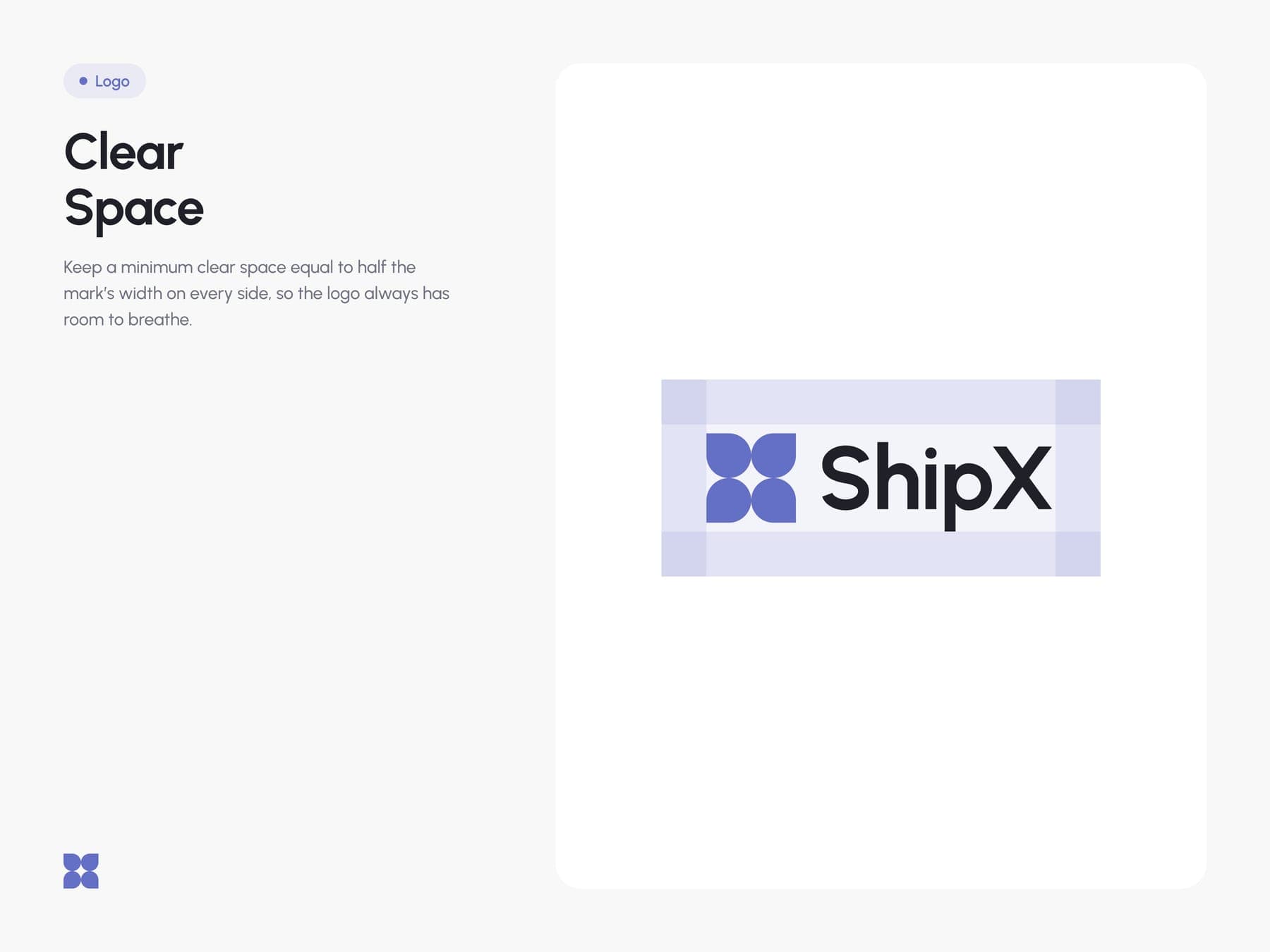
the brand book
Nine pages. Every rule written down before the first screen.
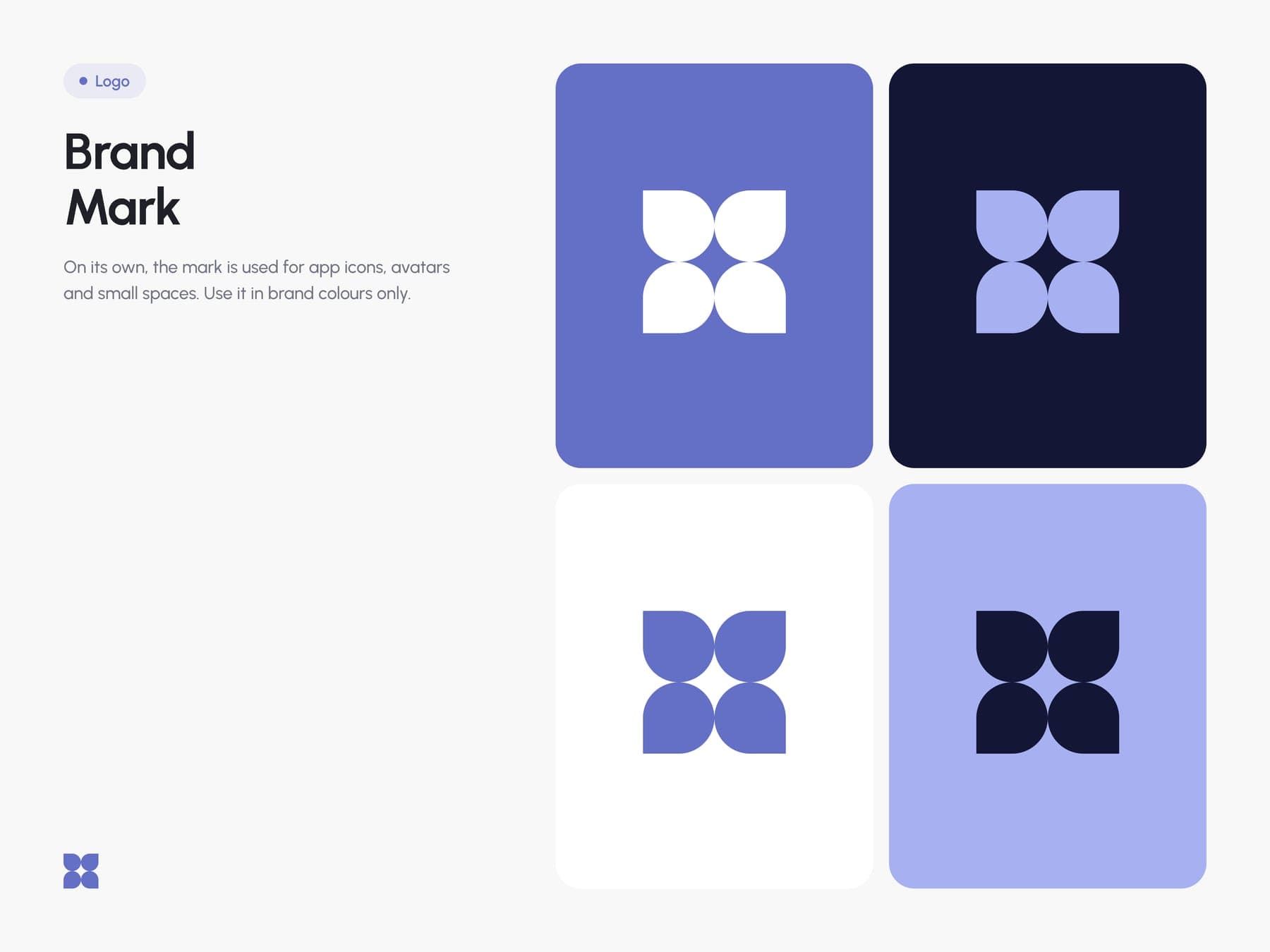
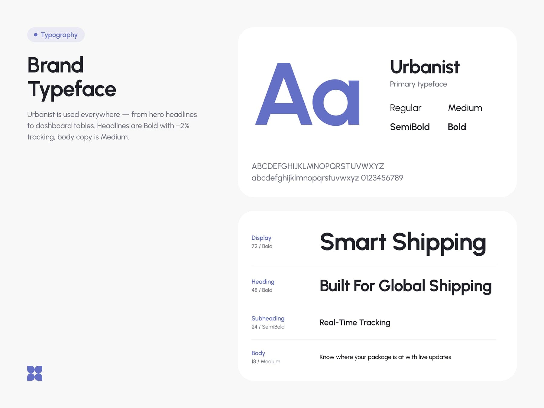
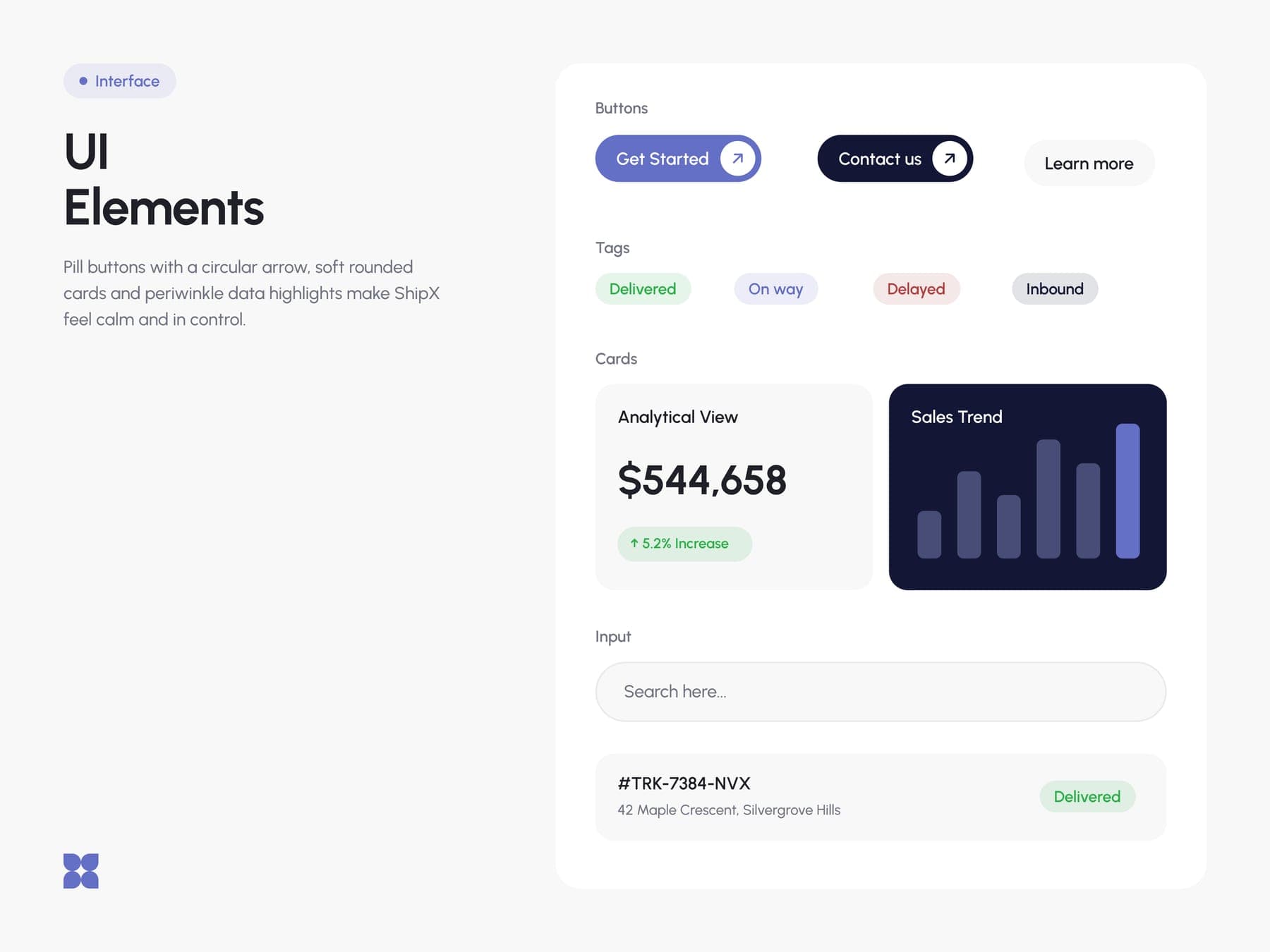
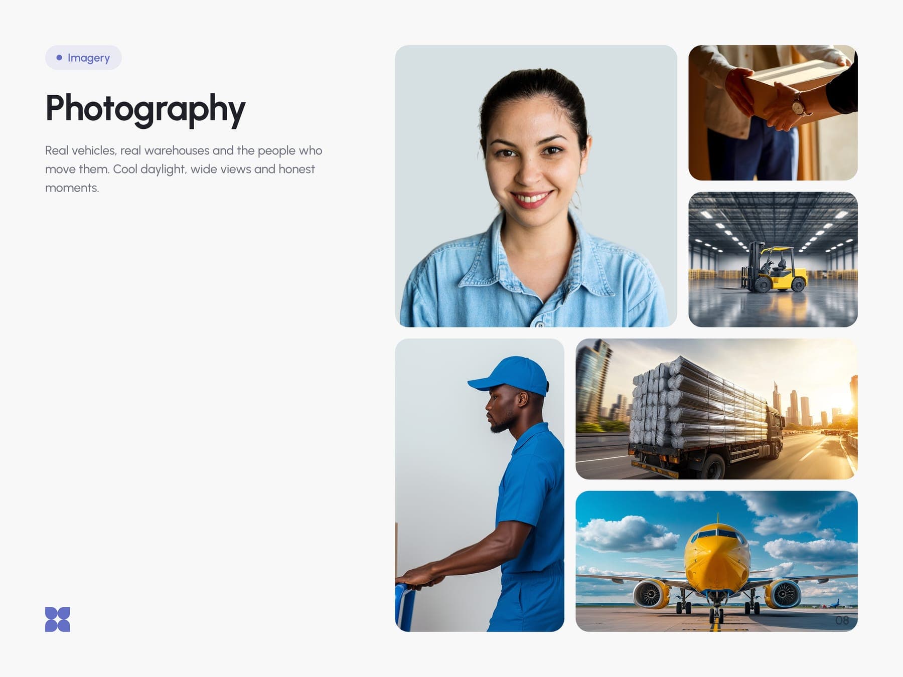
The site and the app, drawn as one.
Same navy, same cards, same status tags. What the website promises is what you see when you log in.
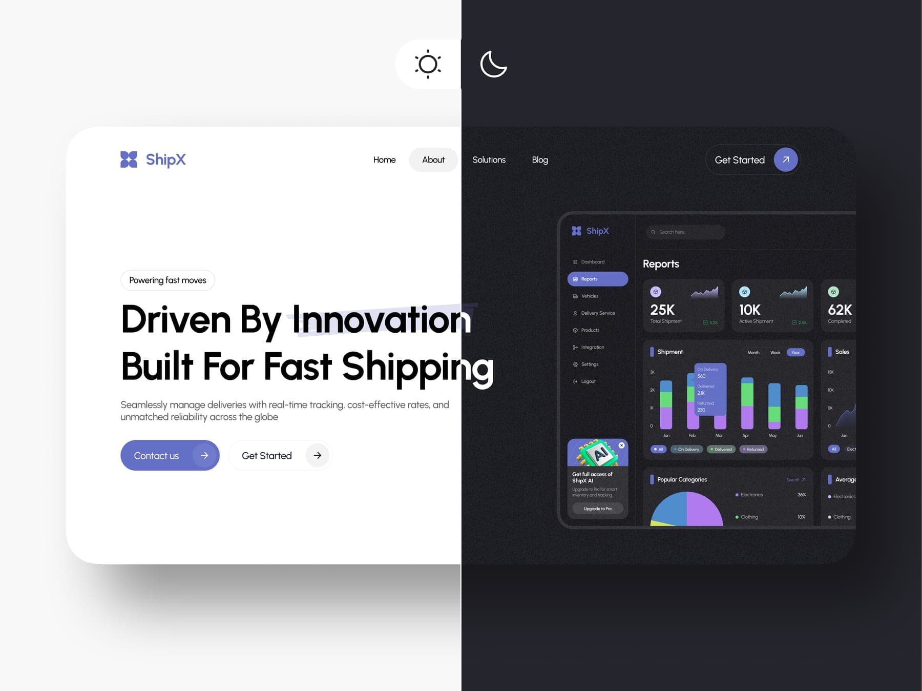
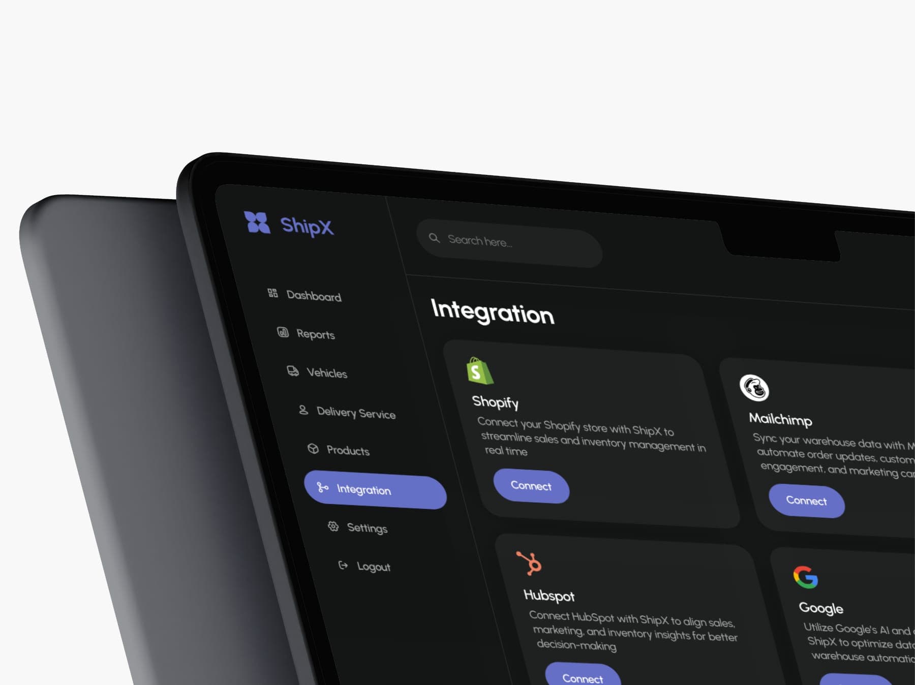
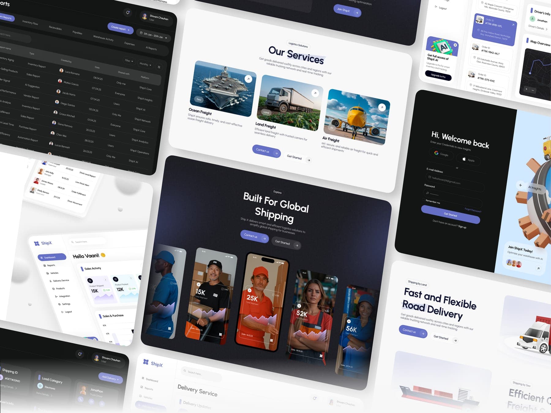
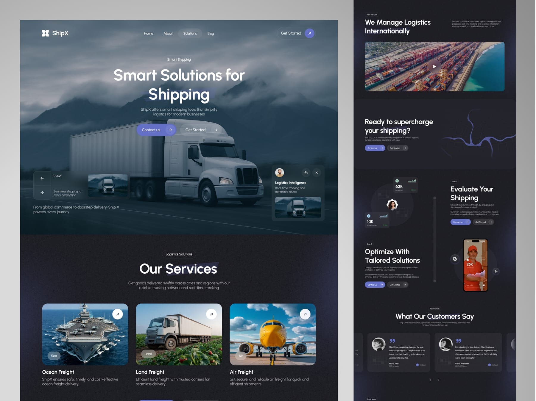
- 01 Home
- 02 About
- 03 Solutions
- 04 Blog
- 05 Dashboard
- 06 Reports
- 07 Orders
- 08 Delivery Service
- 09 Integrations
- 10 Login
4 site pages, 6 product screens
Then it went out for delivery.
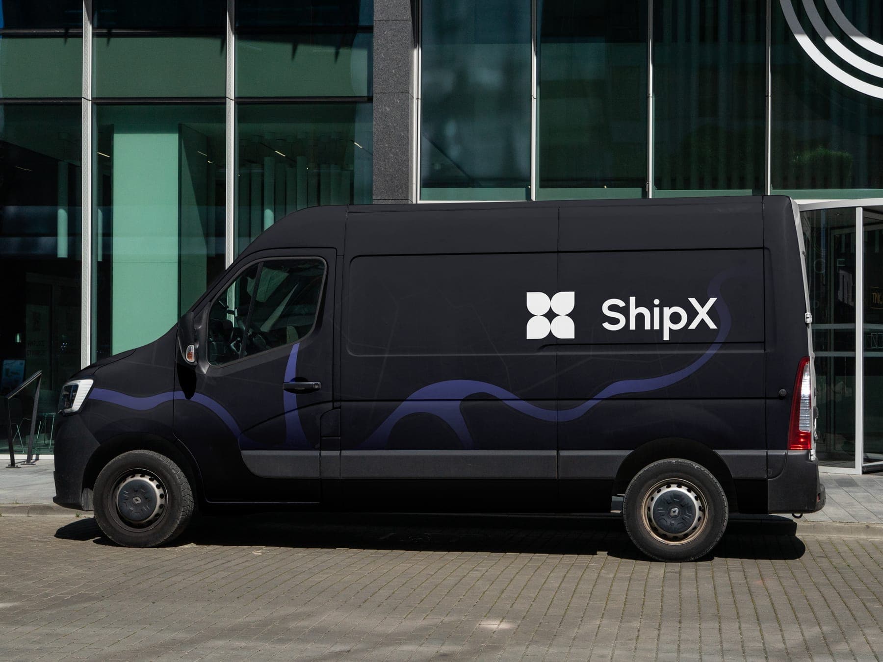
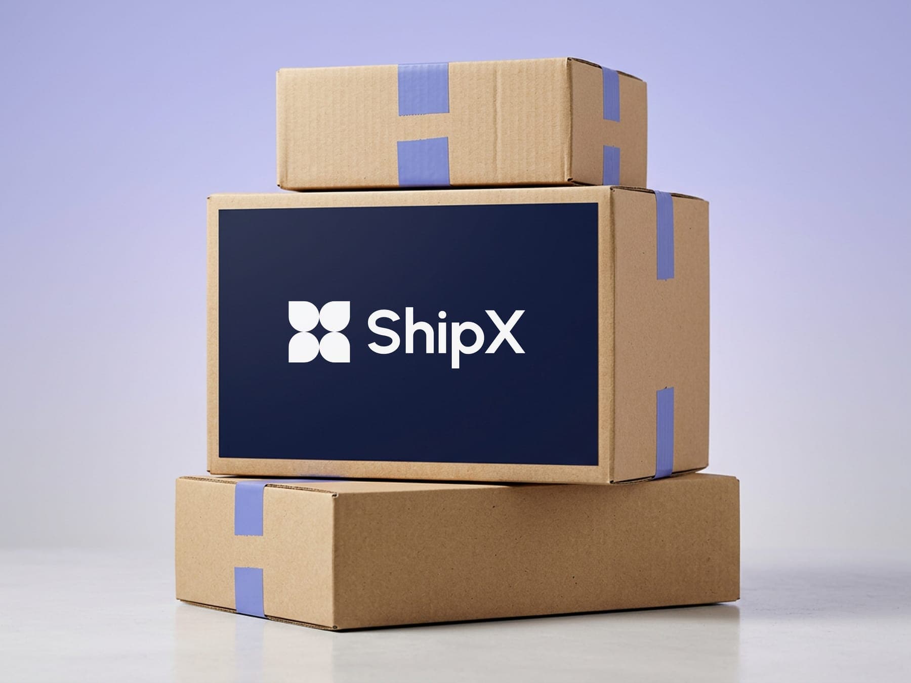
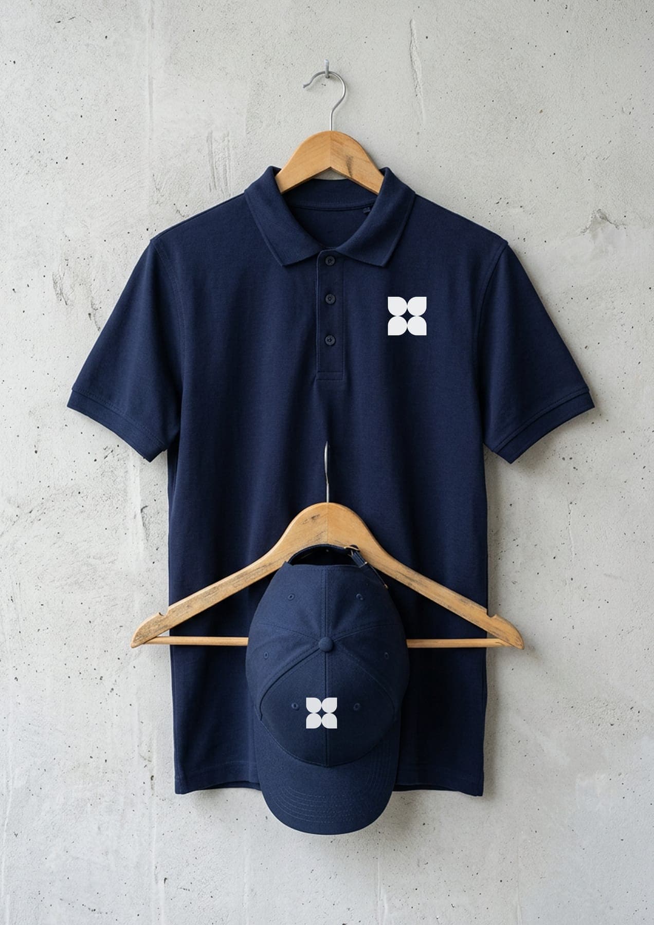
A van with one periwinkle route down its side. Boxes taped in brand colour. A navy polo and cap for the crew.
Out on every feed.
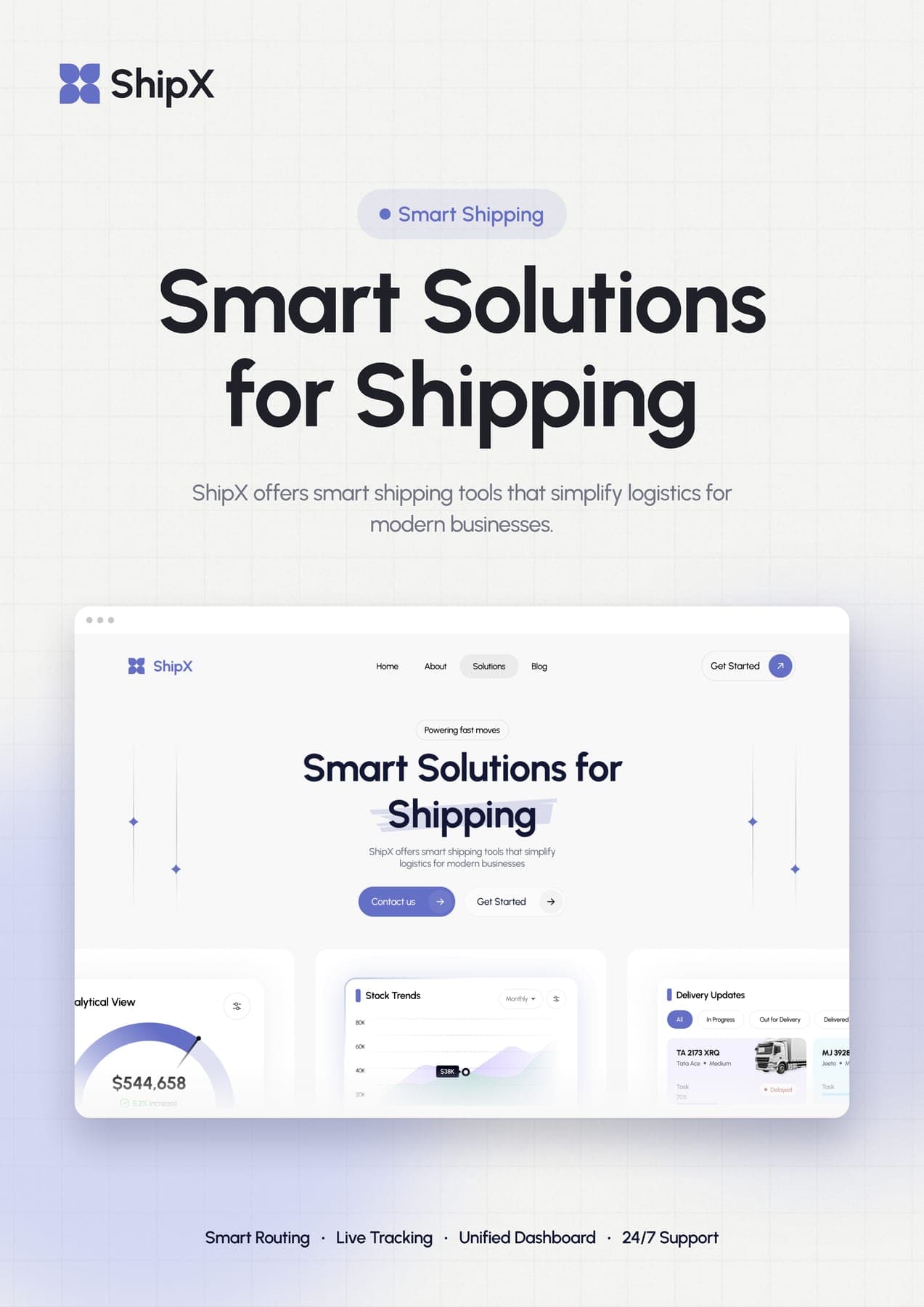
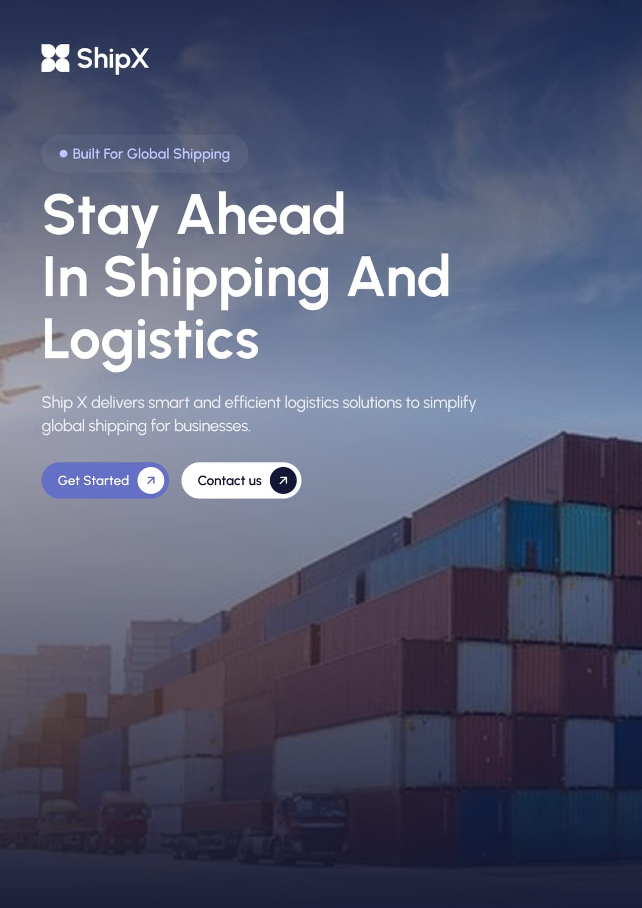
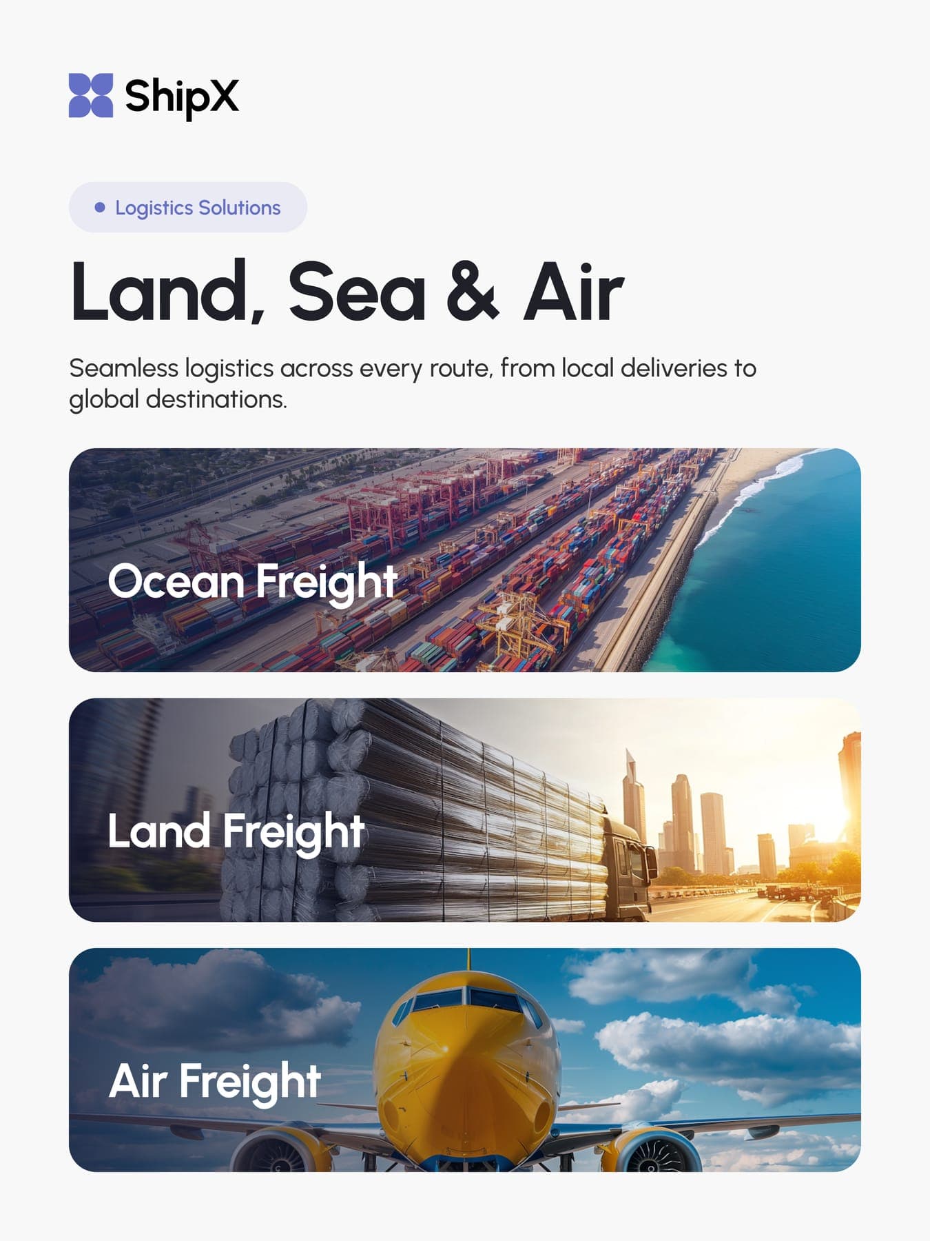
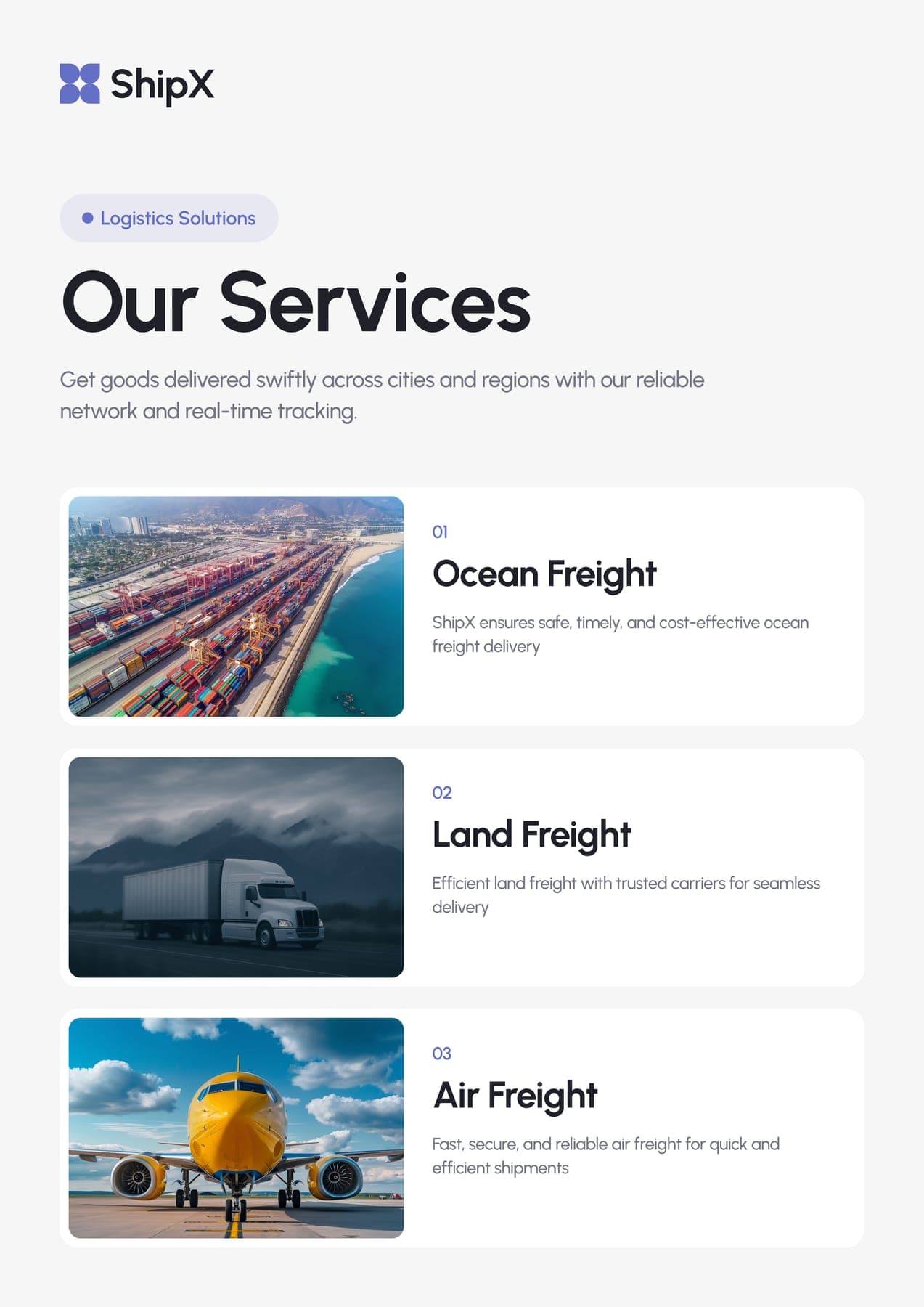
Five flyers and seven posts from the same kit. Even the tracking tags came straight out of the dashboard.
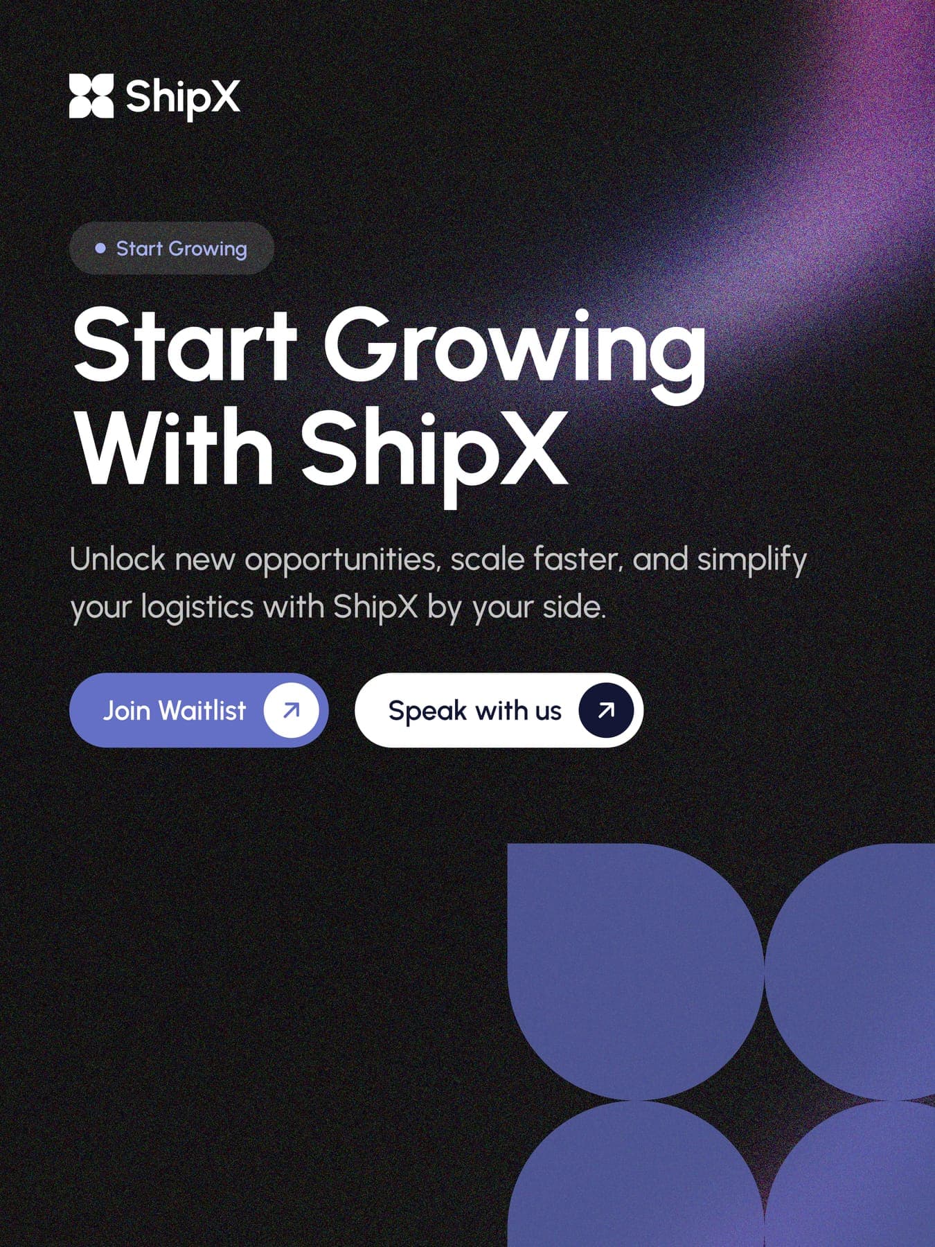
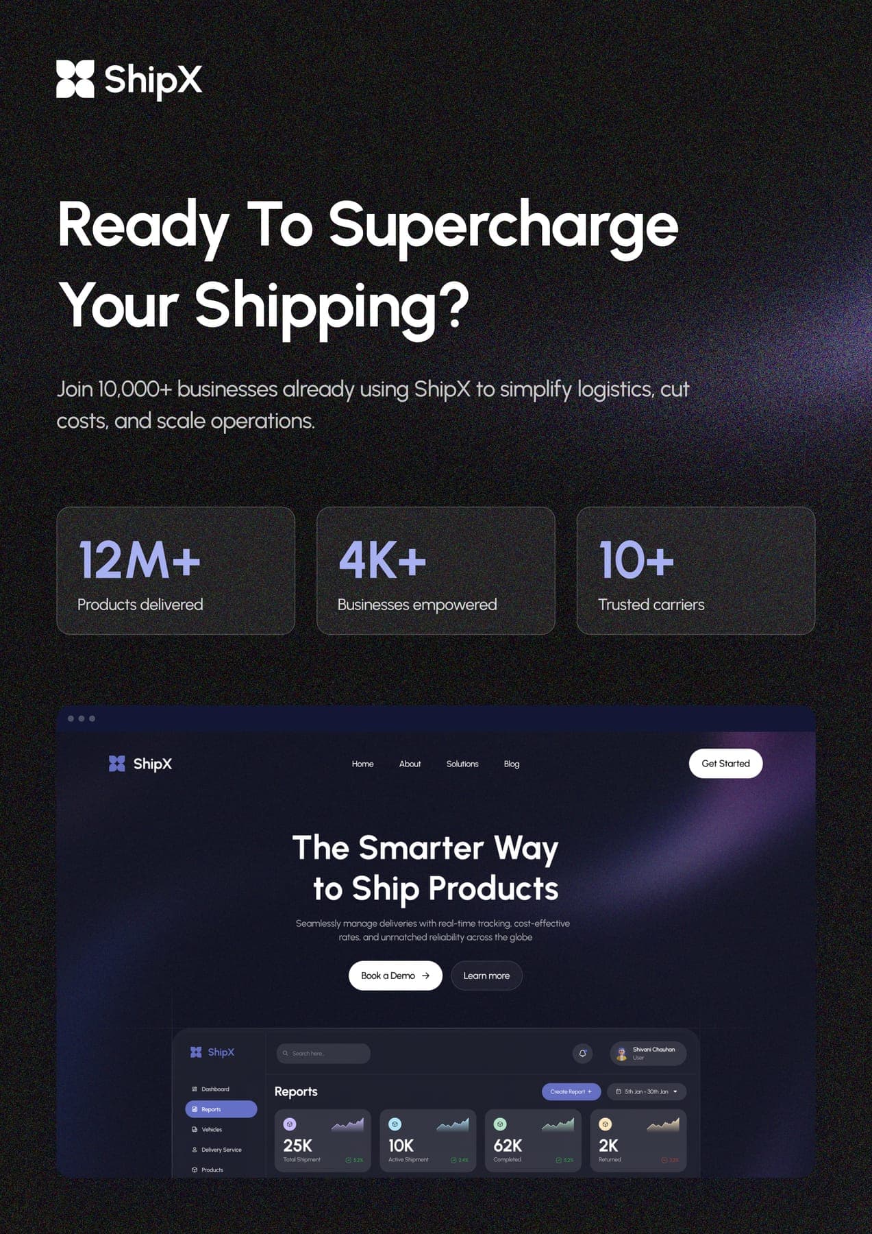

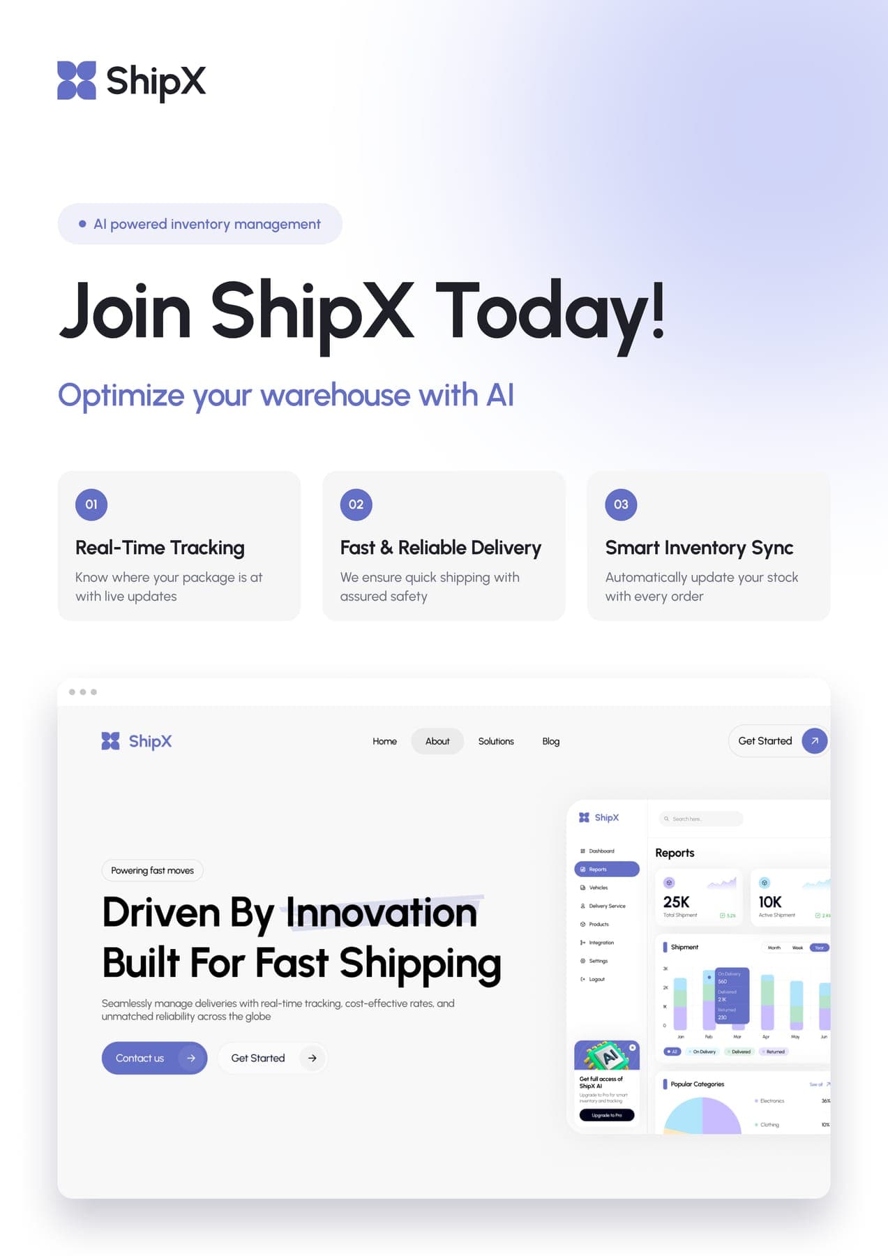
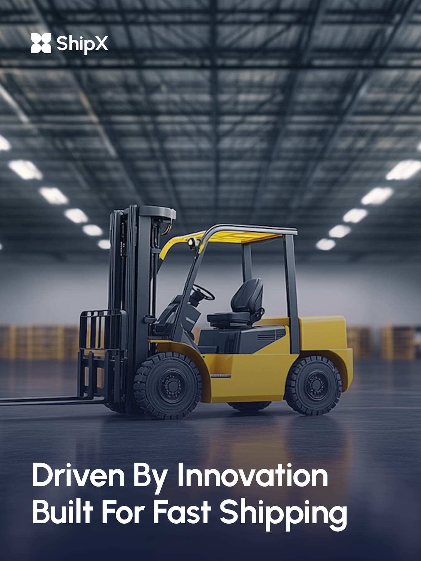
Four routes, one hub. One brand on the move.
0guideline pages
0colours
0pages and screens
03D renders
0flyers
0social posts