
case study
Real estate
Skyline
A real estate brand needed every listing to have room to breathe.
- Client
- Skyline
- Sector
- Real estate
- Year
- 2025
- Scope
- Brand, website, campaign
From one planet to an open house.
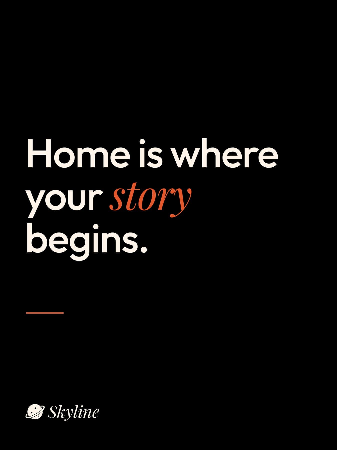
Home is where your story begins.
Skyline helps people buy, rent and sell homes, with real listings, local agents and free valuations. The brand had to feel like a good view.
Local experts. Honest advice. Every step of the way.
Sans for the facts, serif for the feeling.
The guidelines came first: a planet for a mark, Sunset Orange as the only accent, and every headline split between Outfit and a Playfair italic.
the logo
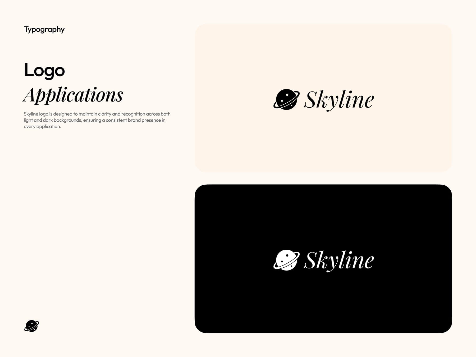
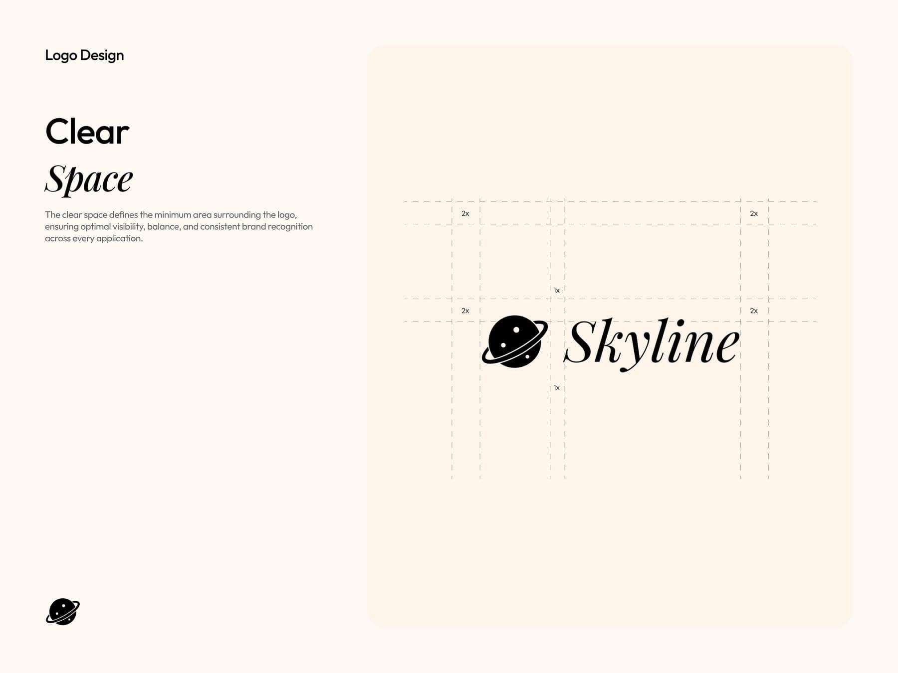
On light and on dark, with clear space on a simple grid.
the colour
One orange, used like a signpost.
Hover to open a colour, click to copy it.
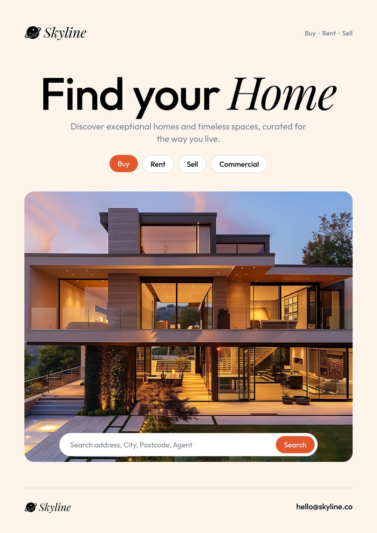
Find your Home
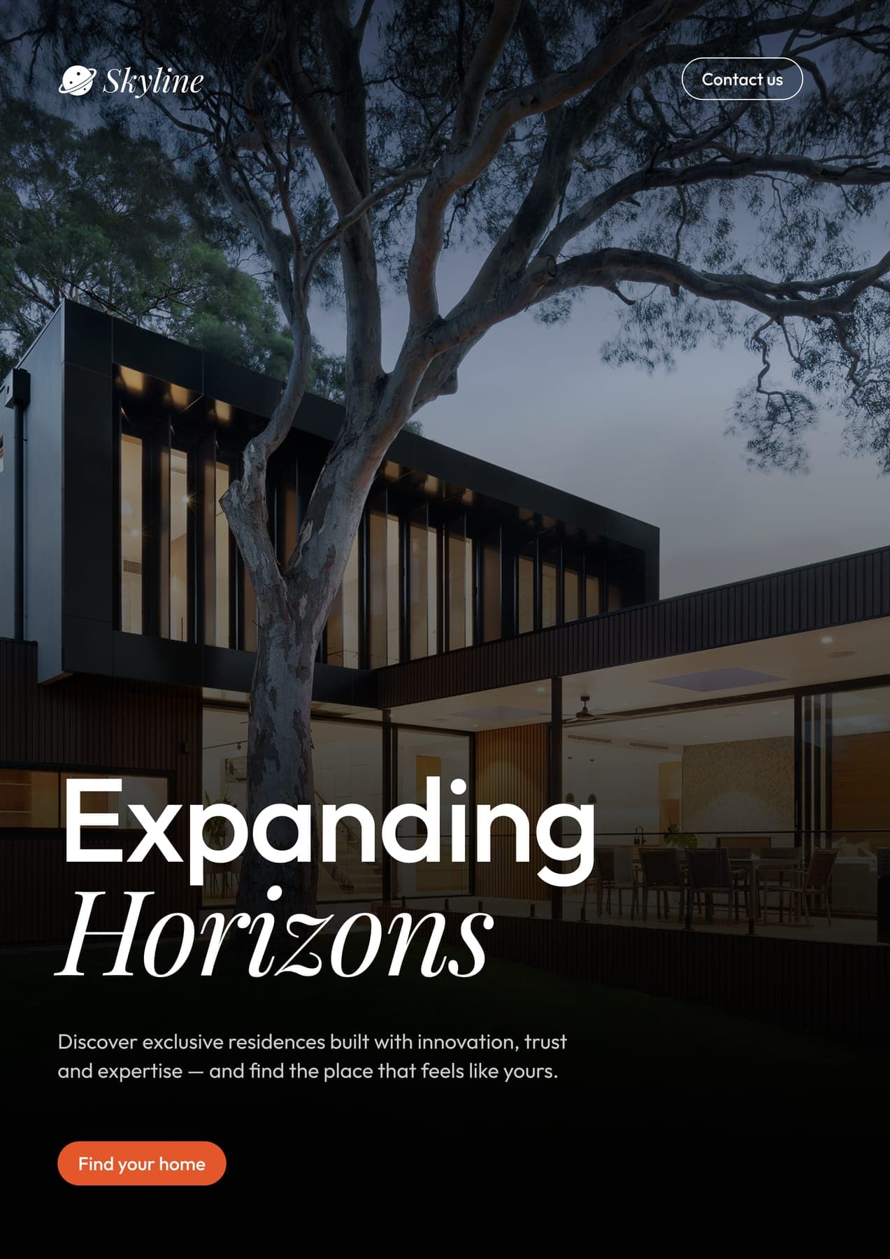
Expanding Horizons
the brand book
Ten pages, from the phone to the tote.
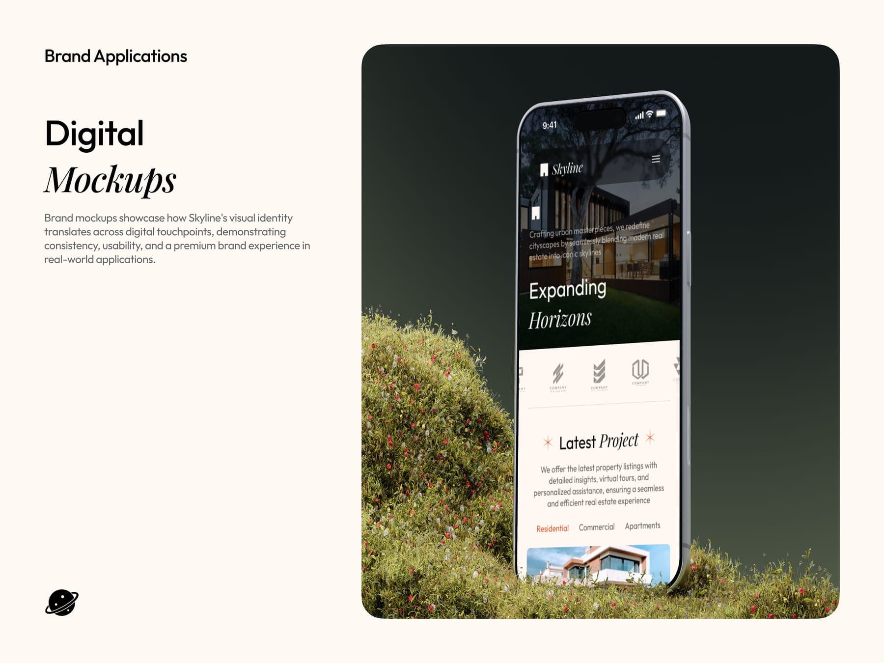
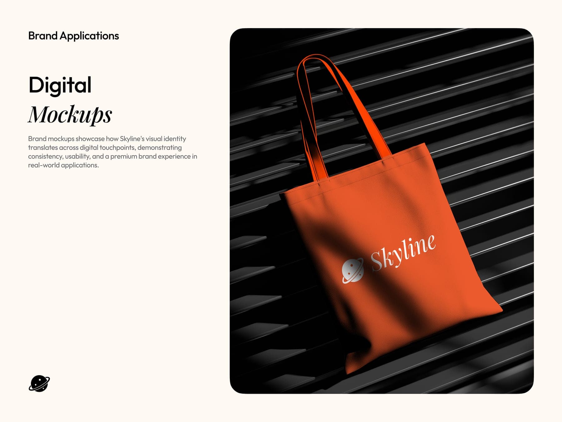
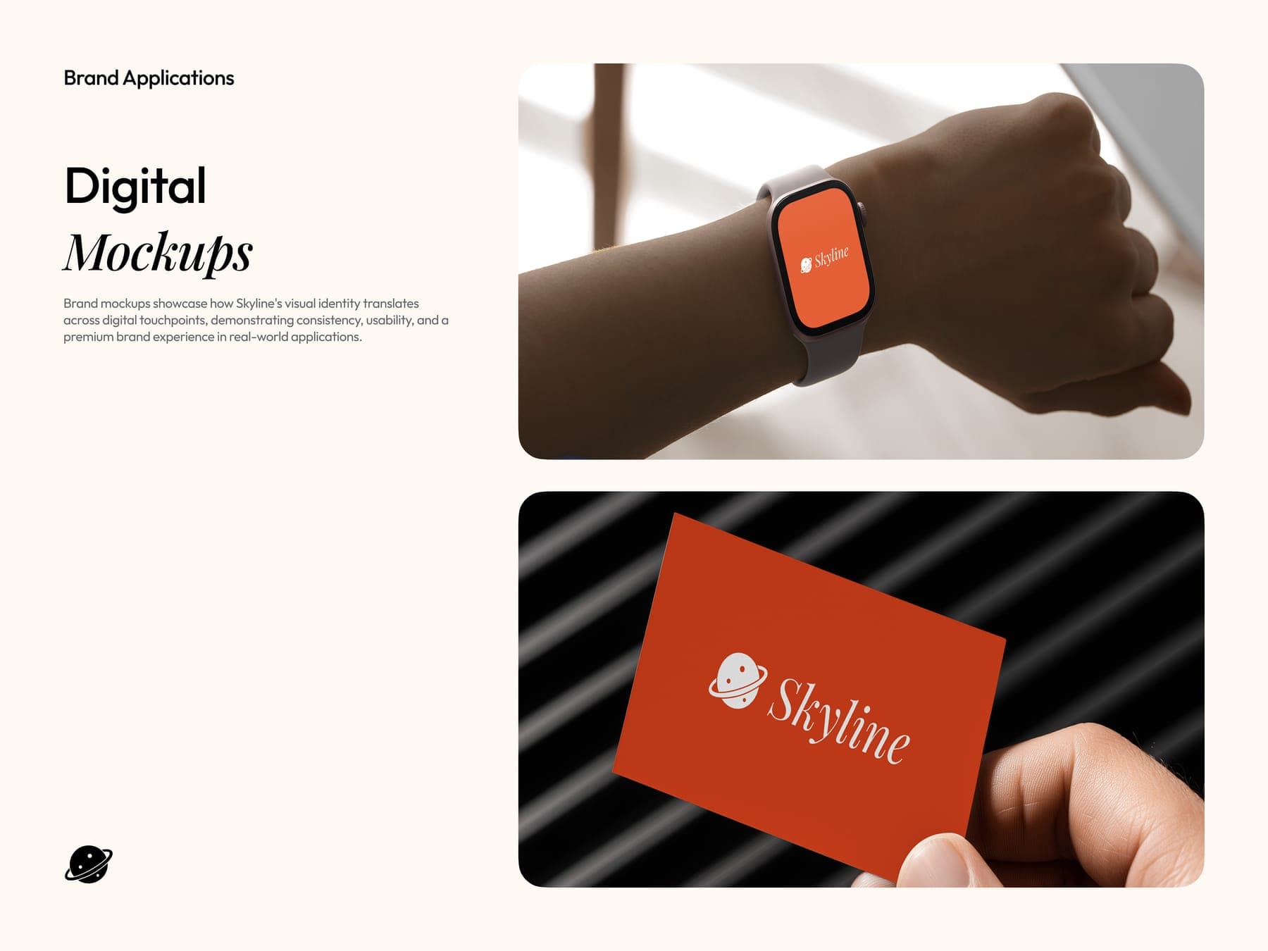
Every listing, room to breathe.
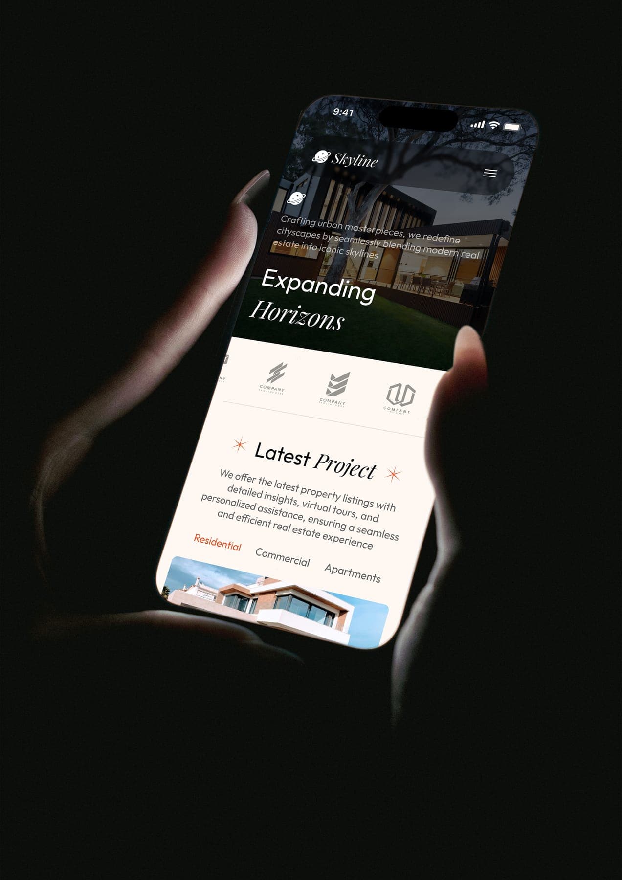
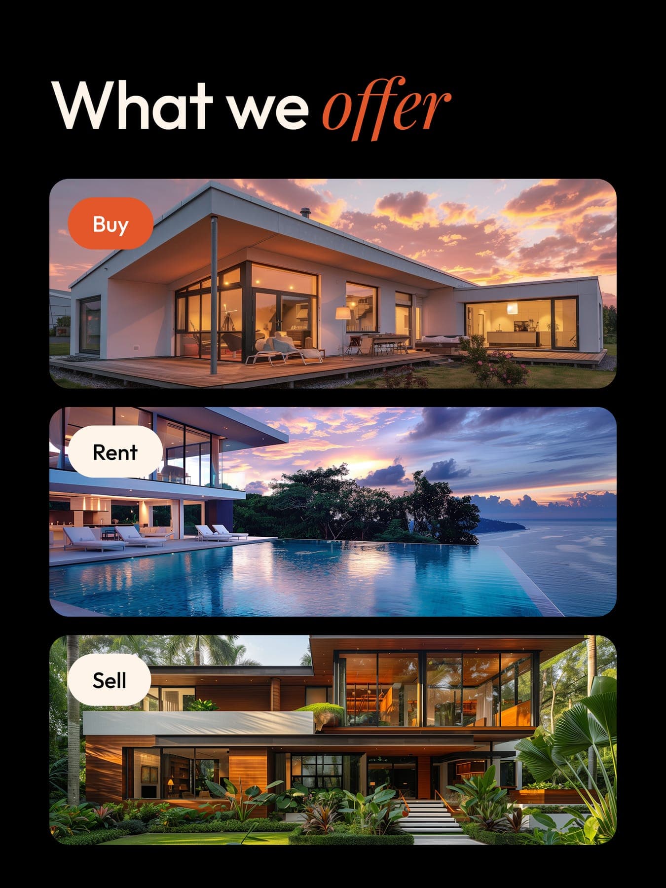
Then the site: search by buy, rent or sell, big photos, plain numbers and an agent one tap away. On laptop, tablet and phone.


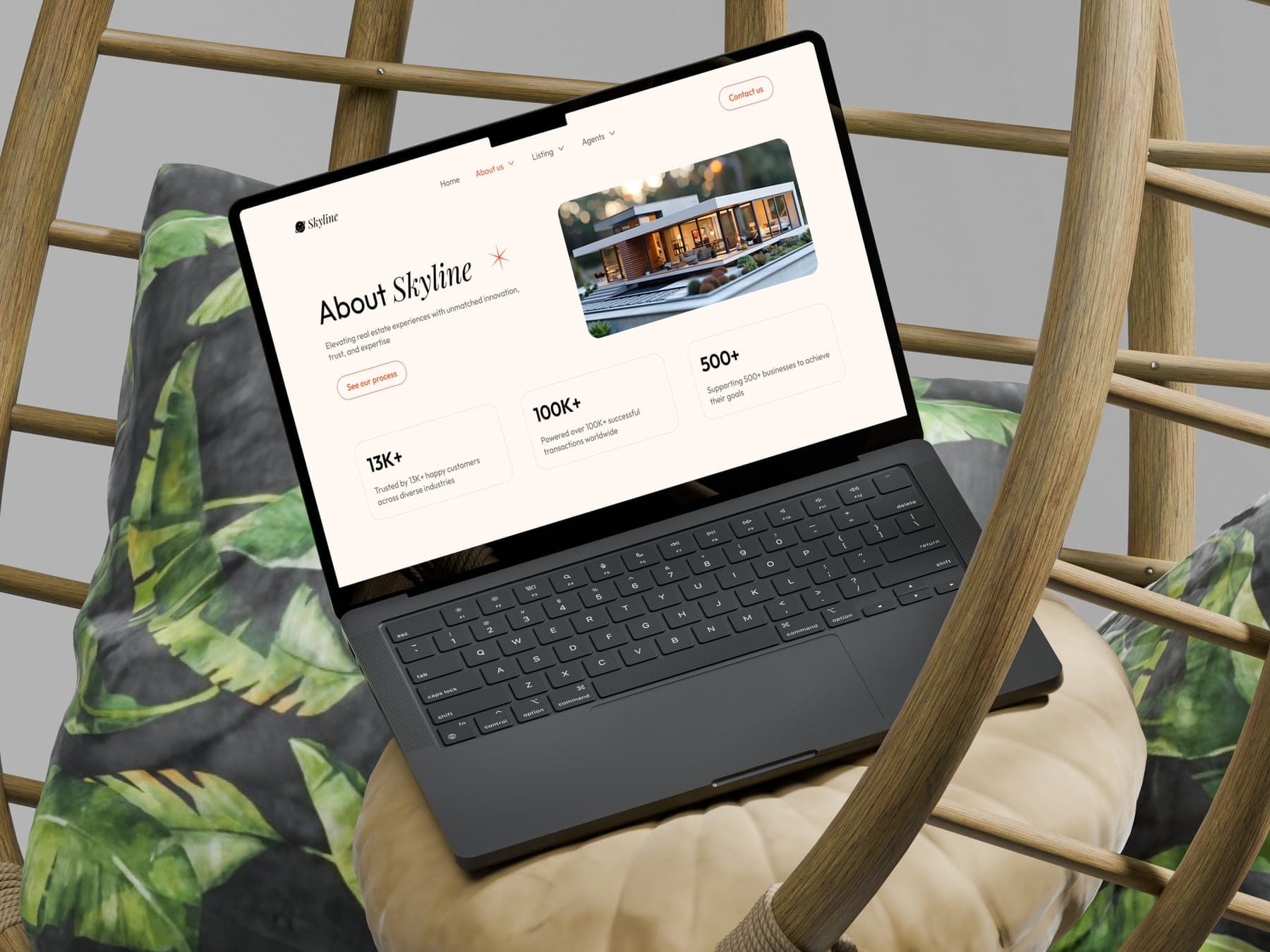
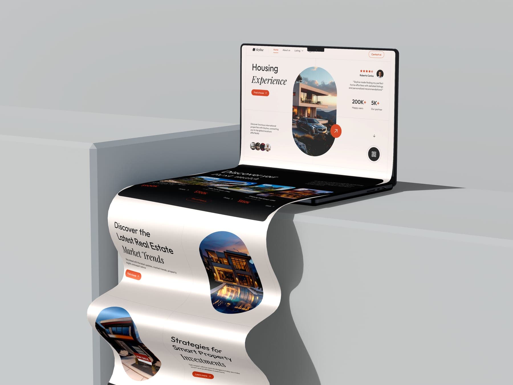
- 01 Home
- 02 About
- 03 Listings
- 04 Property detail
- 05 Contact
5 page types, desktop and mobile
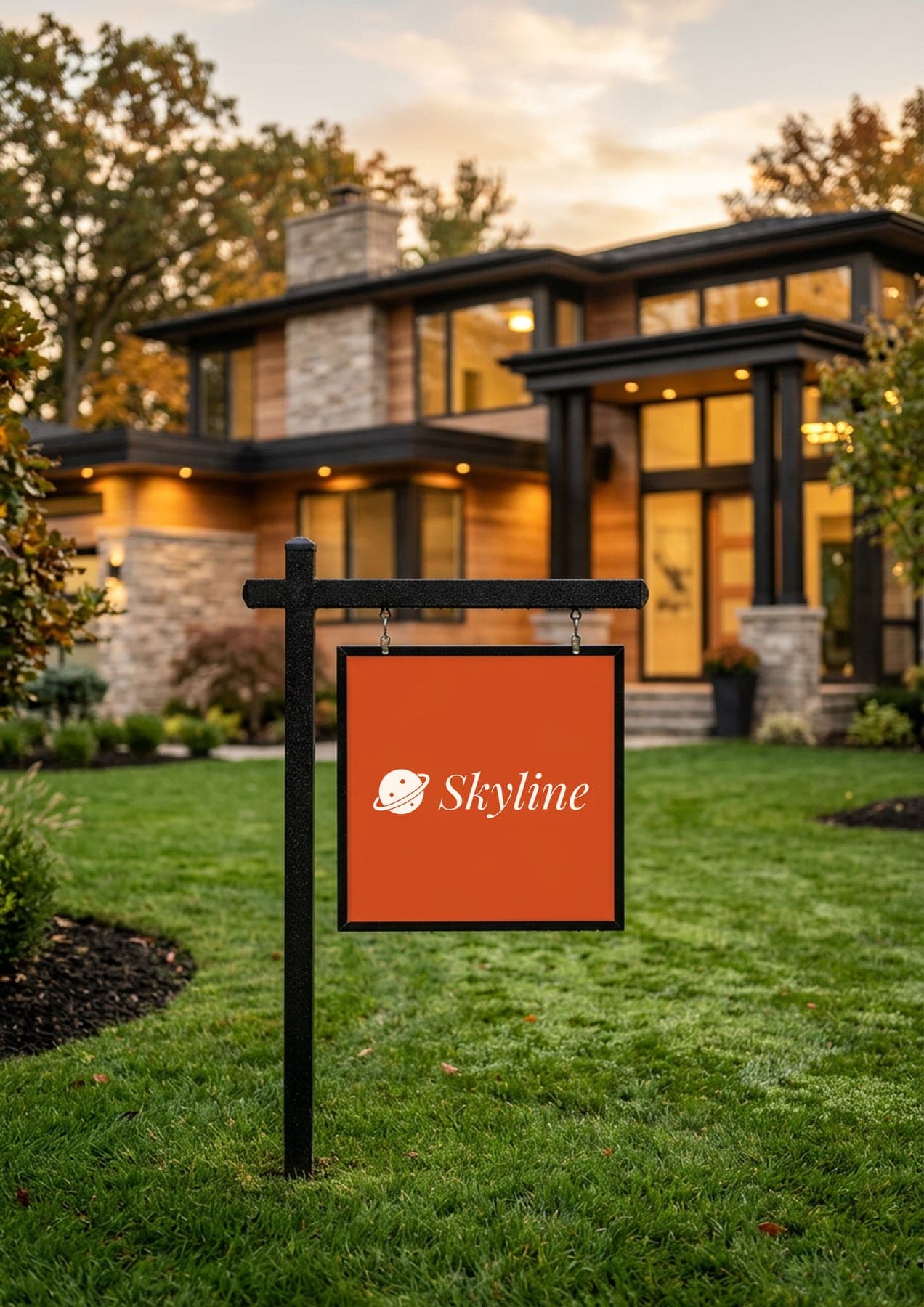
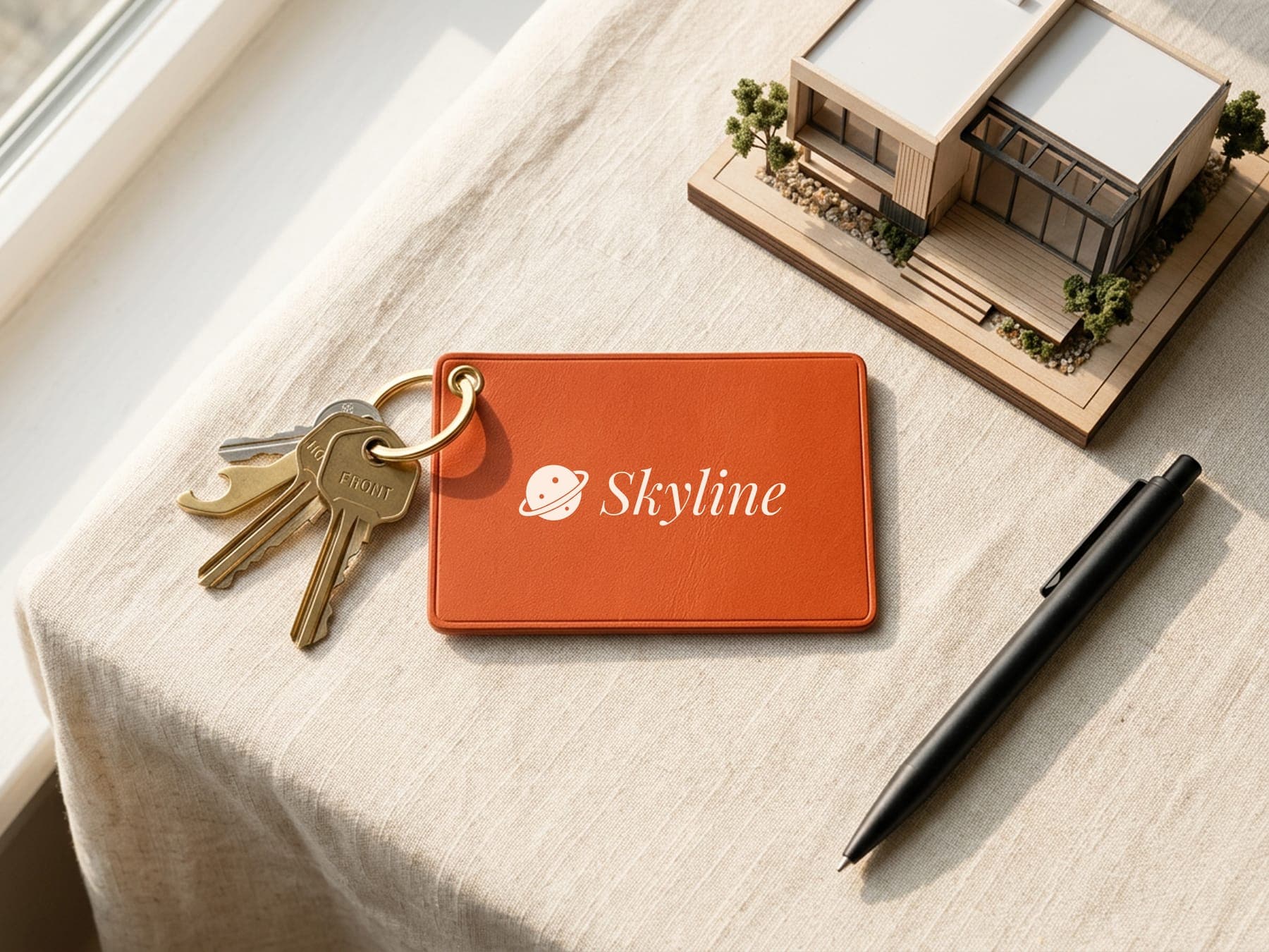
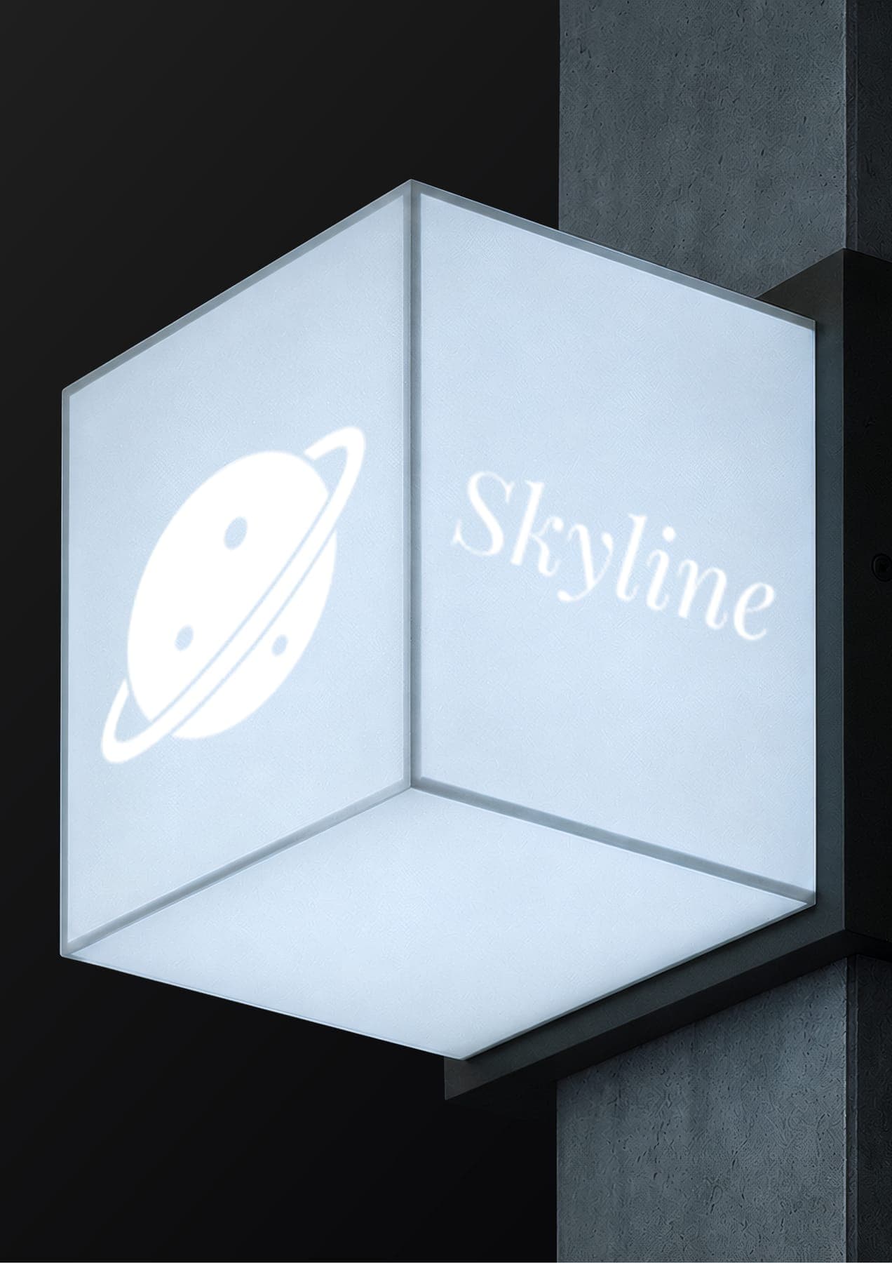
Then it went up on the lawn.
A yard sign, a key tag, a lightbox, a roll-up banner, a brochure, a bag and a billboard at the station.
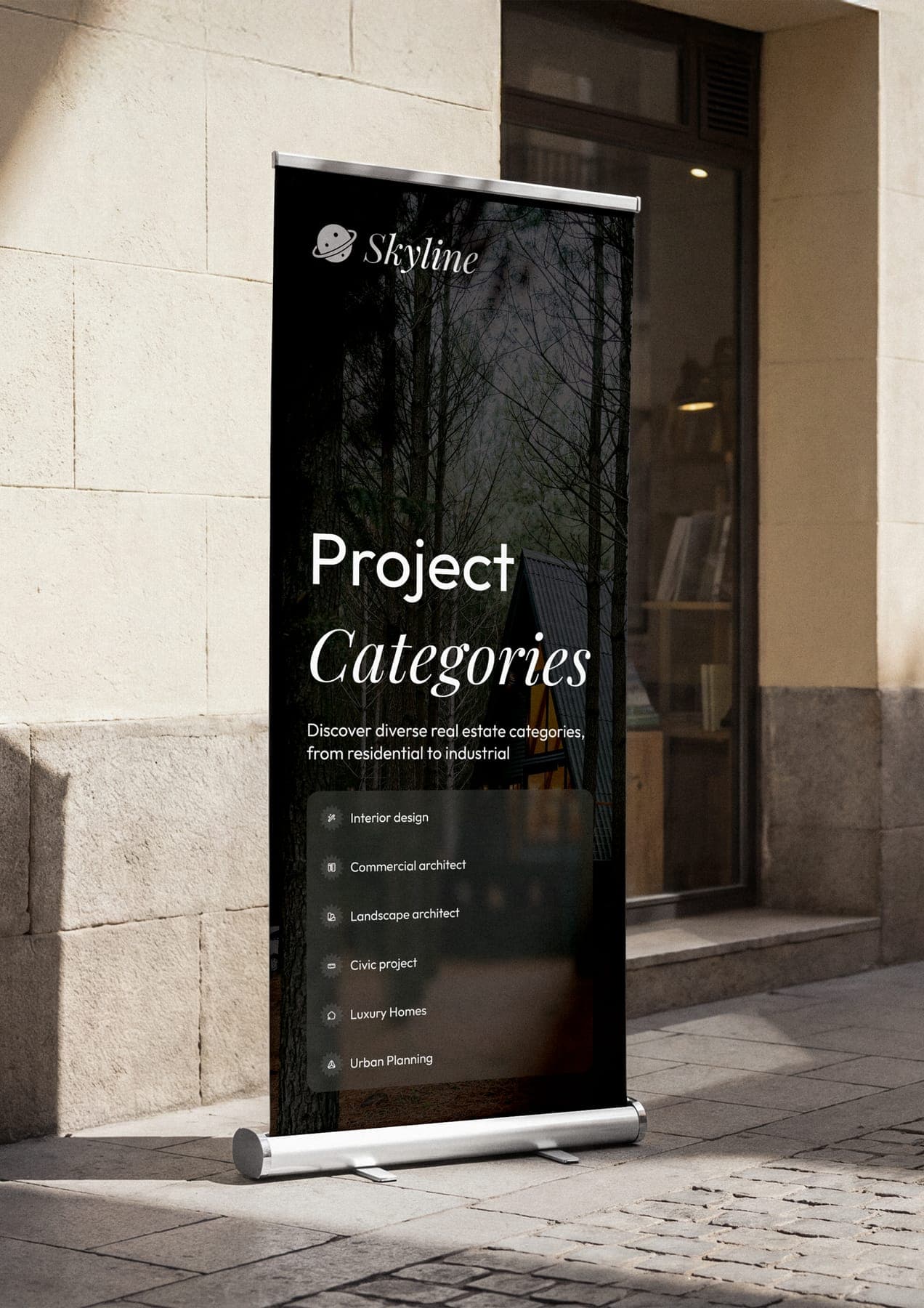
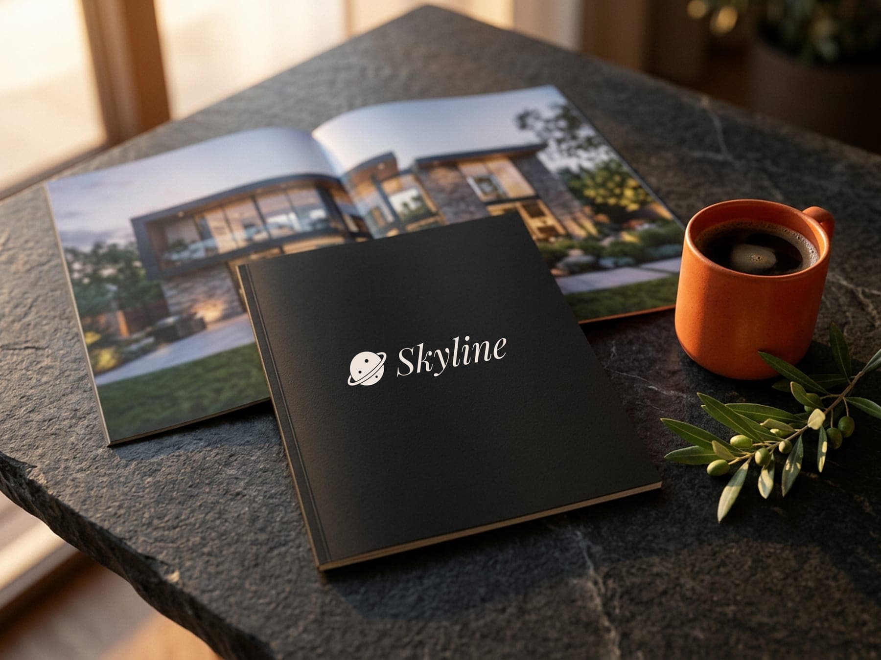
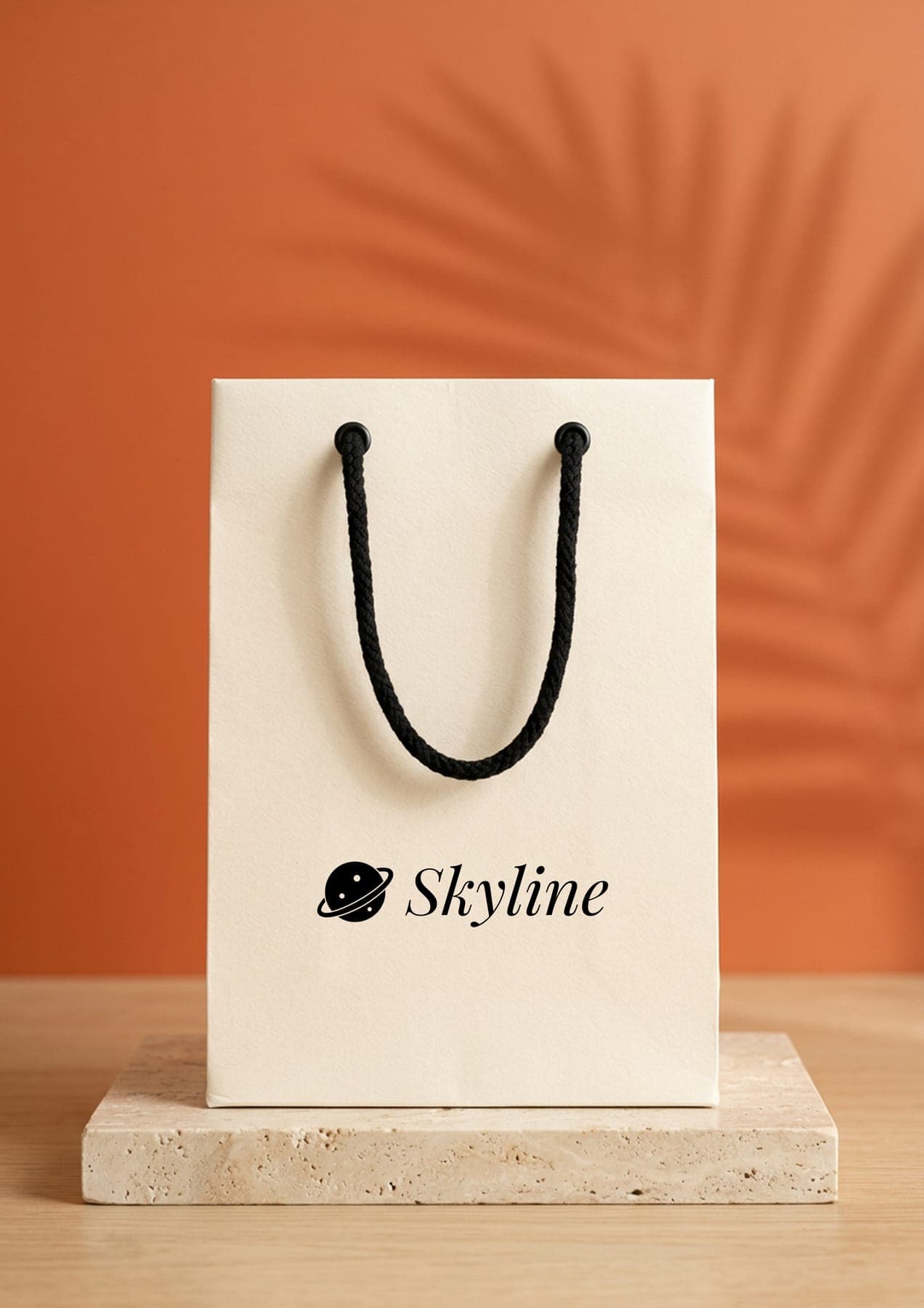
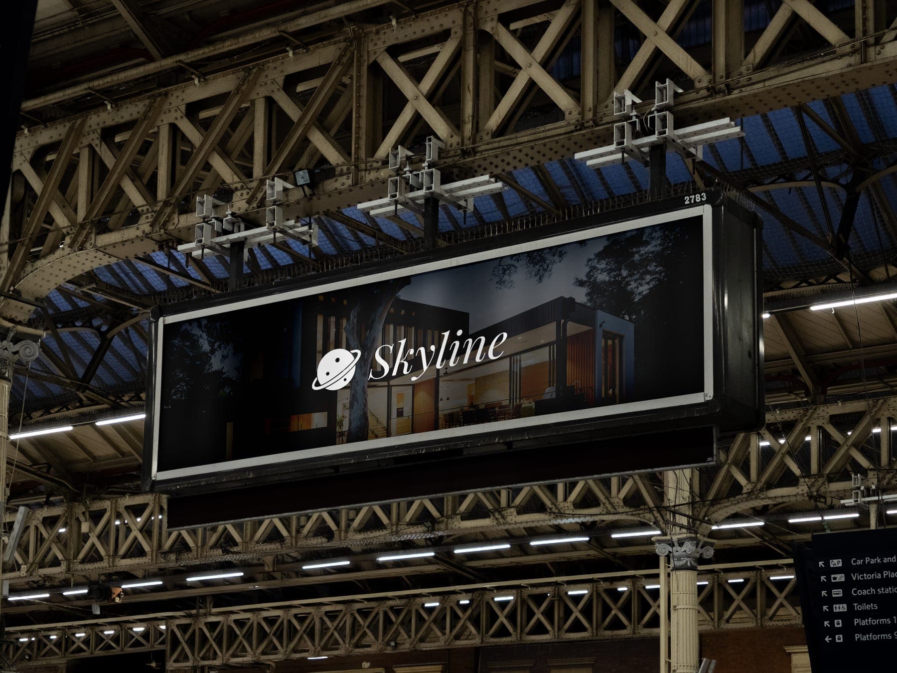
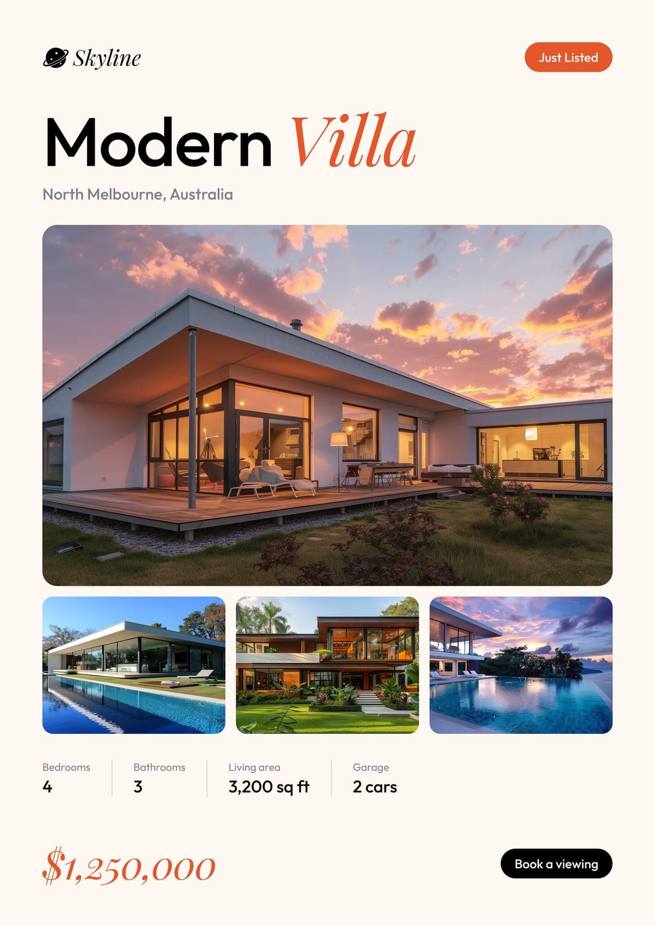
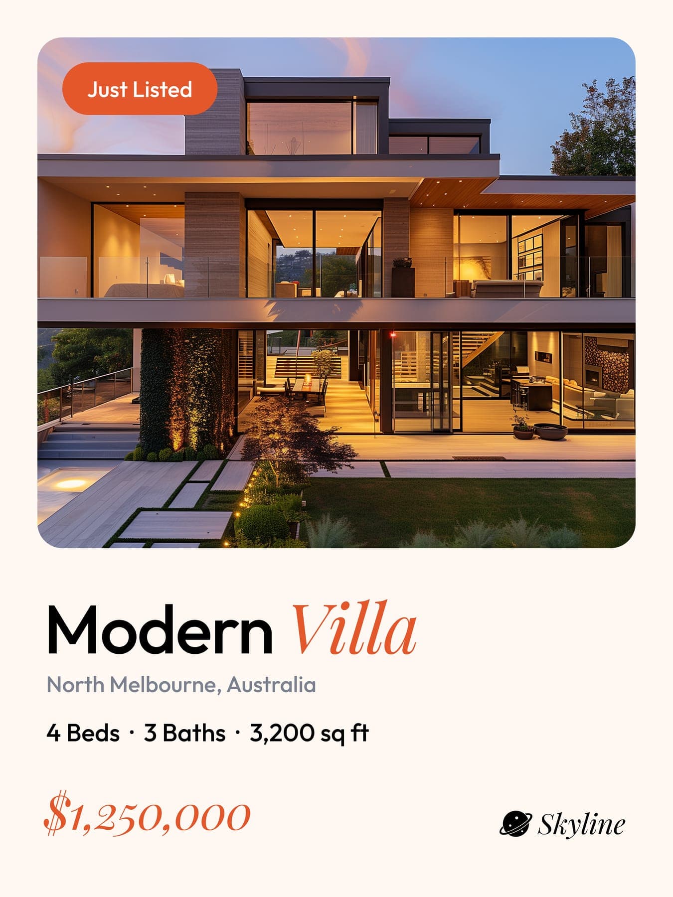
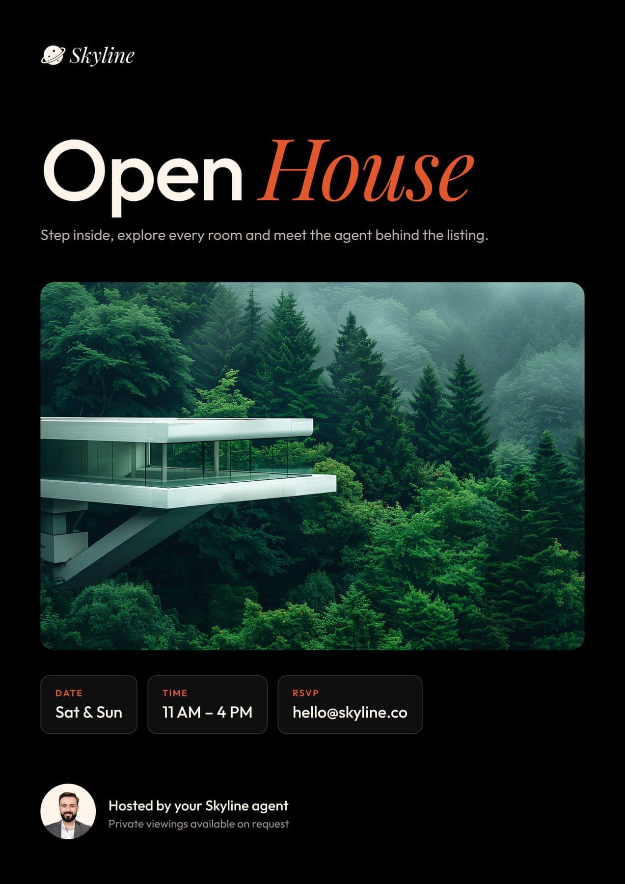
Just listed, then open house.
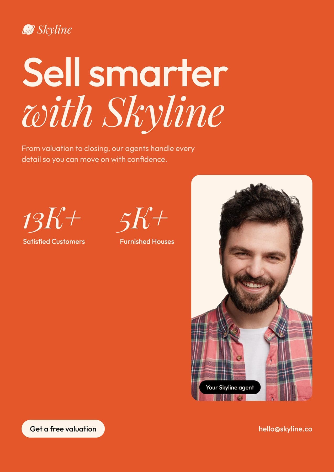
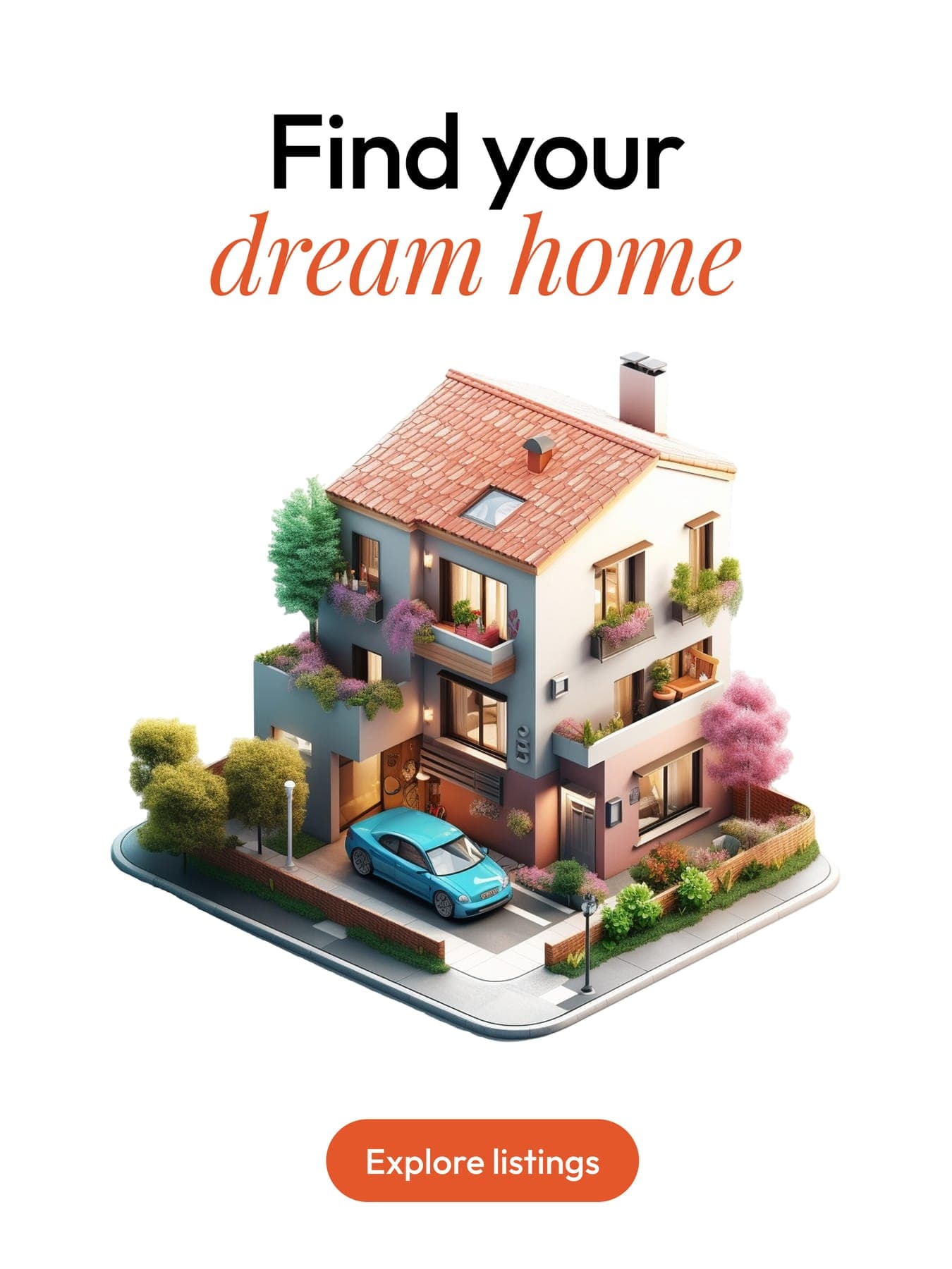
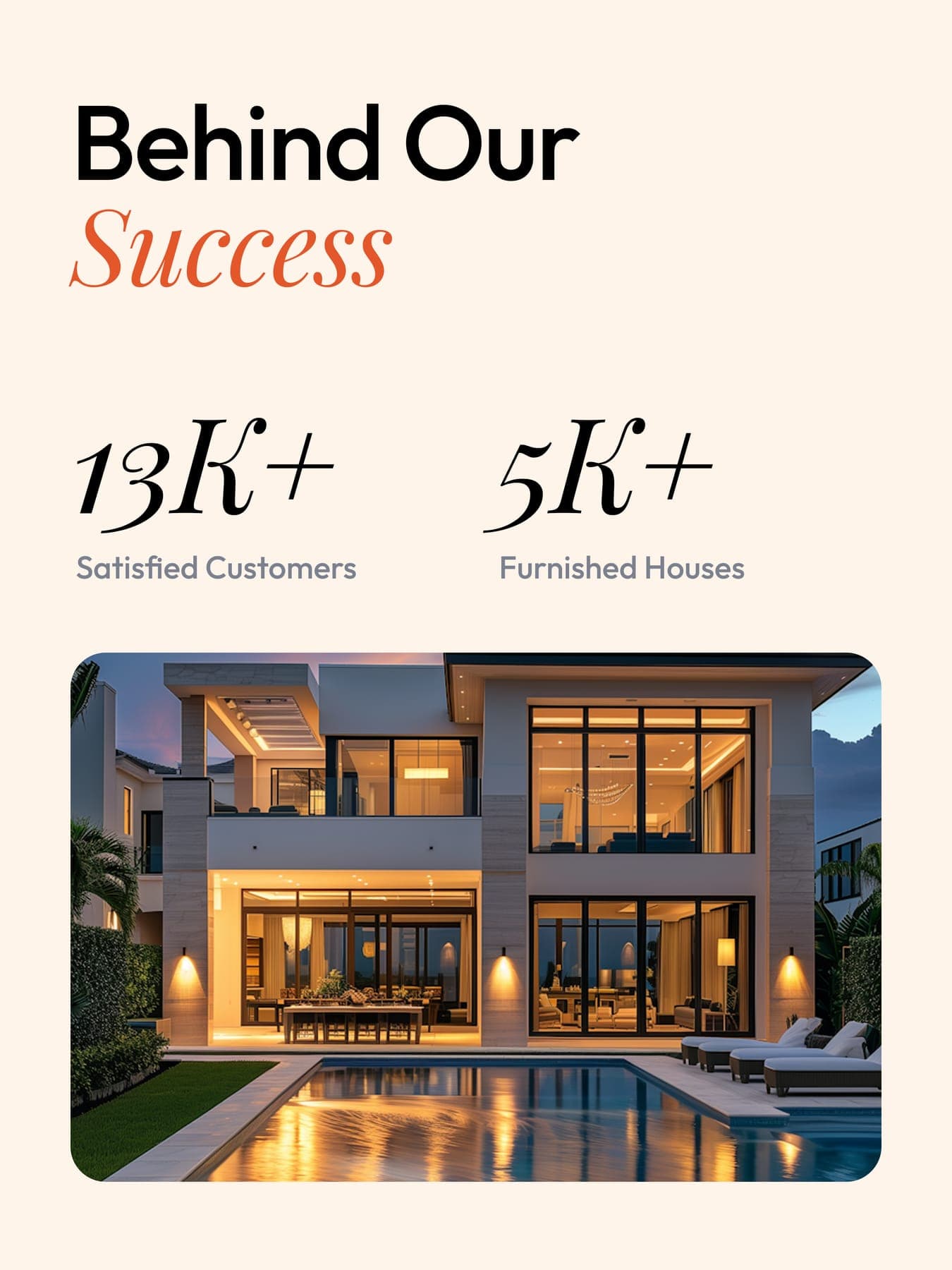
Five flyers and nine posts that follow a sale from the listing to the keys. One italic word in every headline.
the headlines
Outfit for the plain part, Playfair italic for the rest.
- flyer
Find your Home
- flyer
Expanding Horizons
- flyer
Open House
- post
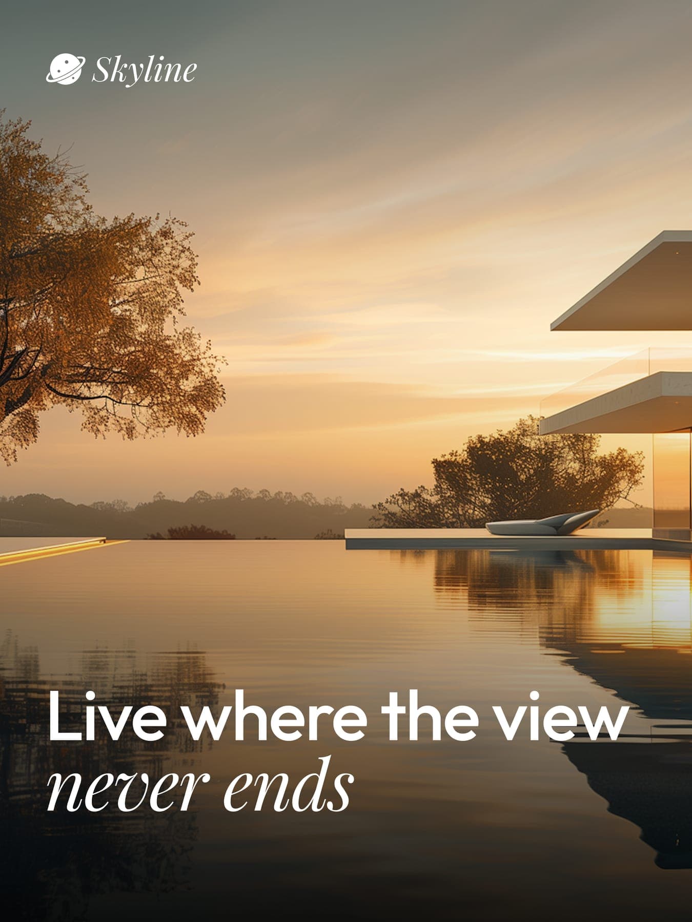
Live where the view never ends
- post
Meet our agents

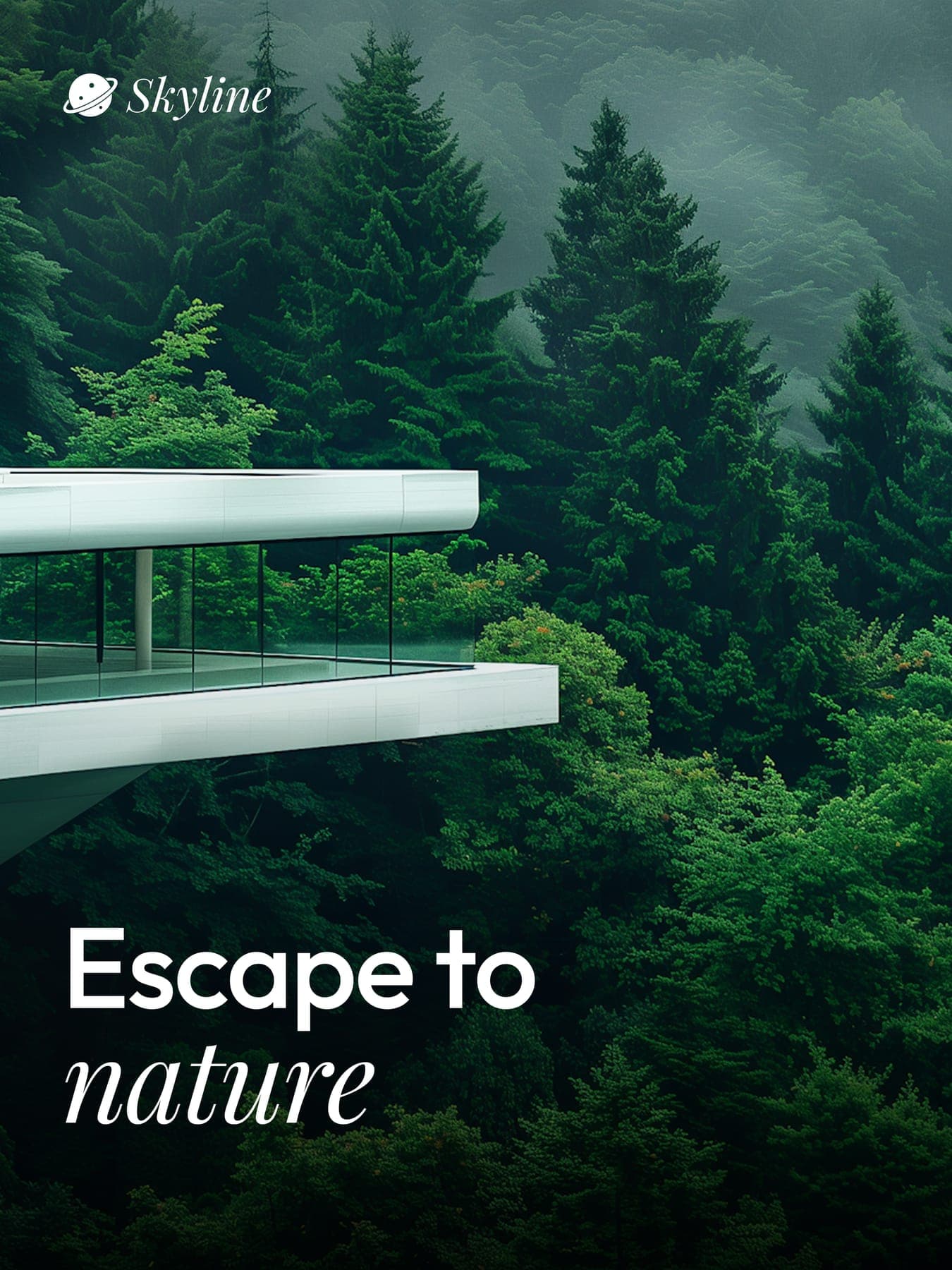
A good view, on every page.
0guideline pages
0colours
0web mockups
03D renders
0flyers
0social posts