

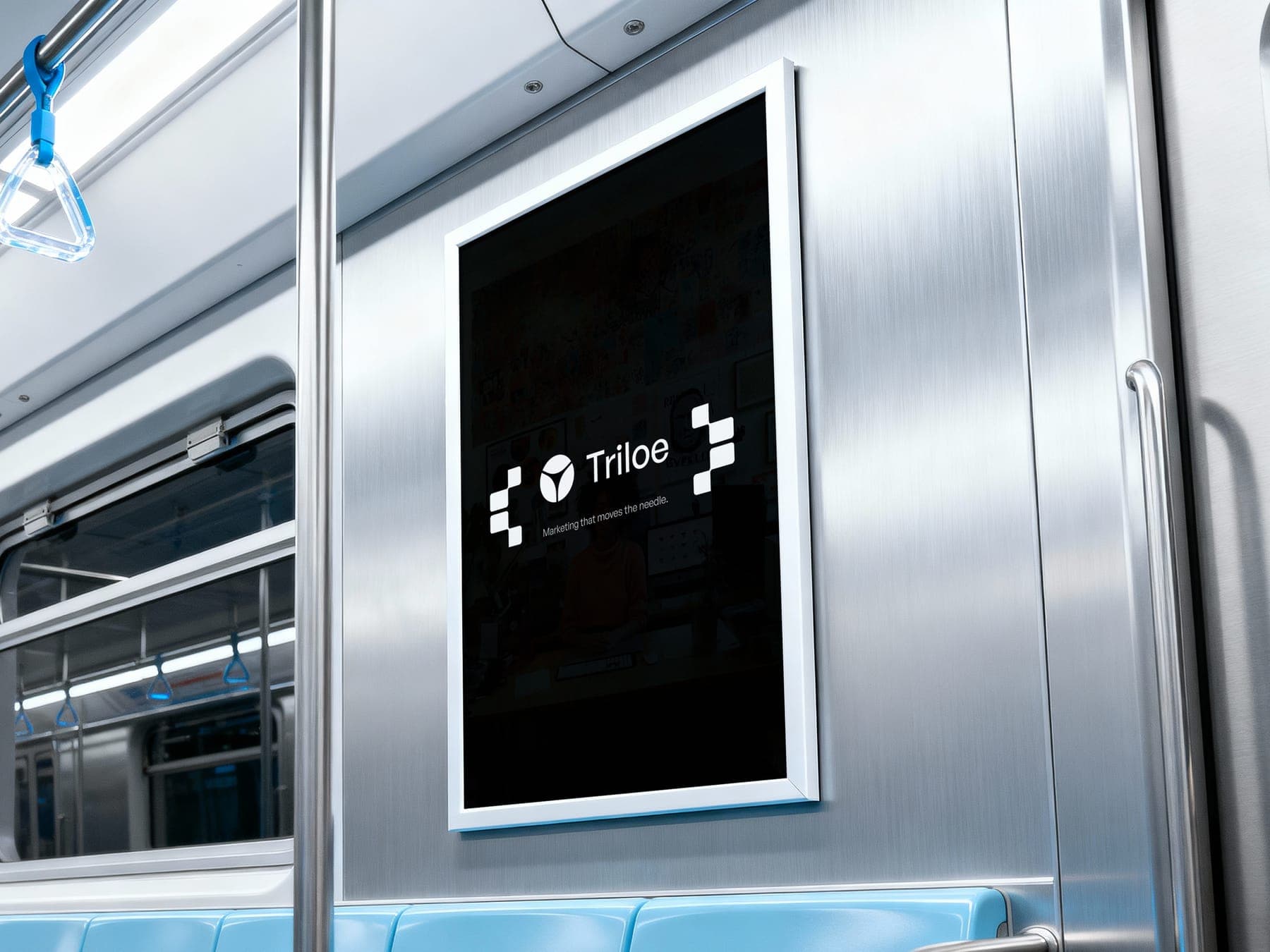
case study
Marketing agency
Triloe
A marketing agency needed a brand that practises what it preaches.
- Client
- Triloe
- Sector
- Marketing agency
- Year
- 2025
- Scope
- Brand, website, campaign
From one blue tile to a feed that teaches.
Growth, without the fluff.
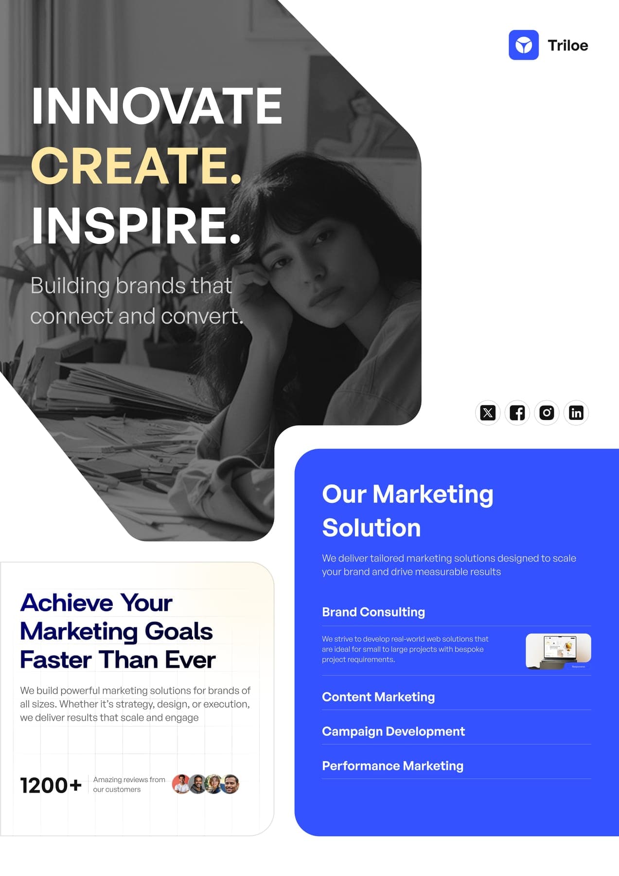
Triloe does branding, social, performance, SEO and influencer work for brands that want to grow. Its own brand had to prove it could do the same.

Turn strategy into results today.
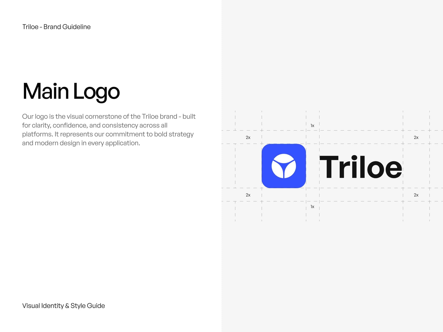
One blue tile, split three ways.
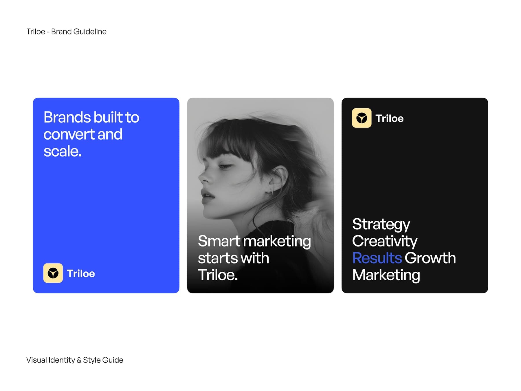
First the guidelines: a white circle cut into three by a Y, sitting in a bright blue tile. Blue does the shouting, black and white do the rest.
the logo
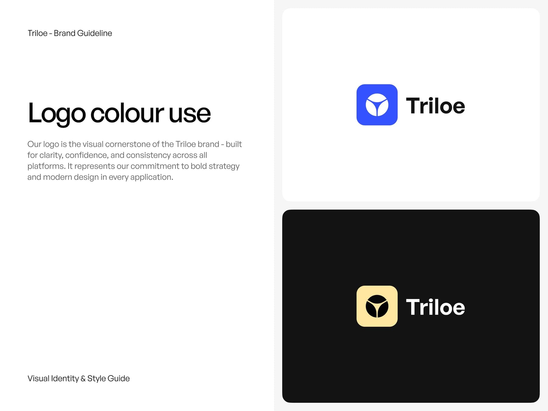
Blue tile on white, cream tile on black.
the colour
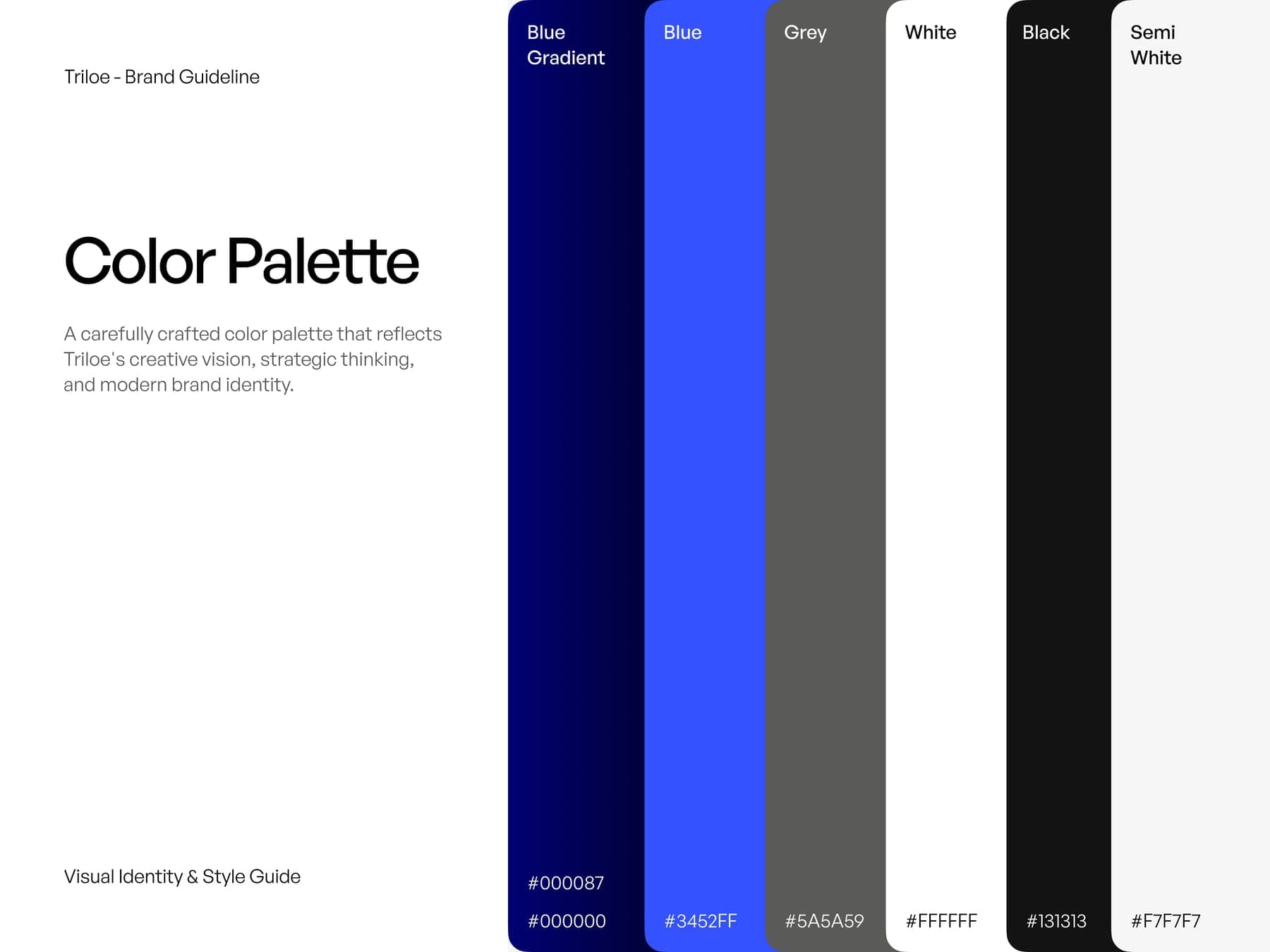
Bright blue, and not much else.
Hover to open a colour, click to copy it.
the brand book
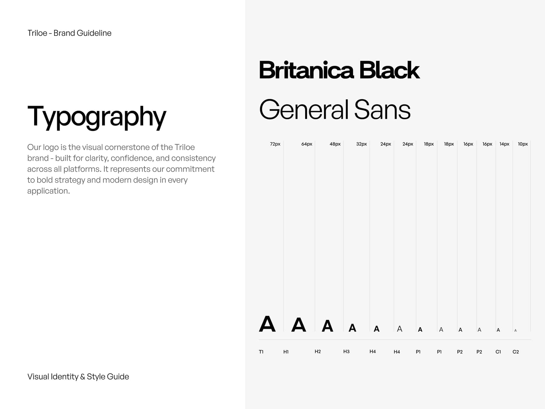
Eleven pages. Two typefaces, Britanica Black and General Sans, and a deep blue gradient for dark heroes.
A site that sells the service.
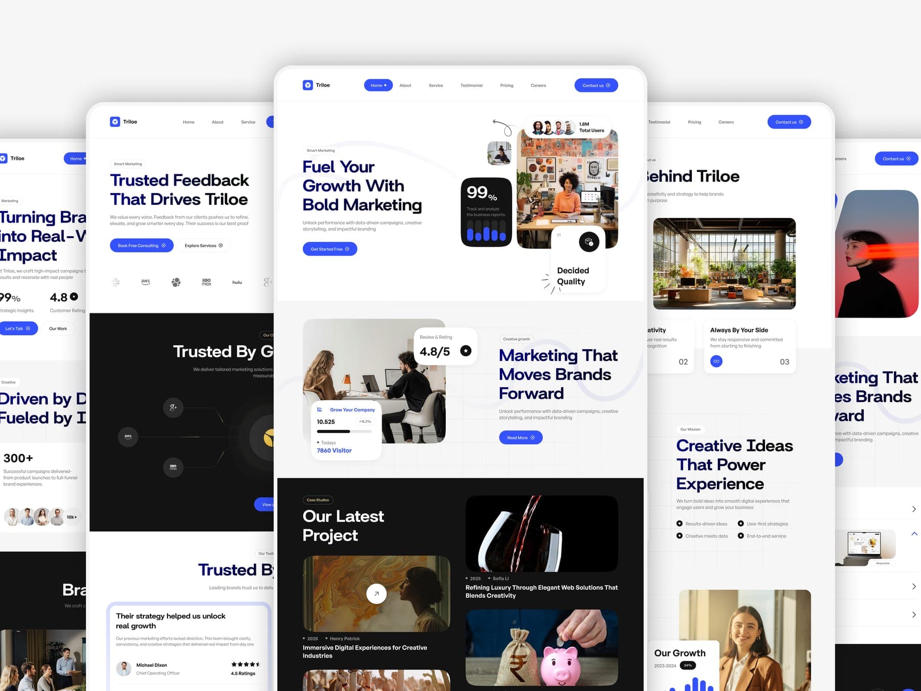
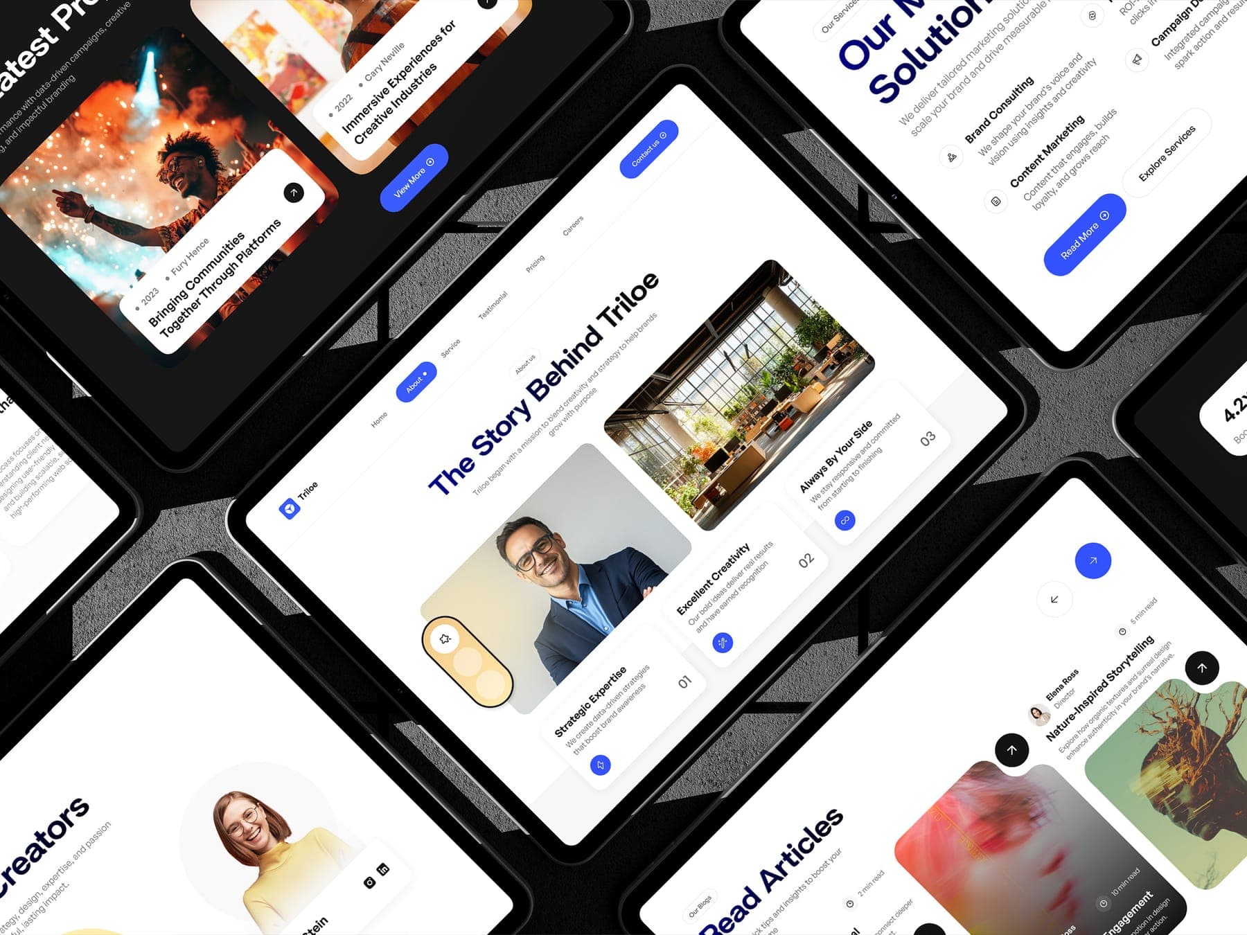
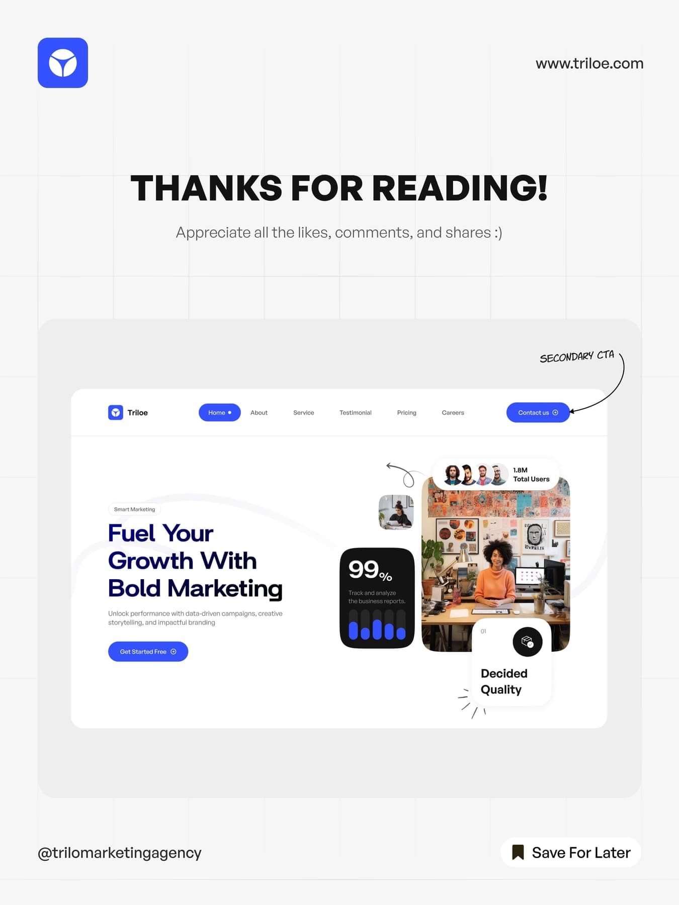
Then the site: services, pricing, careers and the proof, laid out by people who know what makes a page convert.
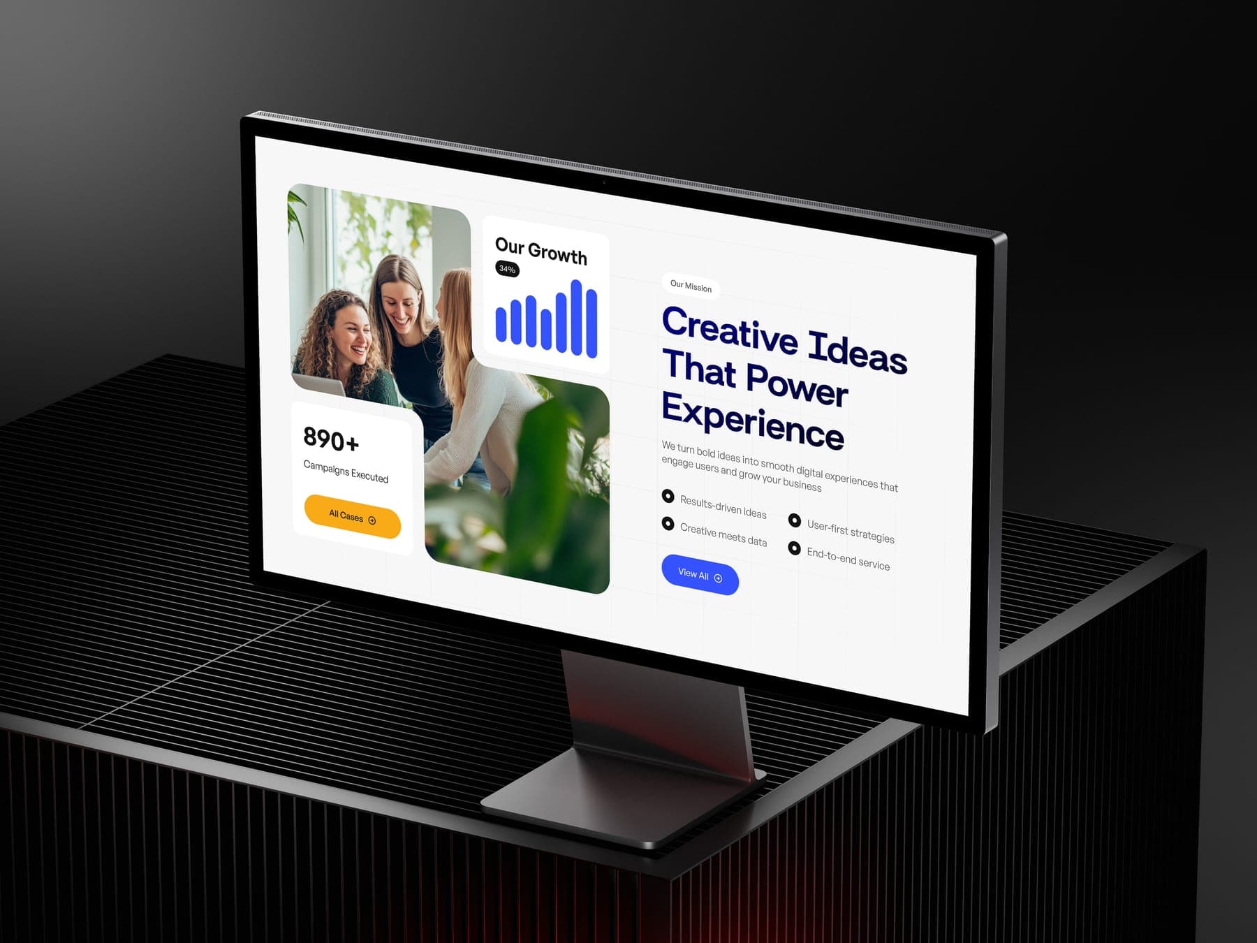

- 01 Home
- 02 About
- 03 Service
- 04 Pricing
- 05 Careers
5 page types
On the desk, and on the wall.
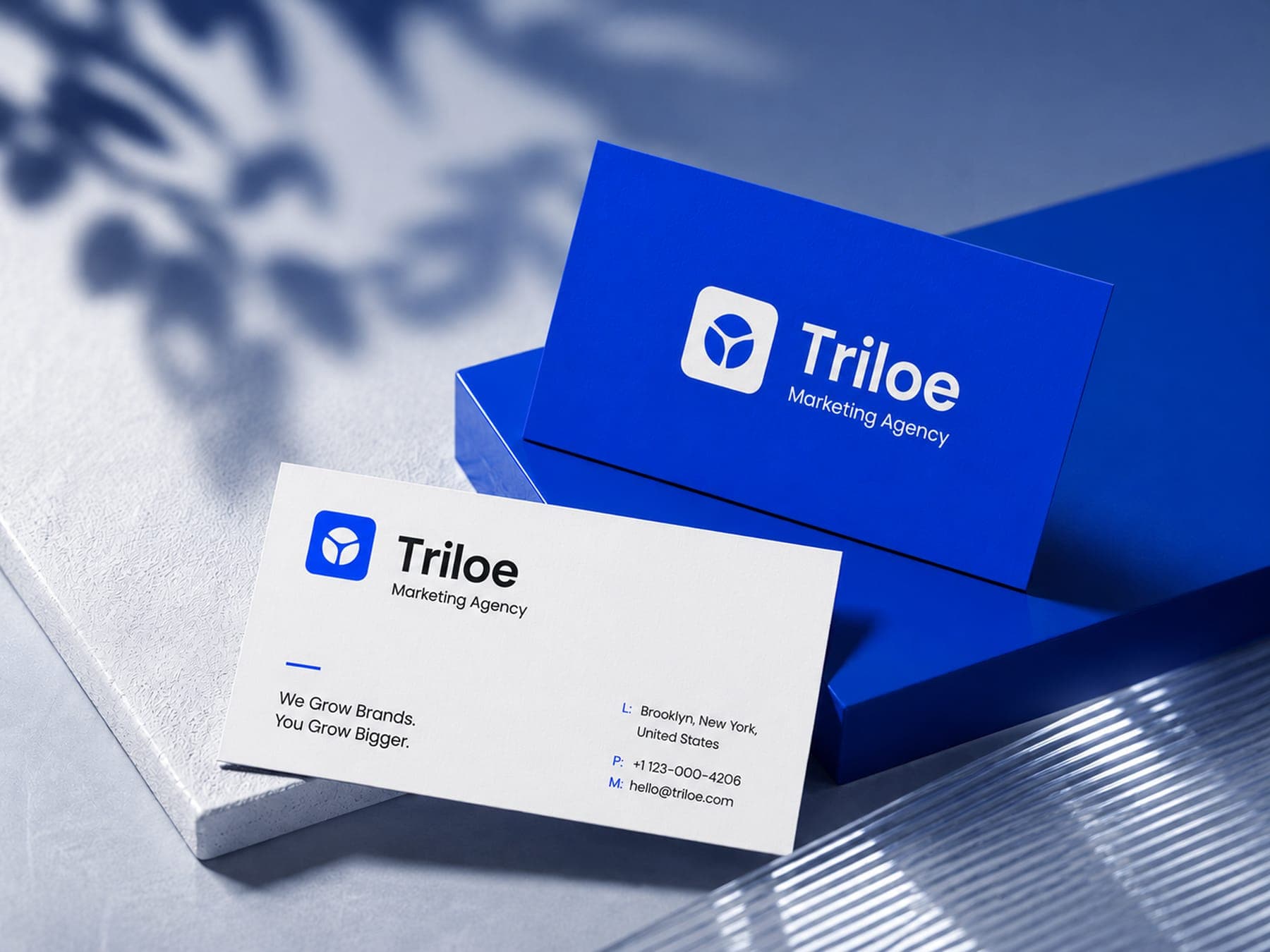
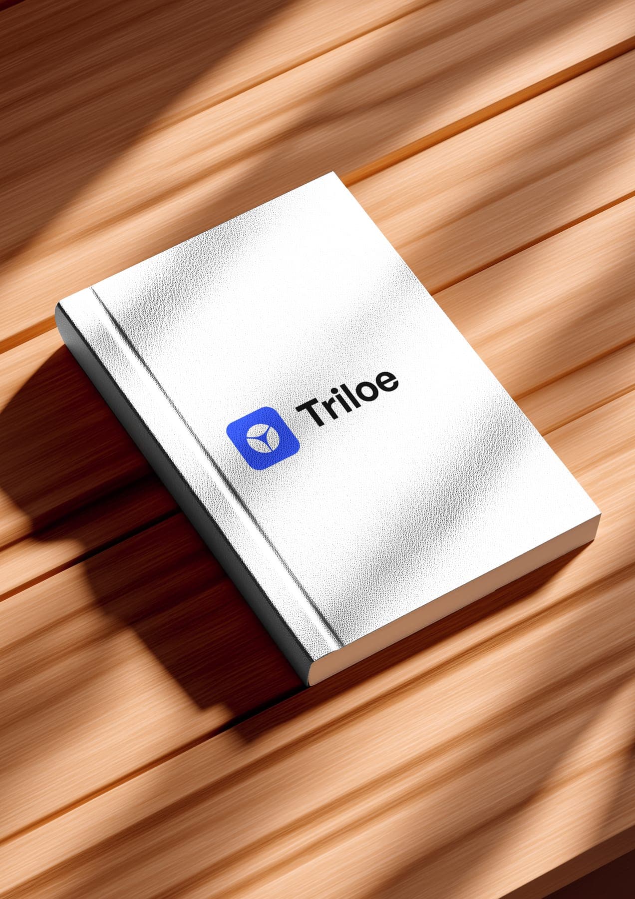
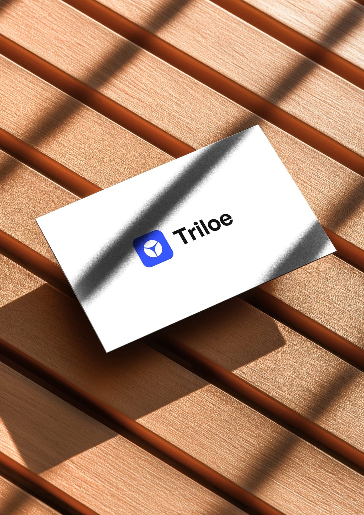
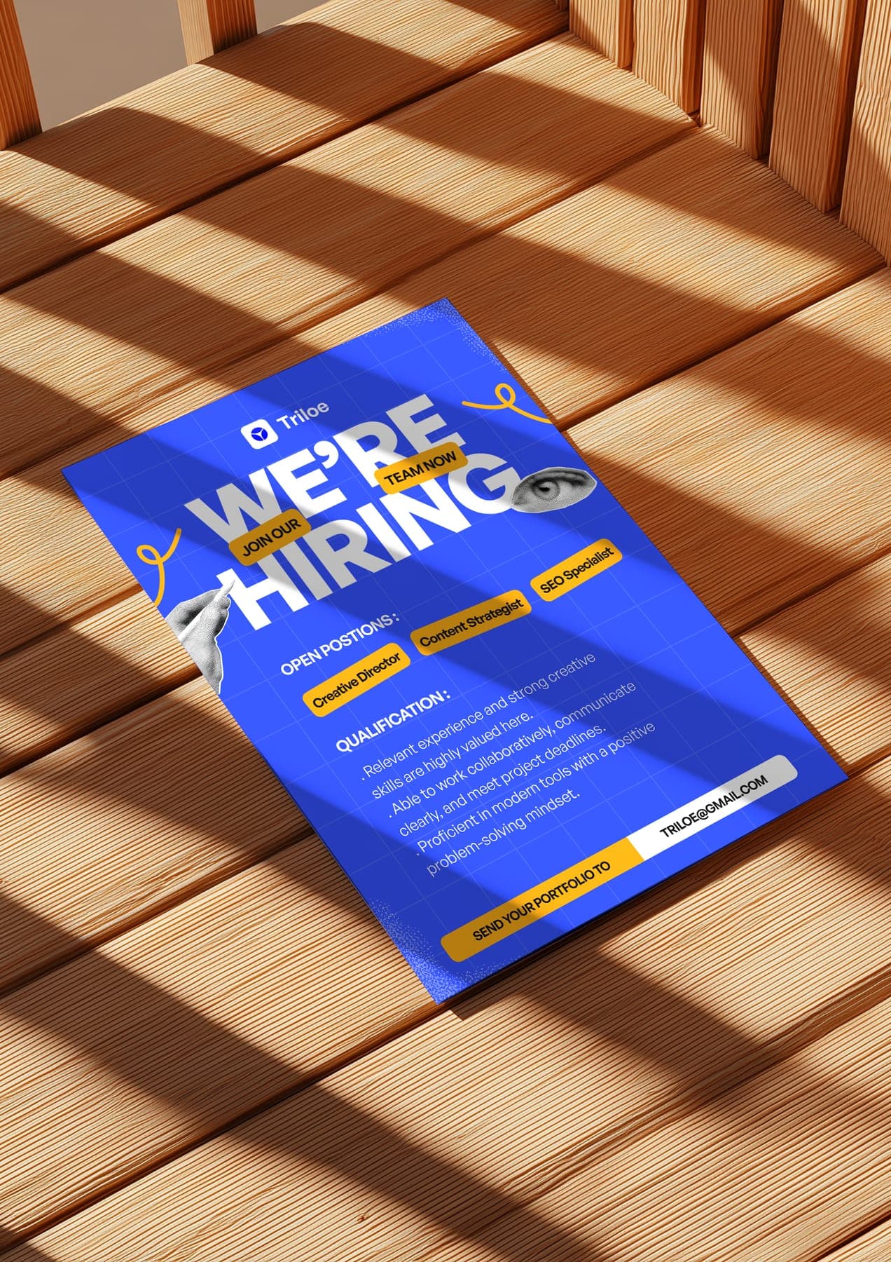
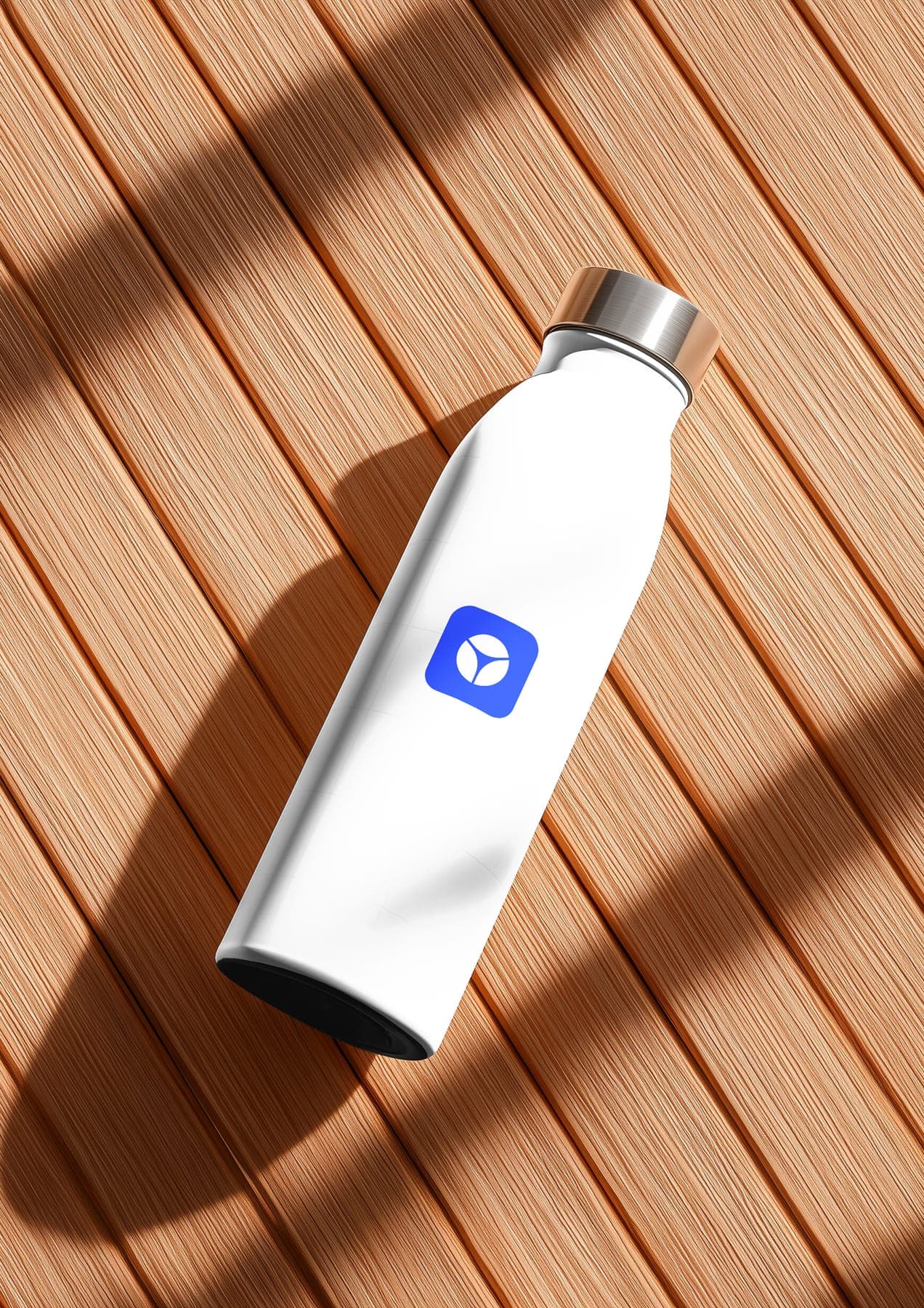
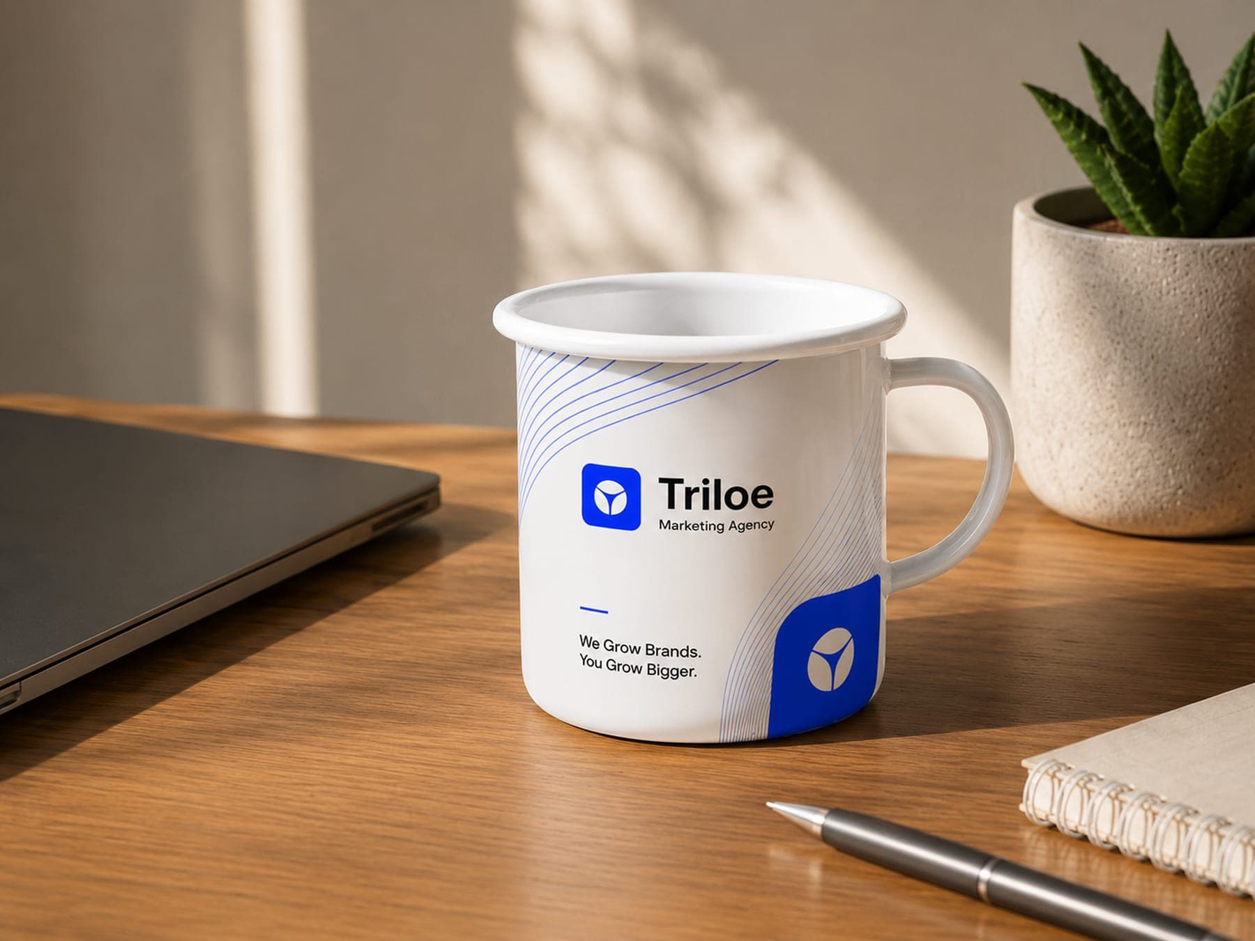
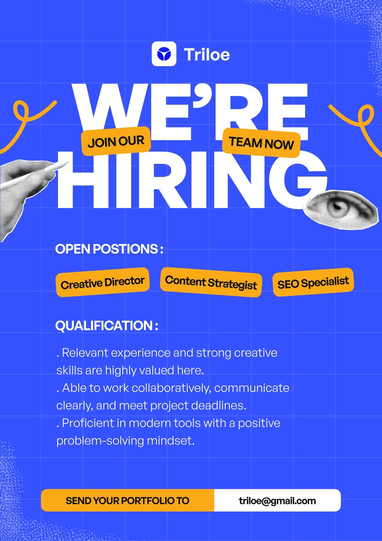
Business cards, a notebook, a bottle, a mug and a hiring flyer. The blue tile turns up on all of it.
A feed that teaches.
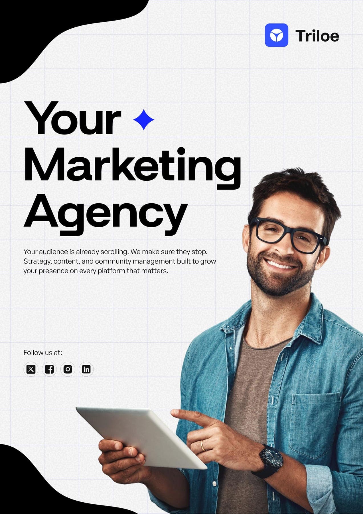
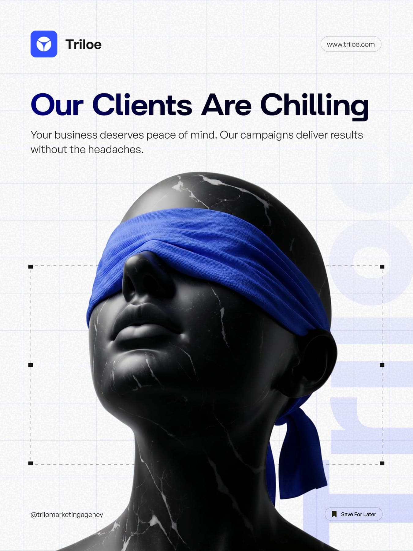
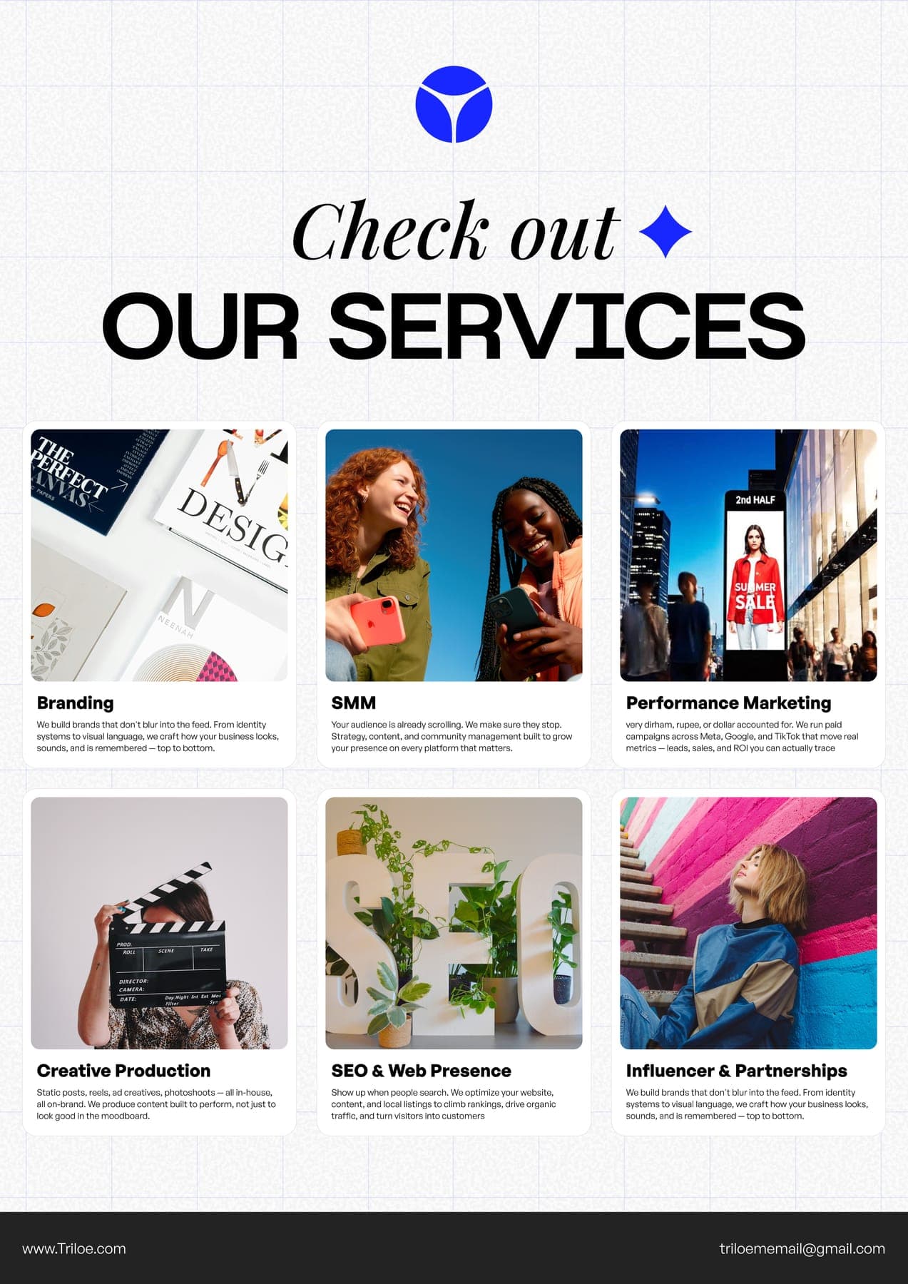
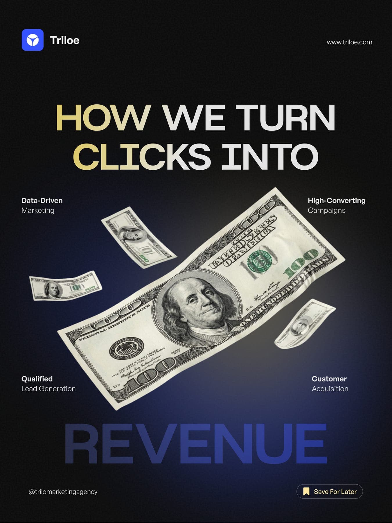
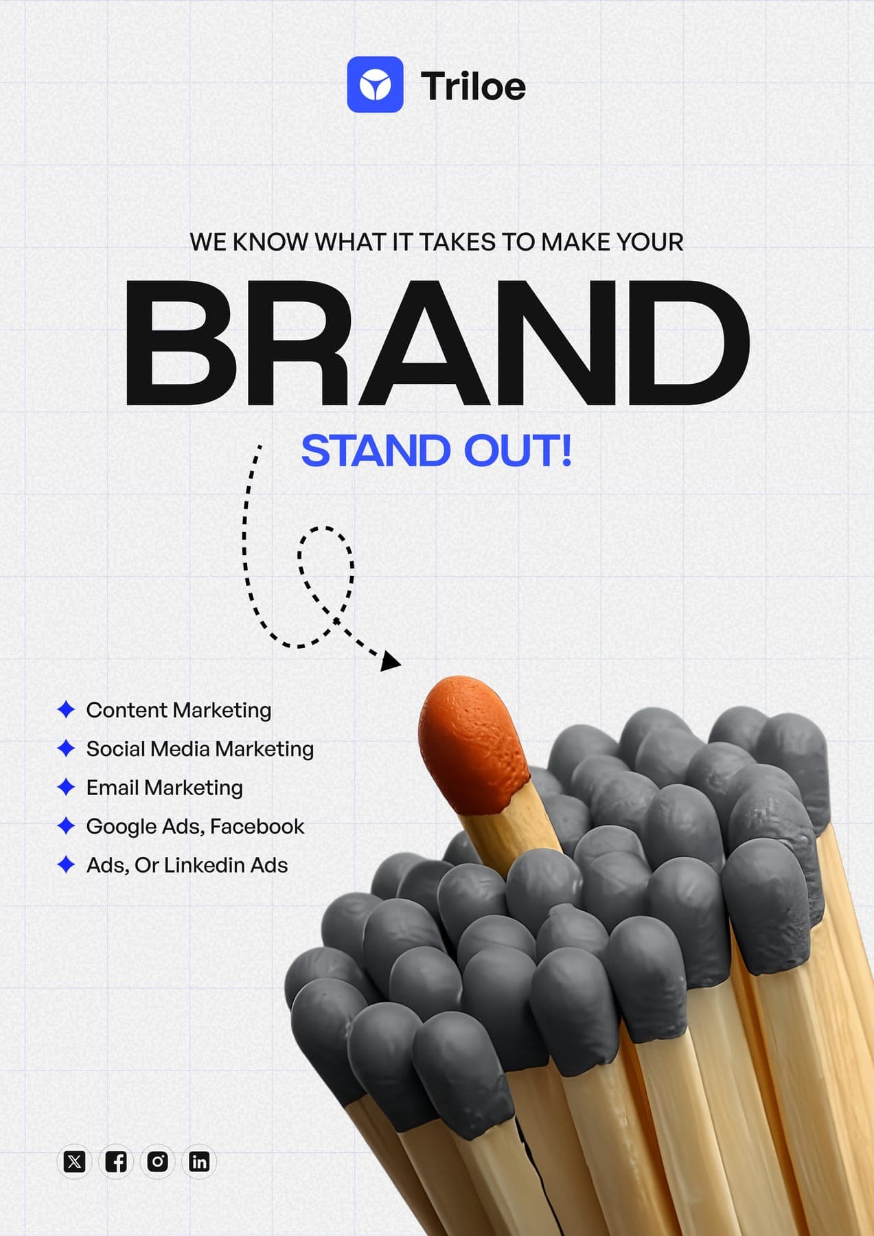
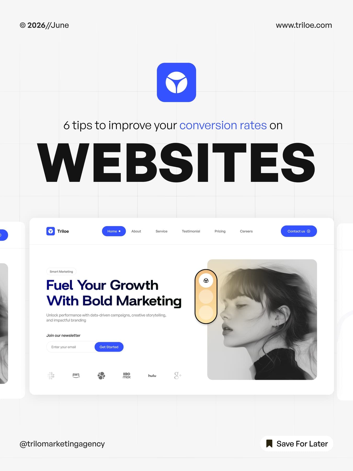
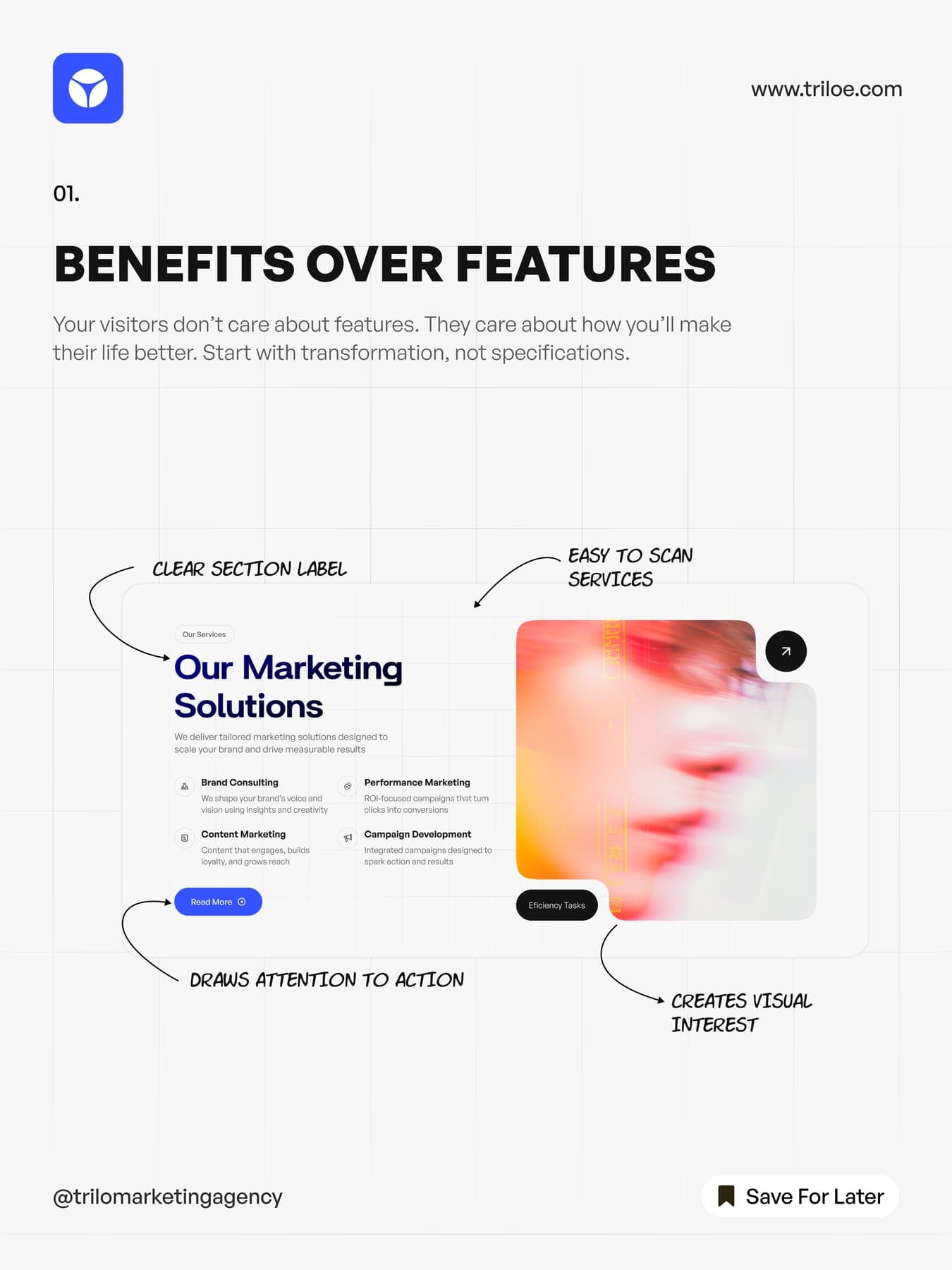
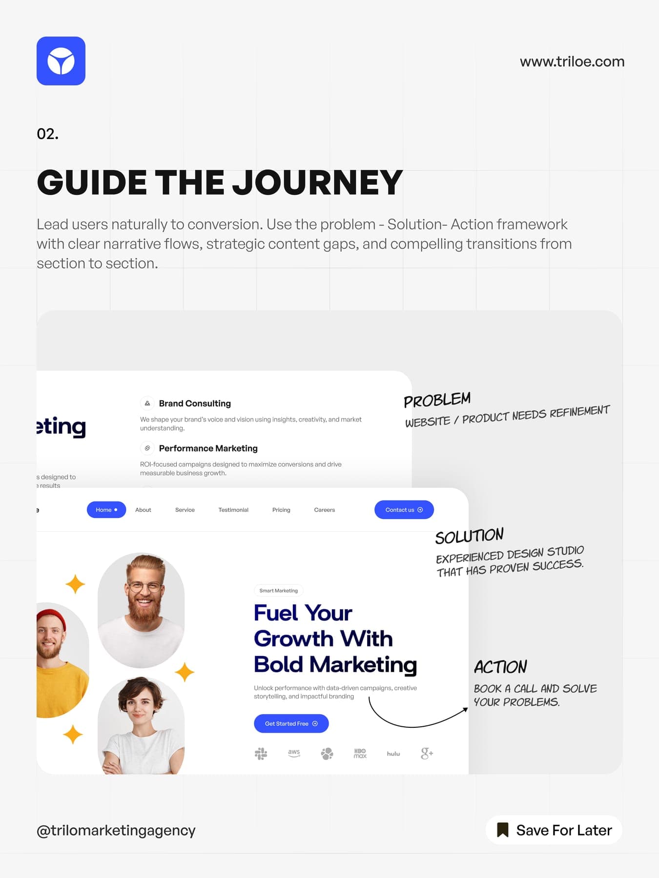
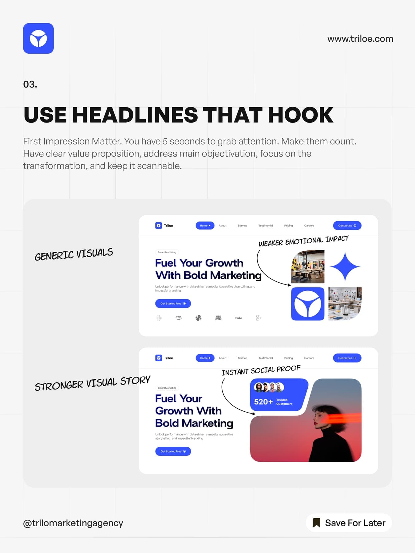
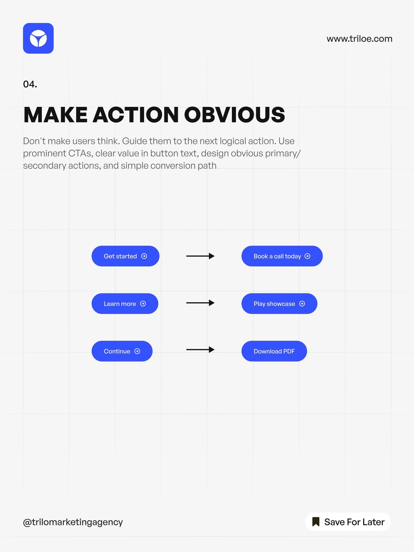
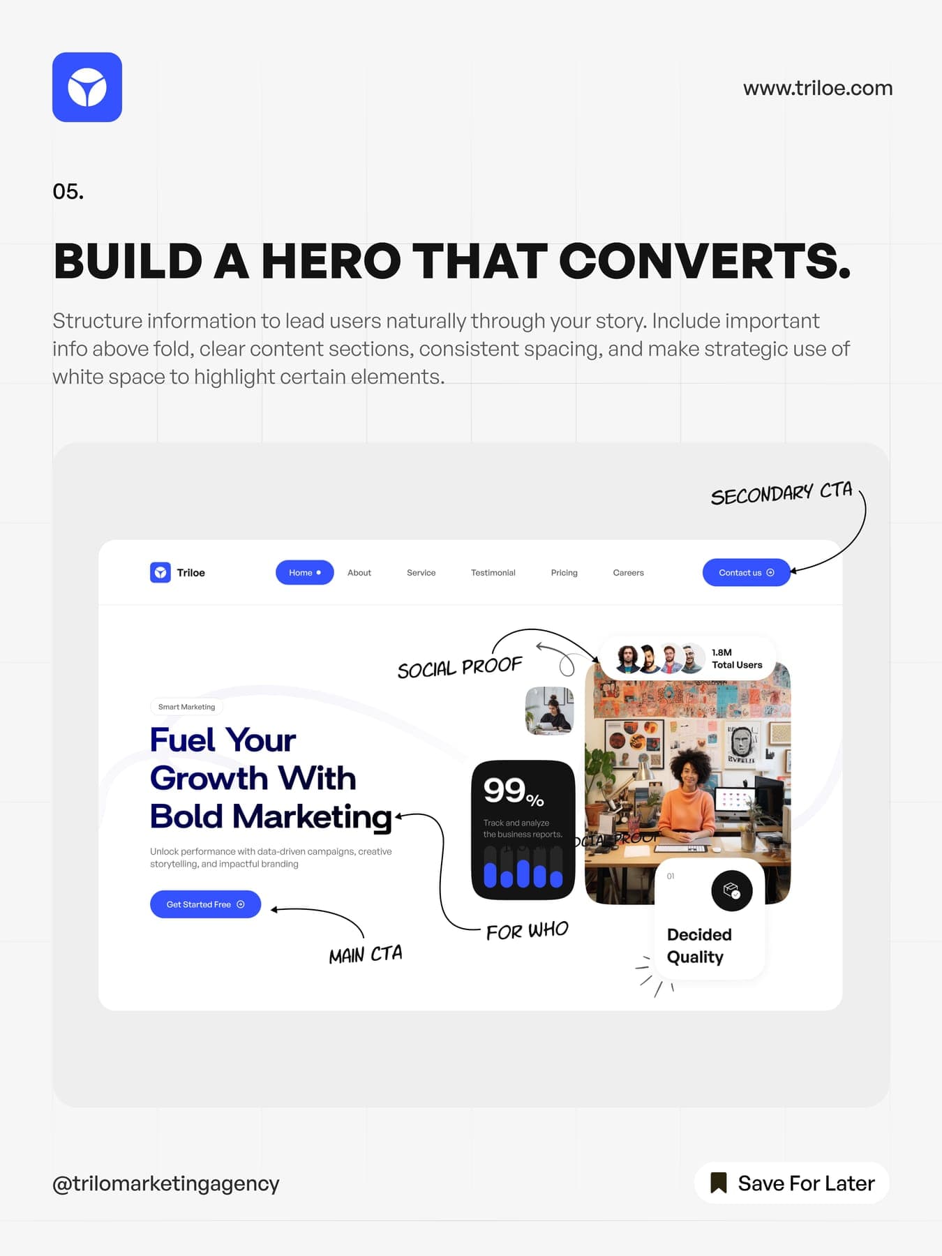
Five flyers and ten posts. The best of them is a carousel of tips on making websites convert, drawn right on top of Triloe's own pages.
the carousel
One tip per slide.
- slide
Benefits over features.
- slide
Guide the journey.
- slide
Use headlines that hook.
- slide
Make action obvious.
- slide
Build a hero that converts.

An agency brand that does the work.
0guideline pages
0web mockups
0page types
03D renders
0flyers
0social posts