

case study
Fintech
Evocard
A card company needed a brand you'd actually want in your wallet.
- Client
- Evocard
- Sector
- Fintech
- Year
- 2025
- Scope
- Brand, website
From one ring to a city billboard.
Money should feel less like paperwork.
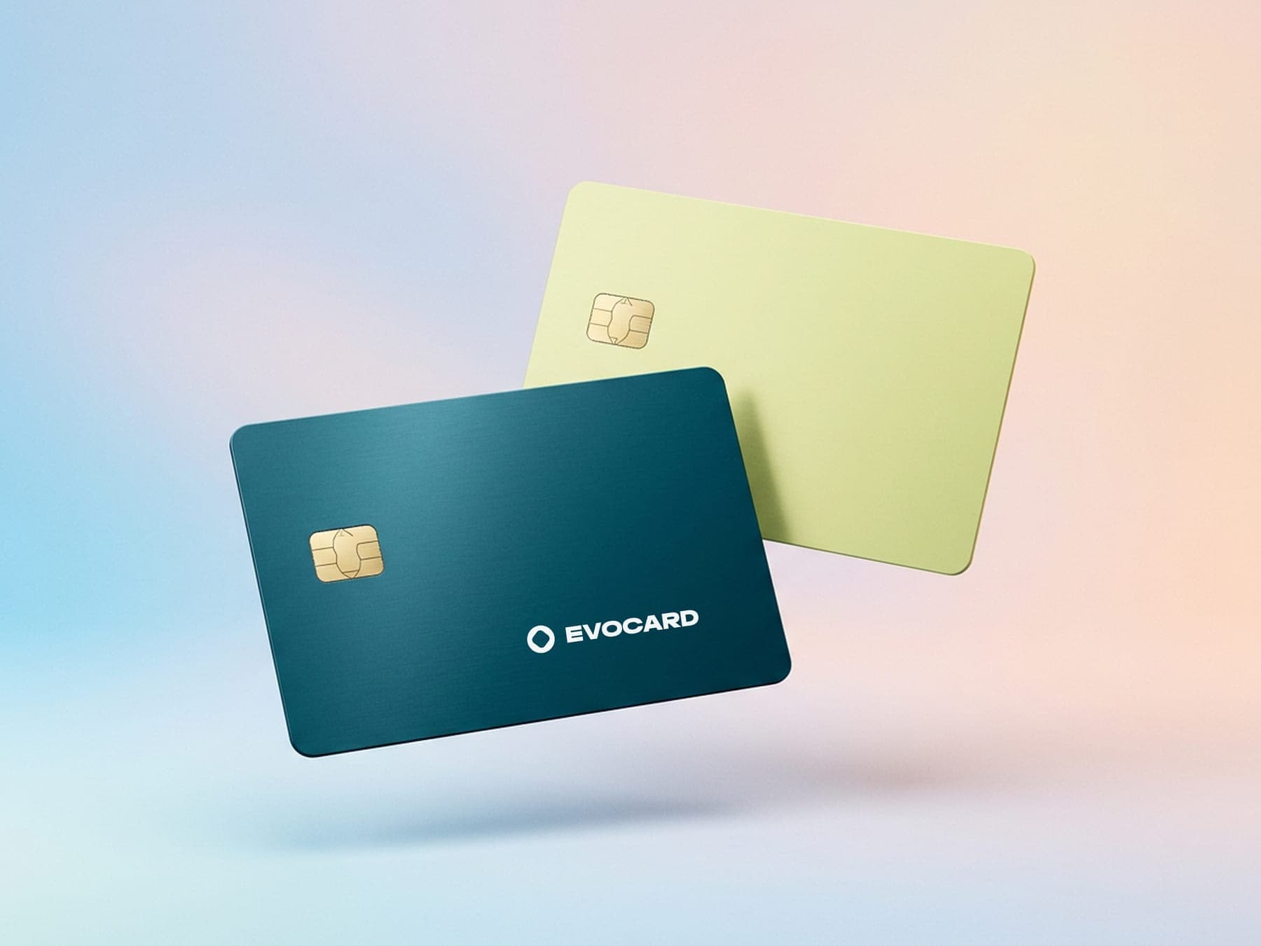
Evocard makes payment cards with security, interest-free financing and rewards built in. The brand had to make all of that feel easy to pick up.
Empowering your finance journey.
One ring, one soft gradient.
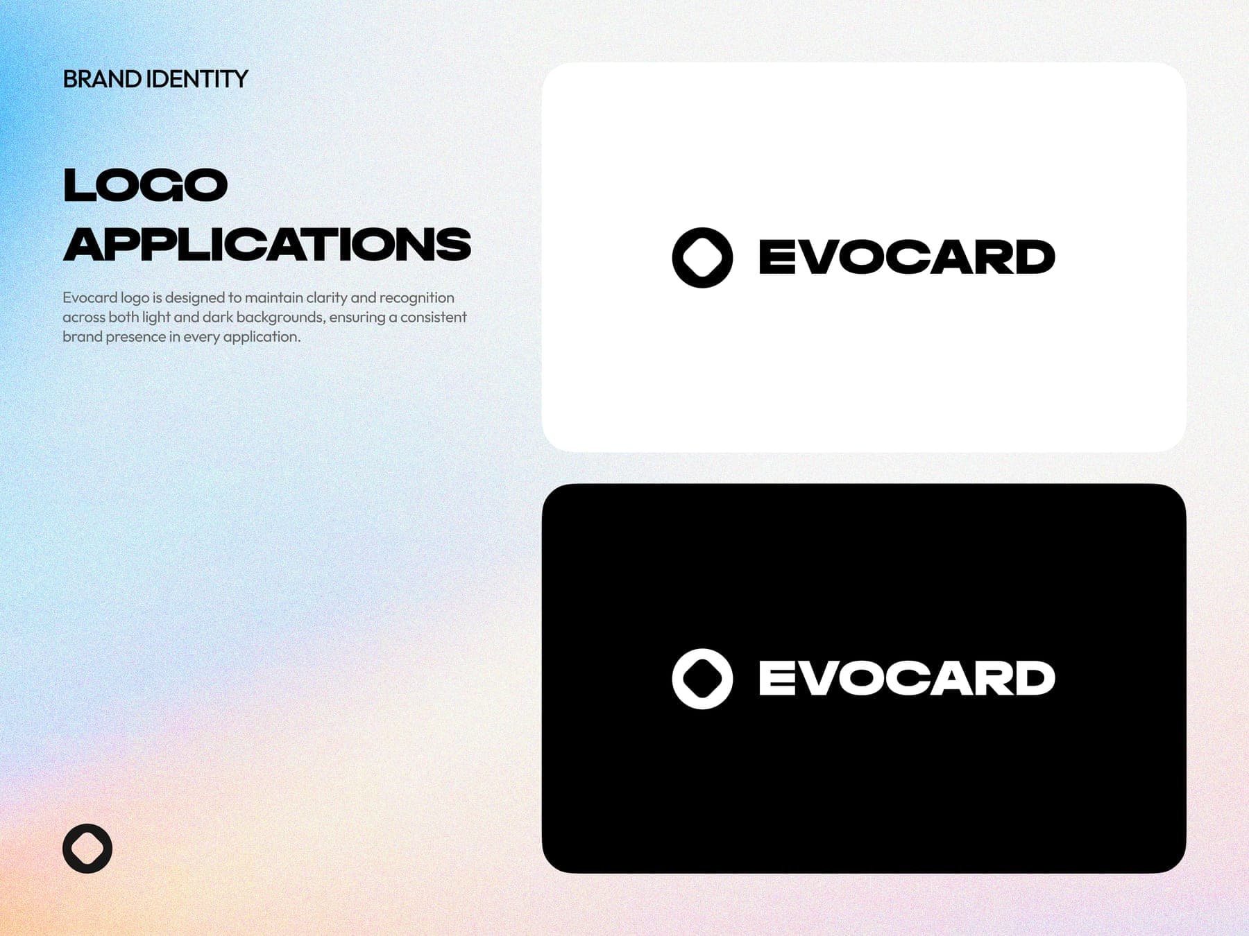
First, the identity. A heavy ring with a rounded square cut from the middle, deep teal and soft lime for the cards, and a grainy gradient behind everything.
the mark
- 01A circle on a two by two grid.
- 02Turn a rounded square onto its point.
- 03Cut it out of the middle. That's the ring.
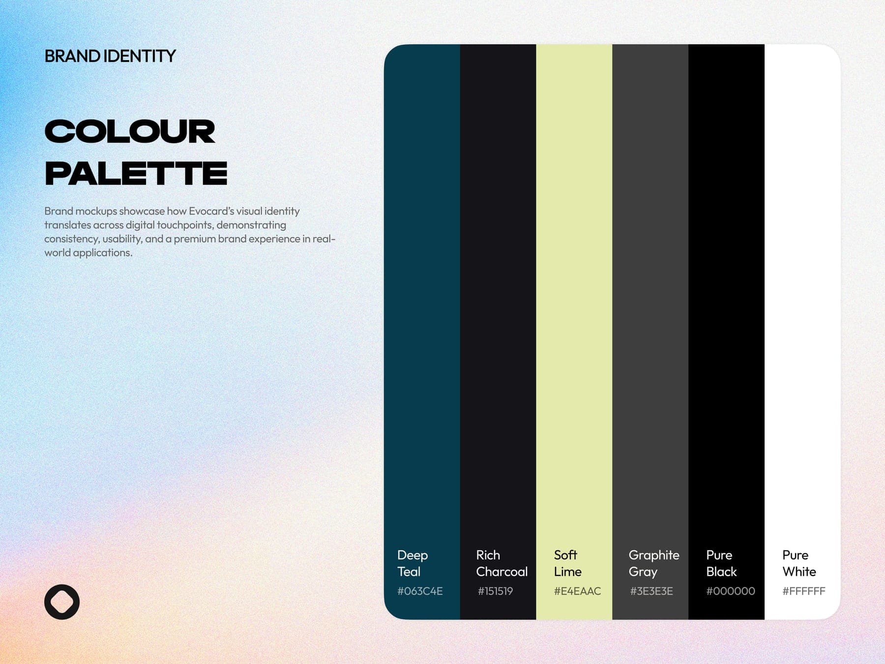
the colour
Teal and lime, like the cards.
Hover to open a colour, click to copy it.
Get the app.
the brand book
Eight pages, all on the same grainy gradient.
One hero, on every screen.
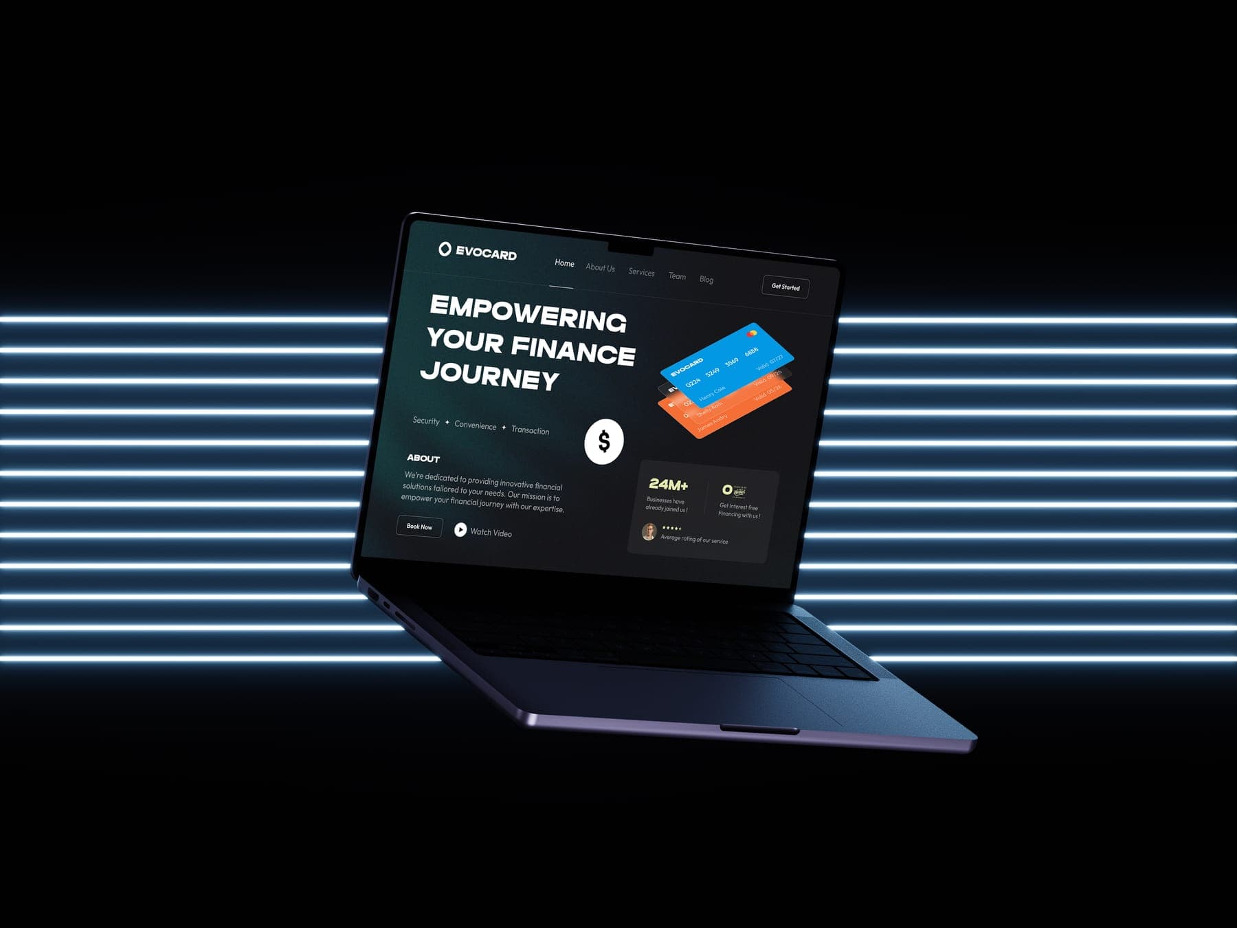
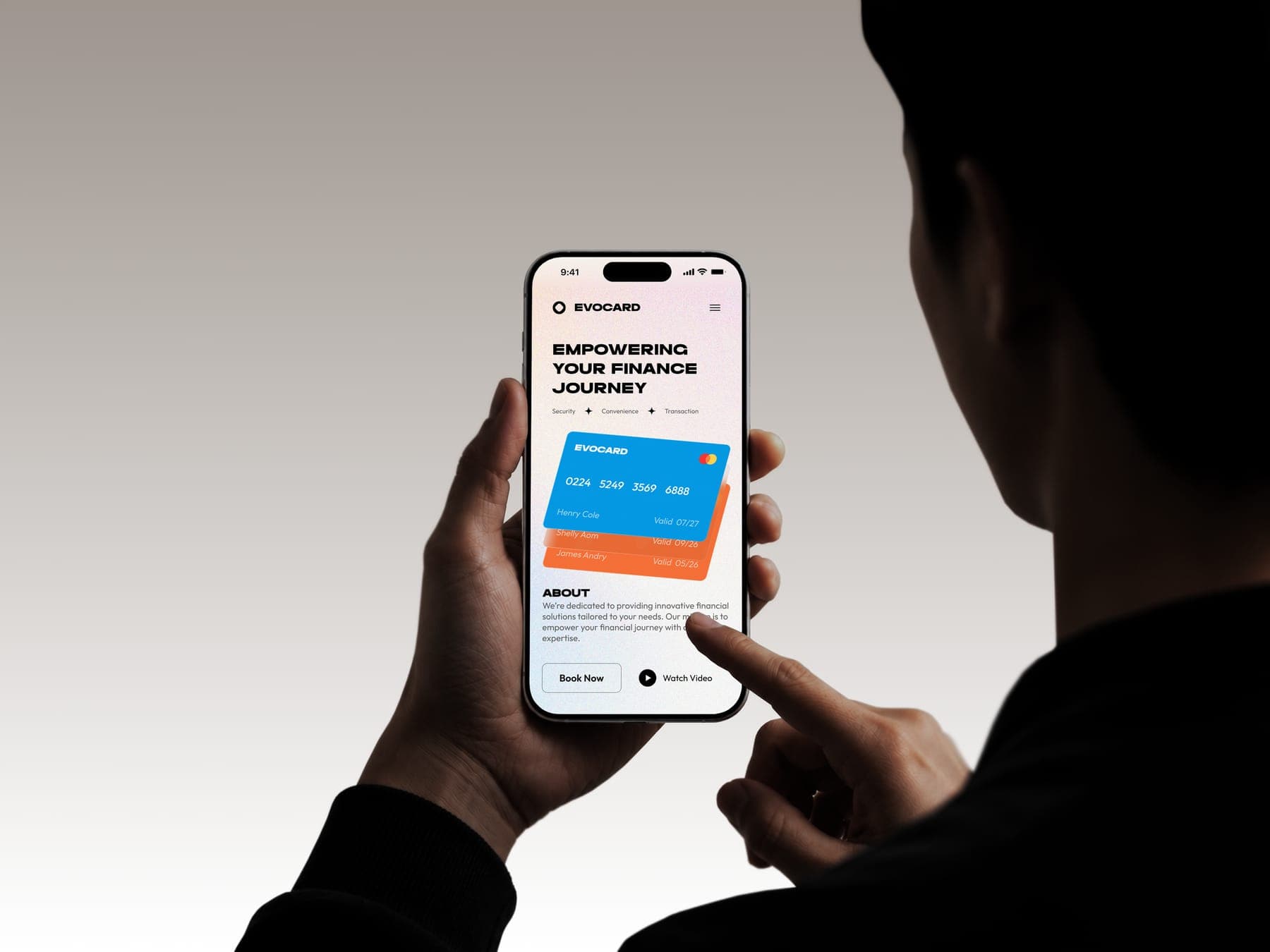
Then the site, on desktop, tablet and phone, in light and dark. The two cards float in the same spot on all of them.
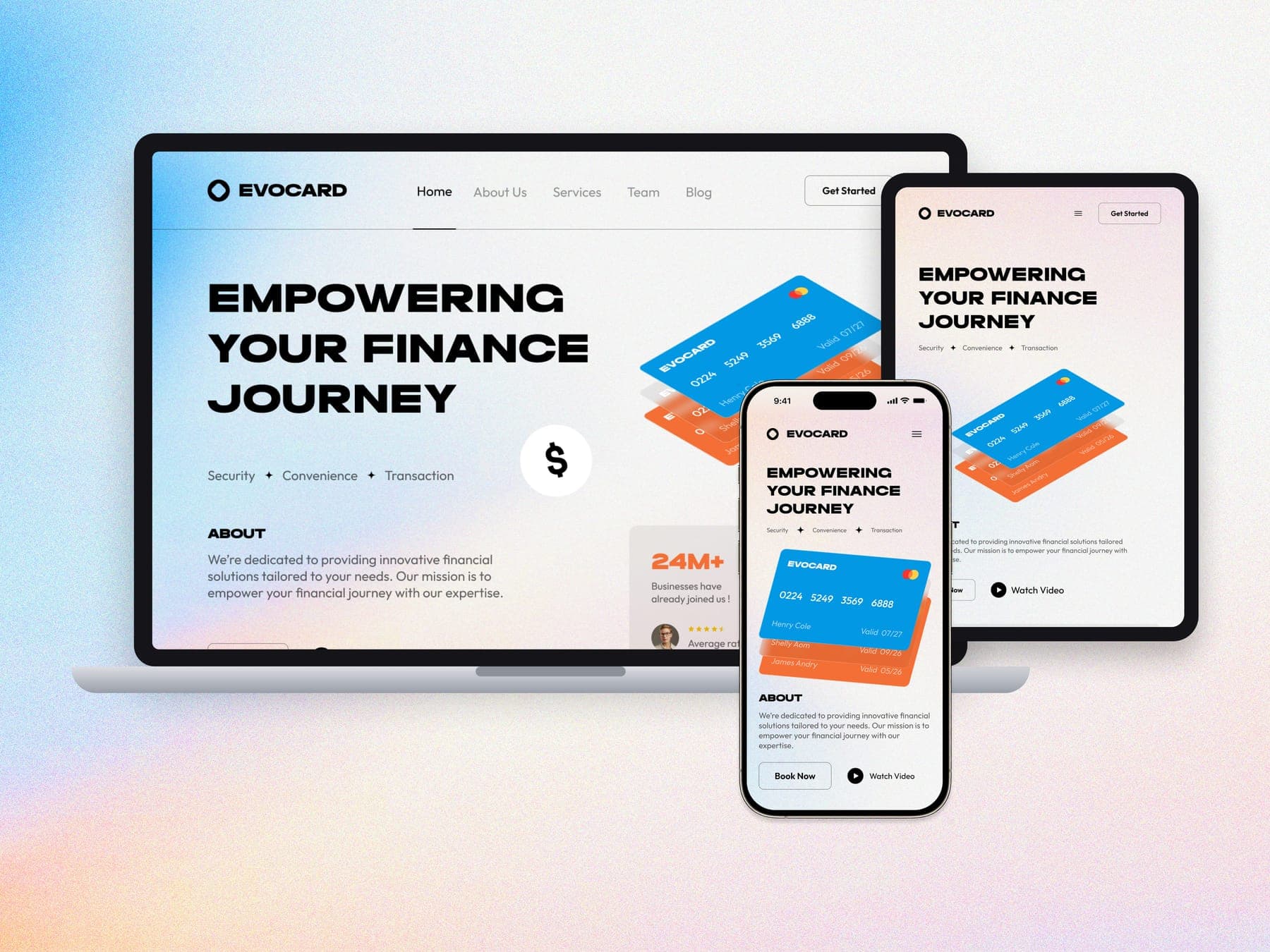
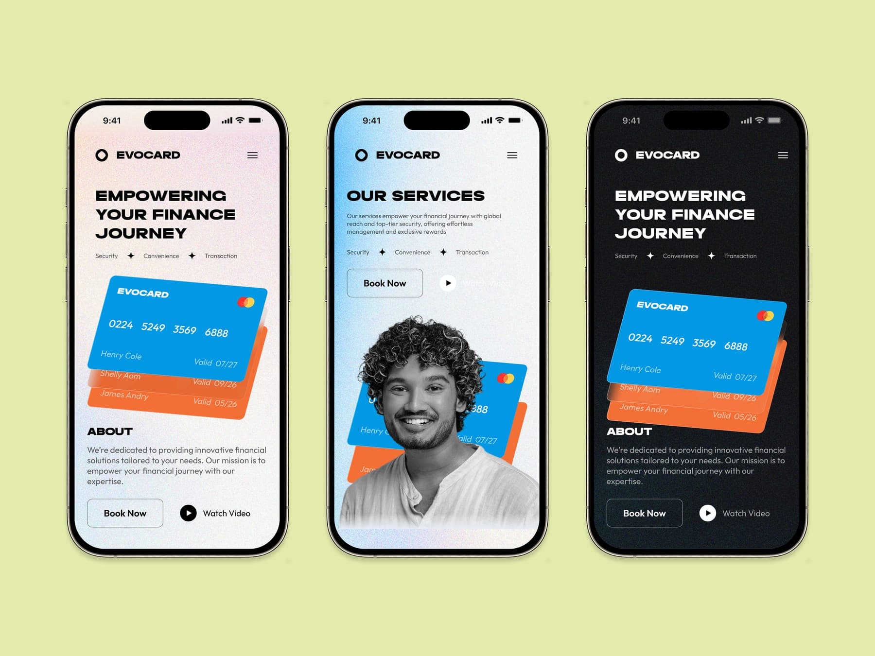
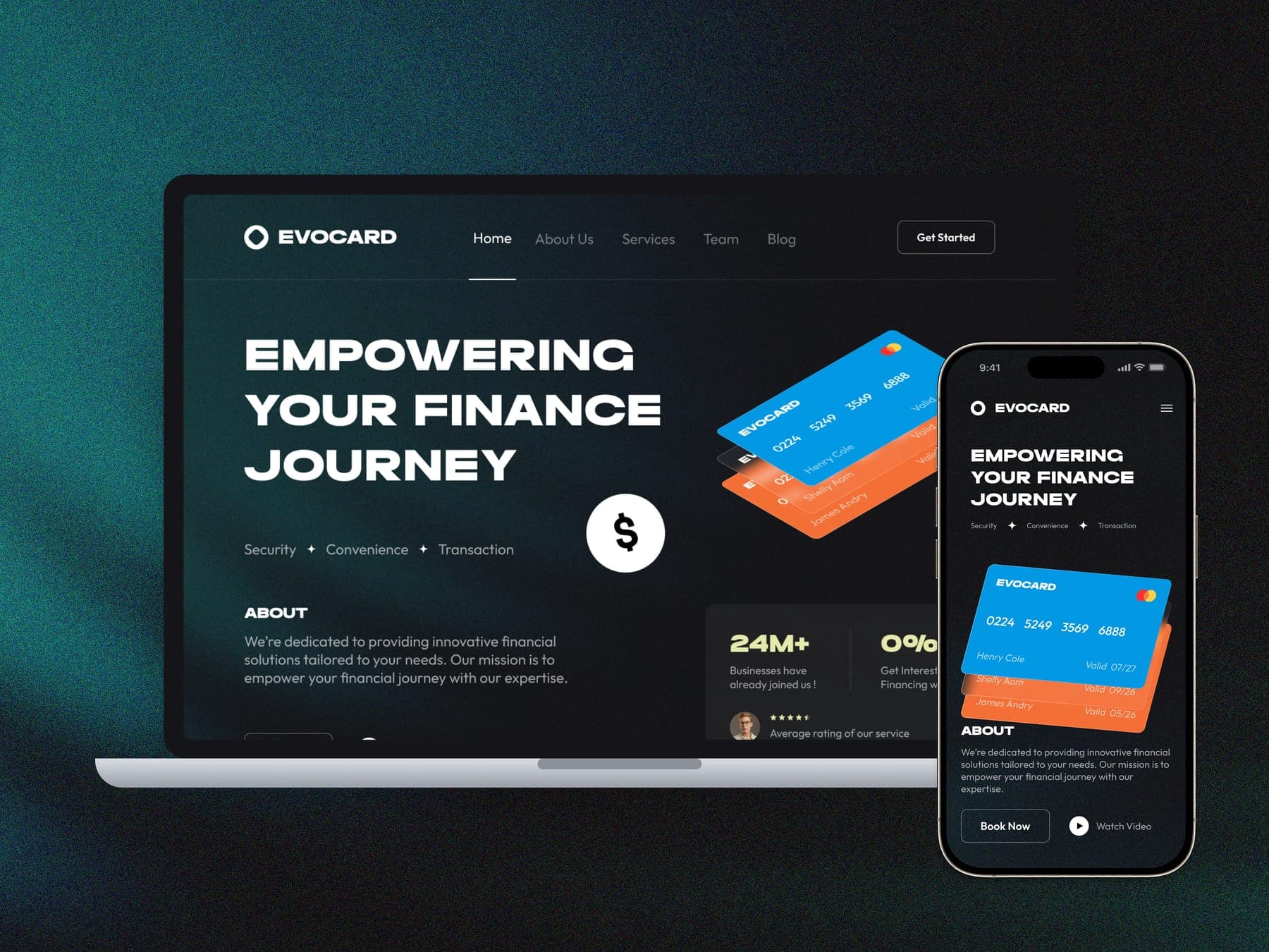
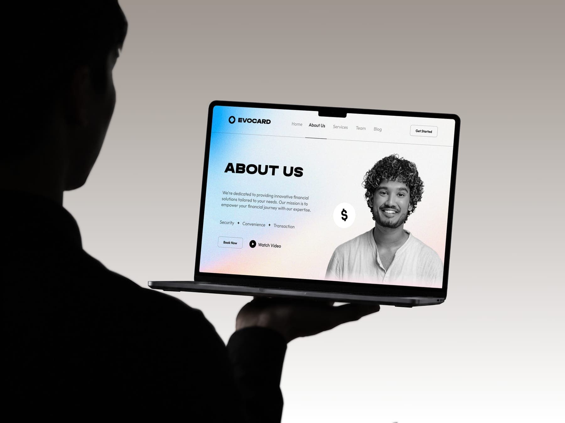
- 01 Home
- 02 About Us
- 03 Our Services
3 page types, light and dark, desktop to phone
Then it got a little merch.
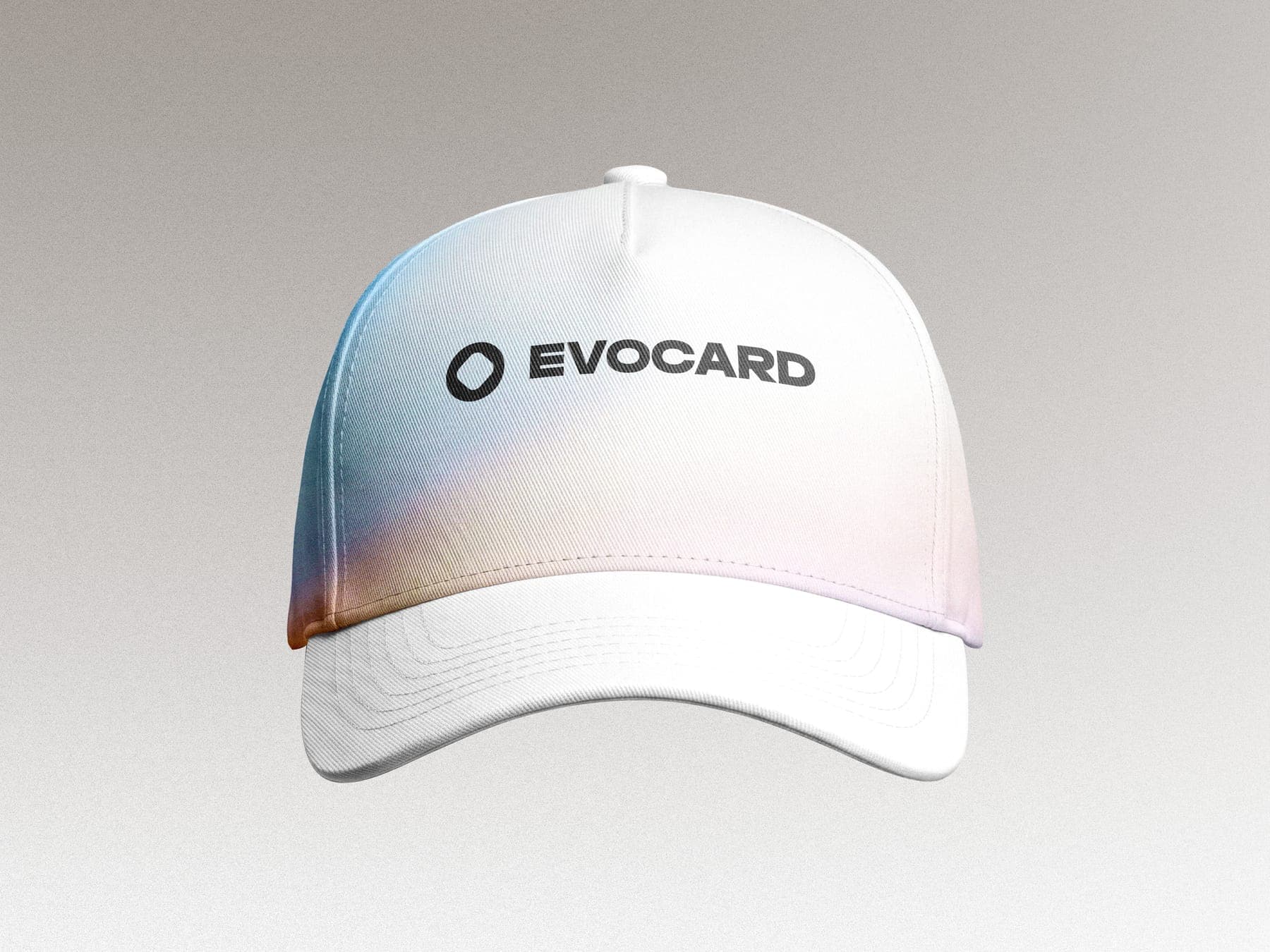
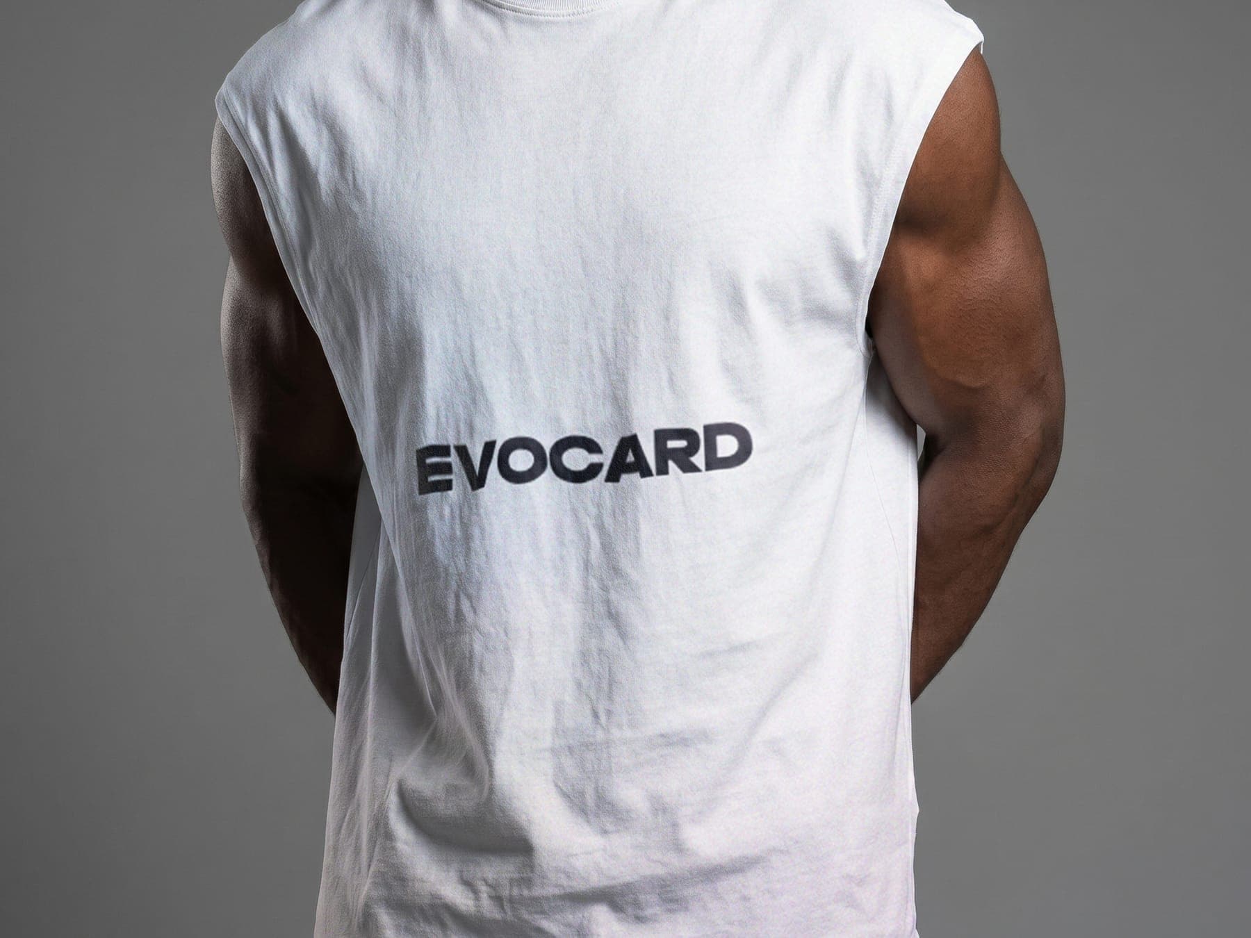
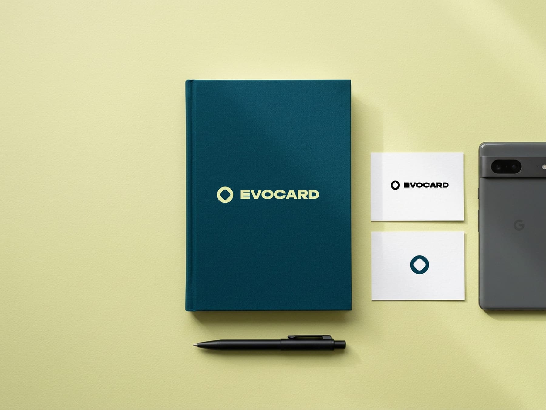
The cards themselves, a cap, a tee and a notebook. The gradient comes along everywhere.
Out on the street.
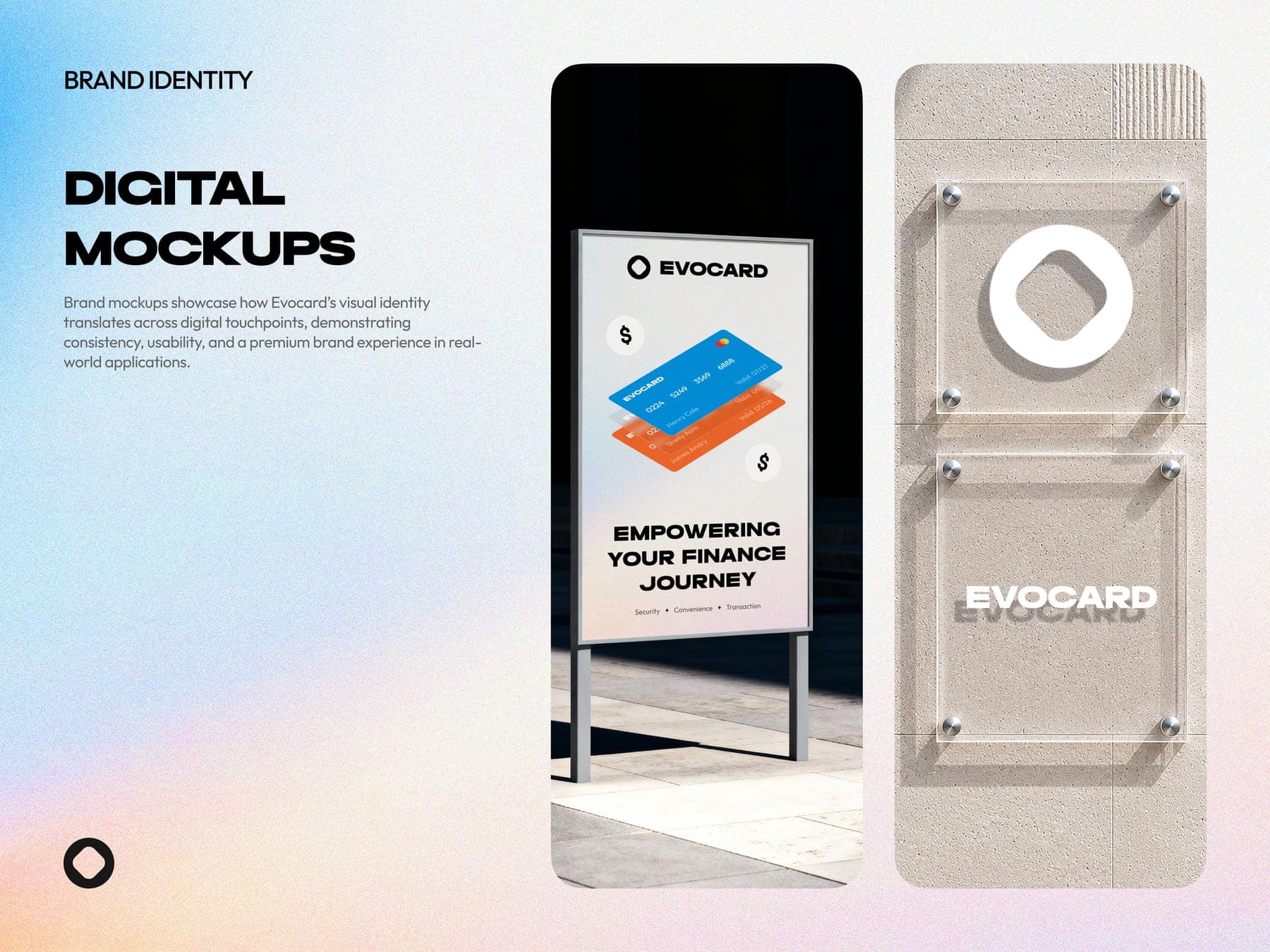
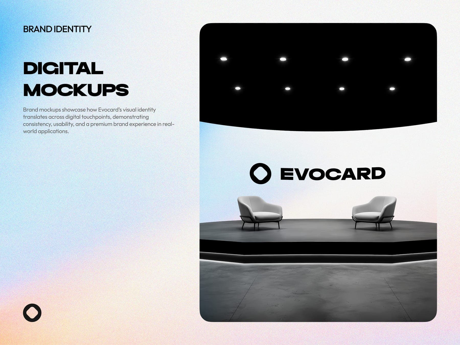
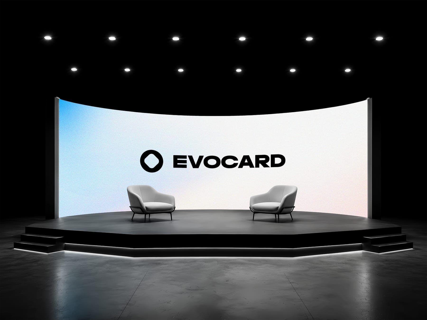
No flyers or posts this time. A billboard, a glass wall sign, a poster stand and a stage did the talking.

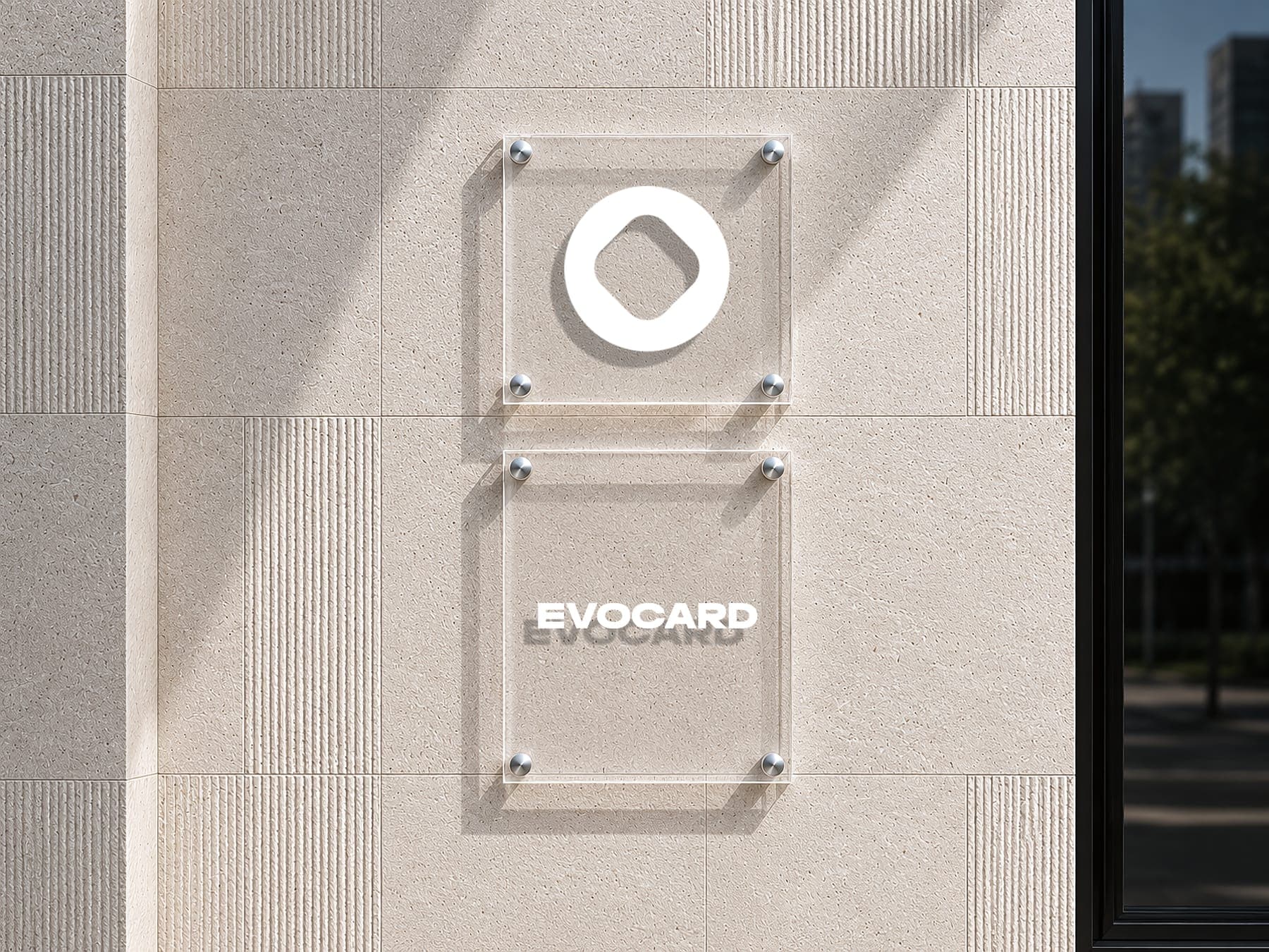
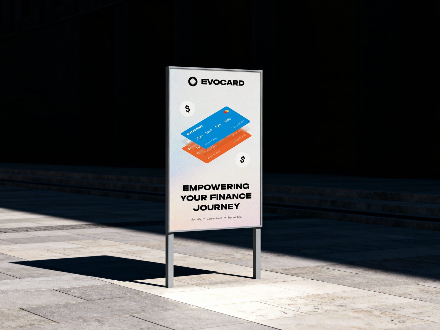
One ring, on every surface.
0guideline pages
0colours
0typefaces
0web mockups
0page types
03D renders