

case study
Residential construction
Kingsway Builders
A home builder needed a brand as solid as the homes it builds.
- Client
- Kingsway Builders
- Sector
- Residential construction
- Year
- 2025
- Scope
- Brand, site branding, campaign
From one arrow to a whole job site.
It starts with an empty lot.
Kingsway Builders designs, permits and builds custom homes and rental buildings across Calgary and Edmonton. From bare land to keys in the door.
One vision. Built for Alberta.
An arrow that means business.
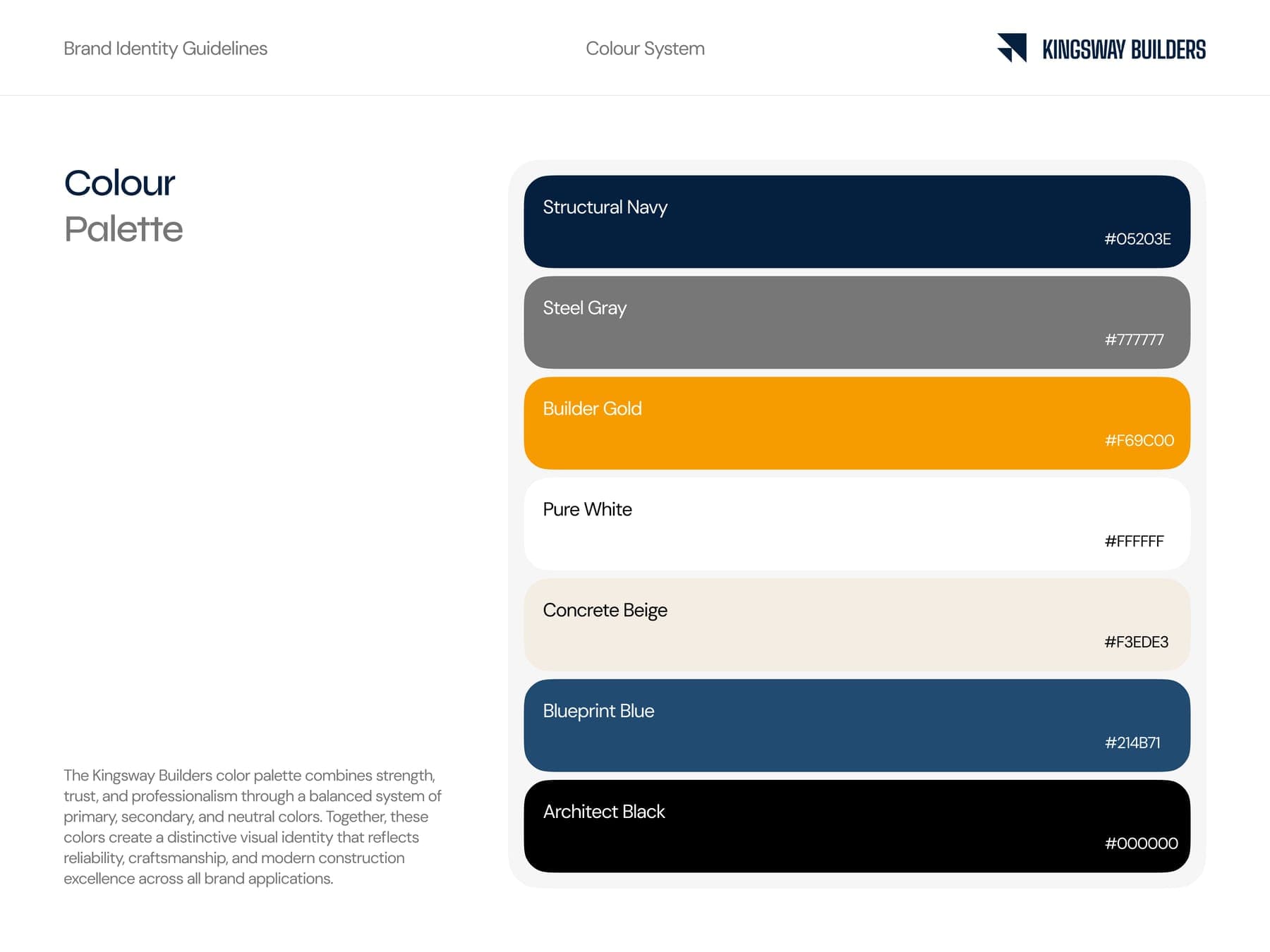
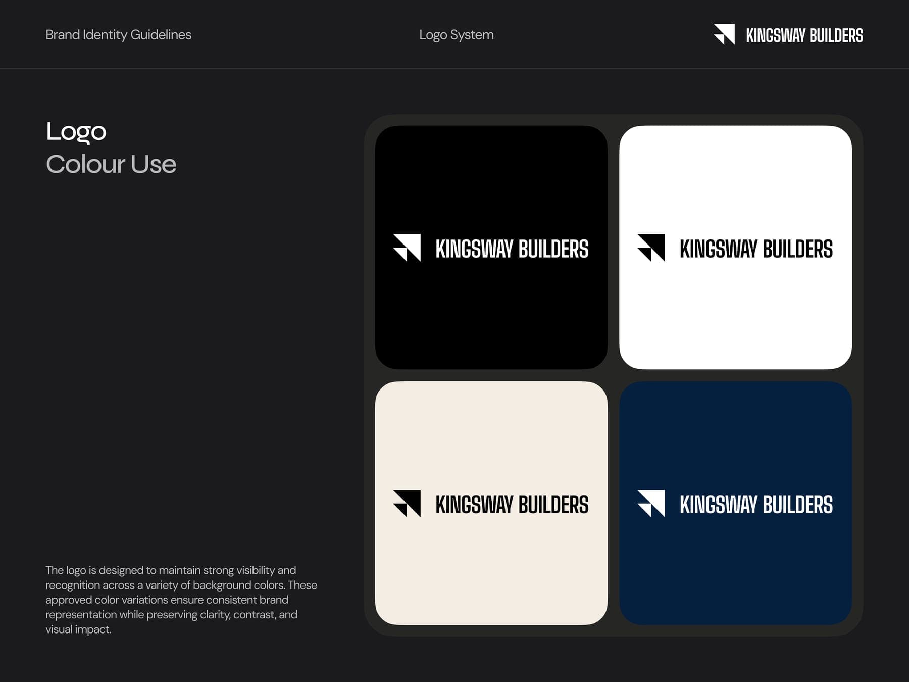
The guidelines came first. Two hard-edged triangles make an arrow for direction and momentum, and every colour got a builder's name.
the mark
- 01A two by two grid.
- 02Cut the square on its diagonal.
- 03Add one more half below it. Now it points forward.
the colour
Named like a materials list.
Hover to open a colour, click to copy it.
Built To Last.
Custom homes across Calgary and Edmonton.
the brand book
Ten pages, written for a job site.
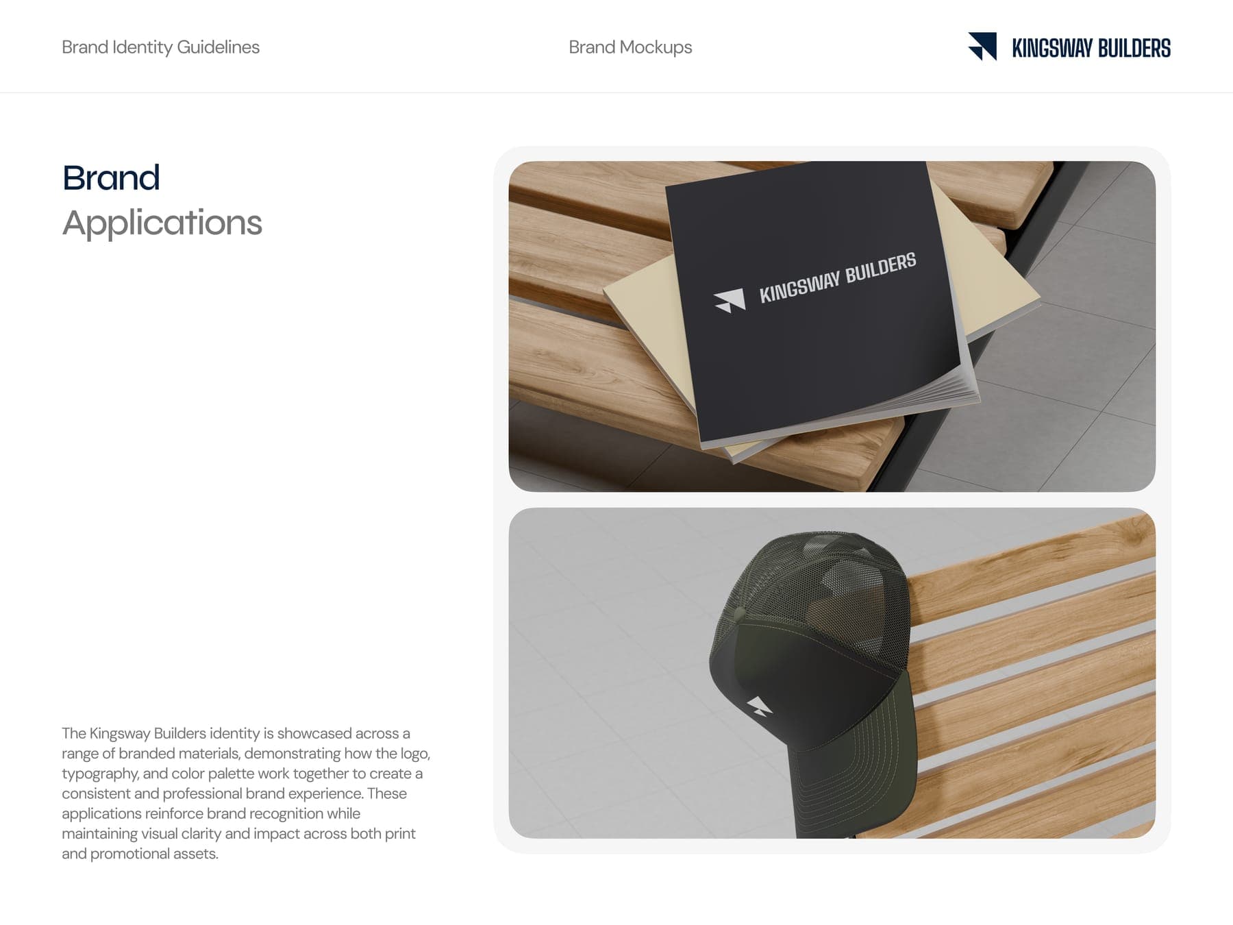
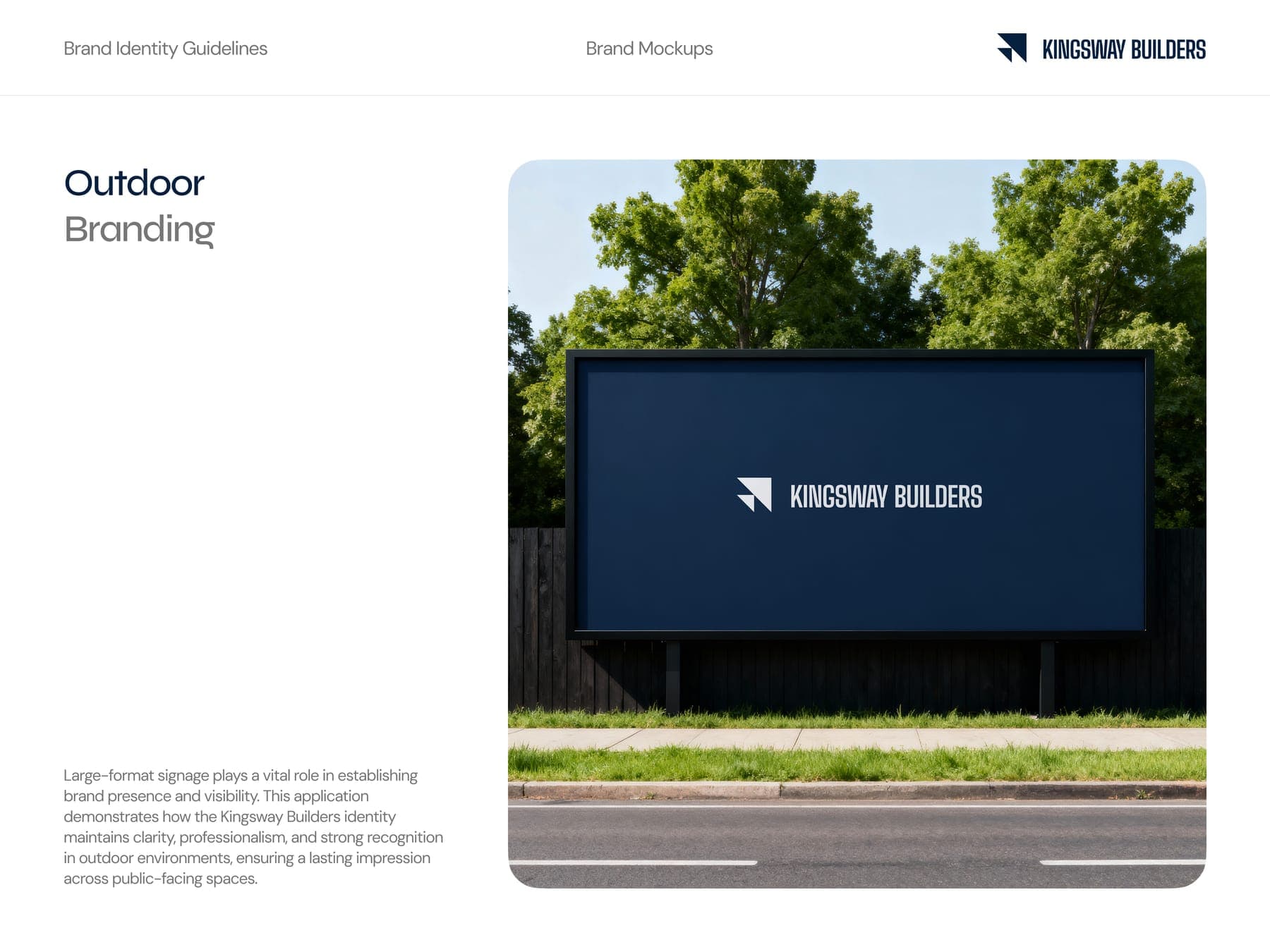
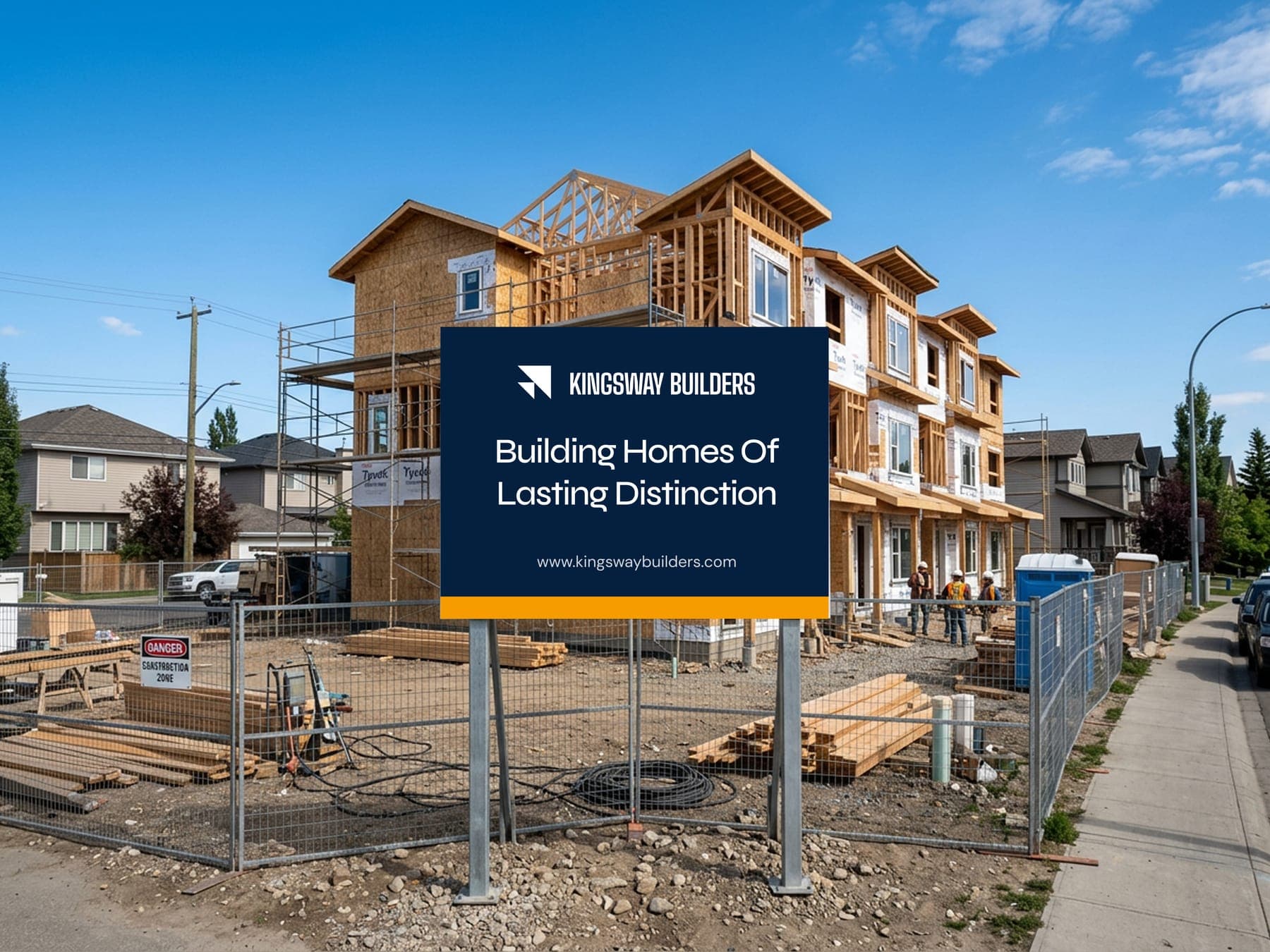
Built for the job site.
There's no website in this one. The brand lives where the work happens: the site sign, the fence, the truck, the billboard down the road.
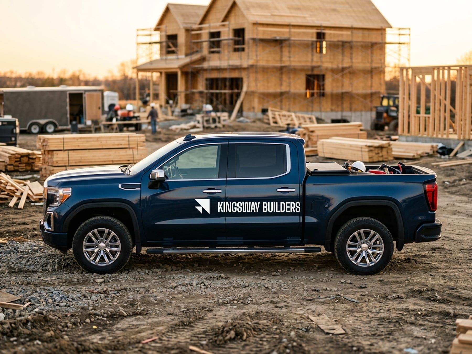
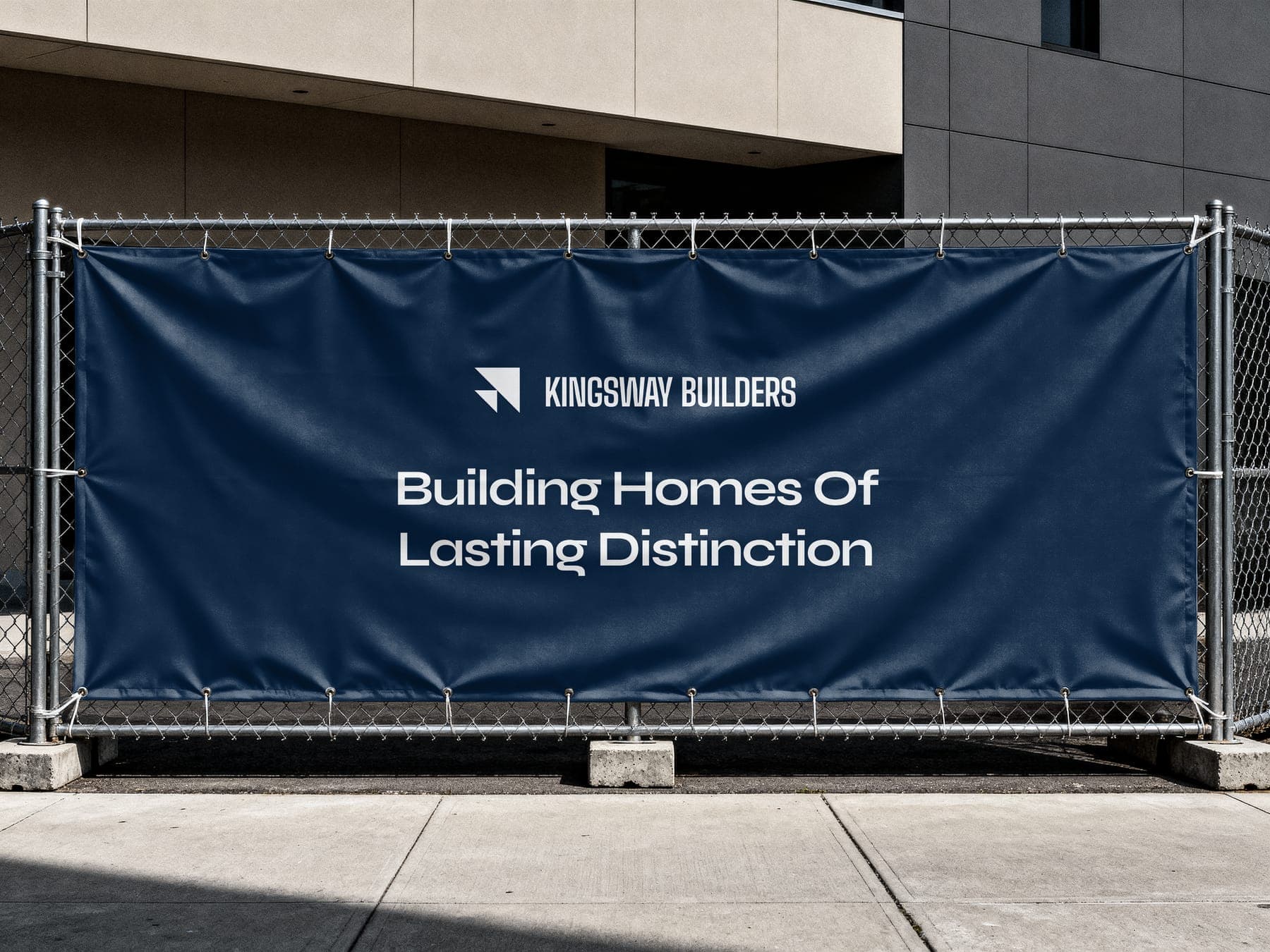
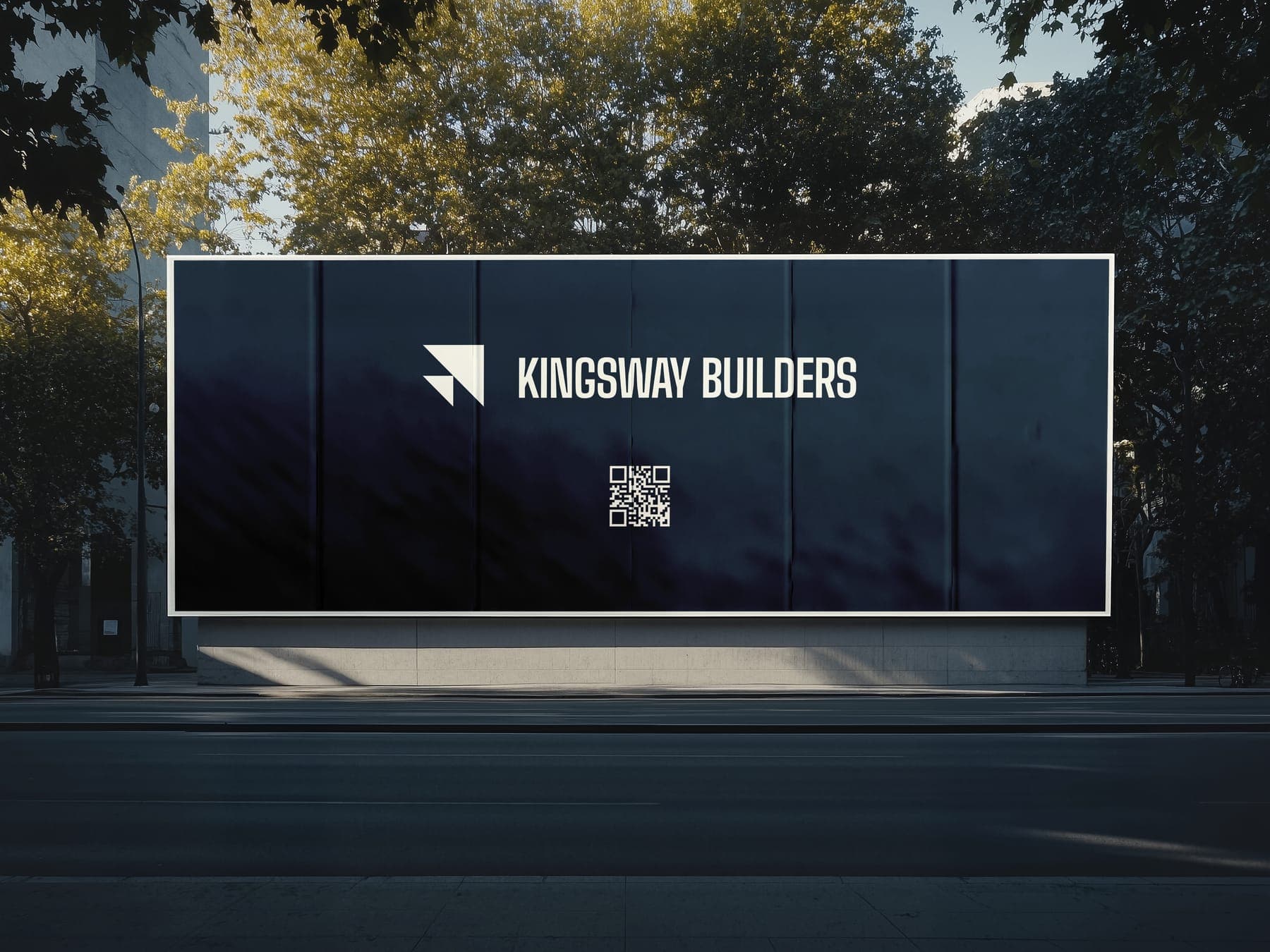
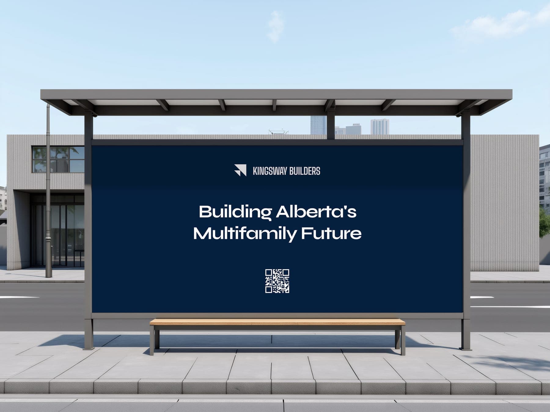
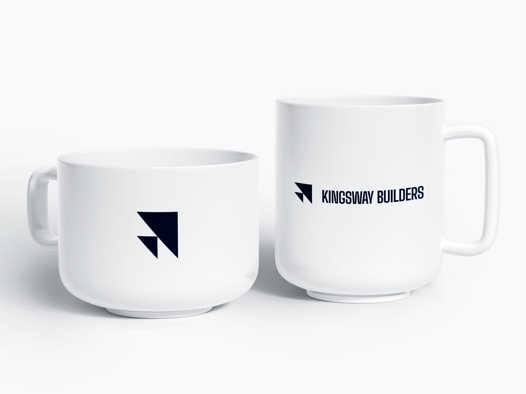
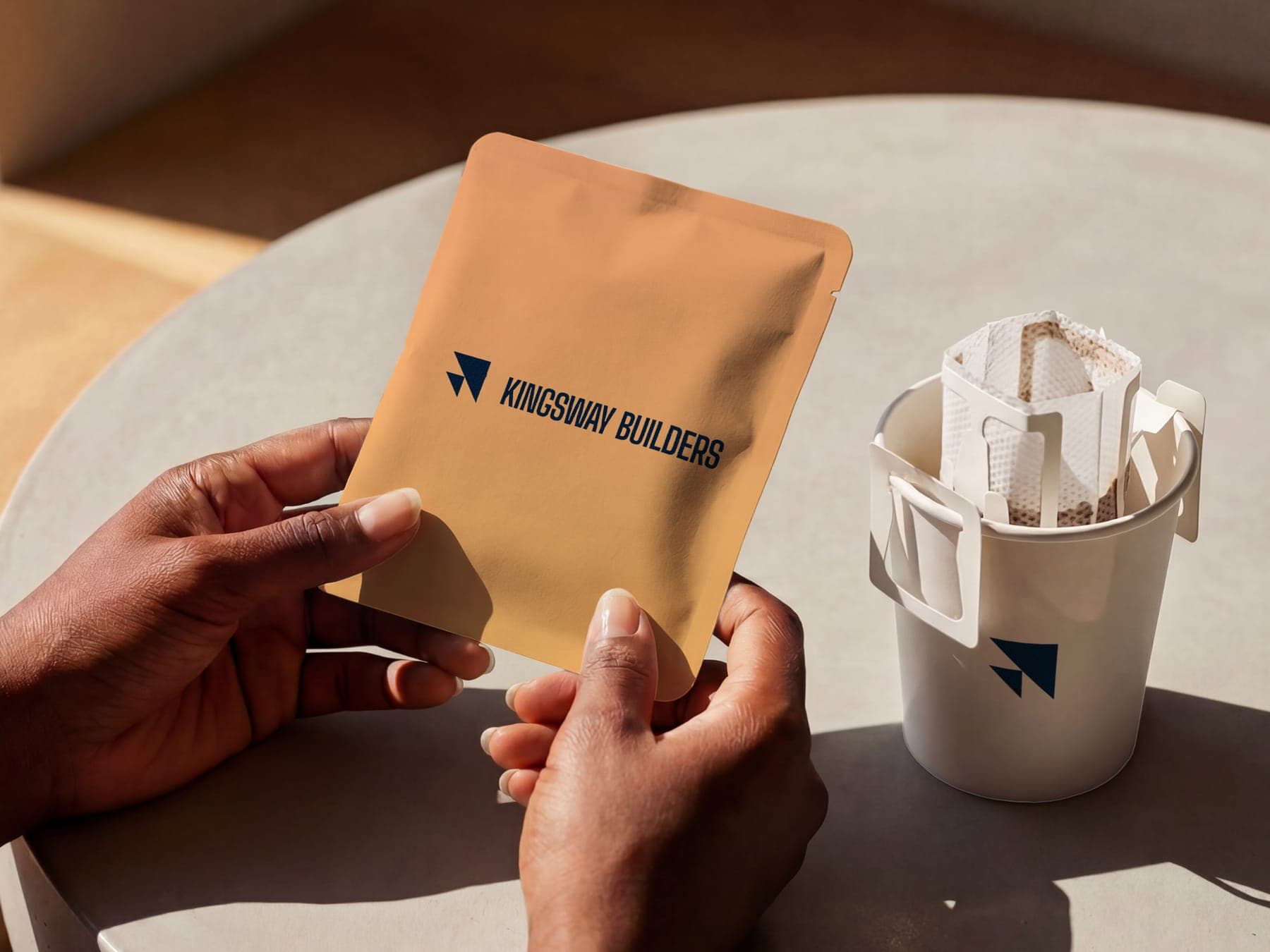
Down to the coffee mug.
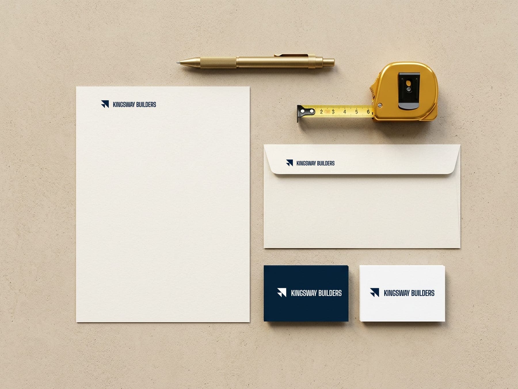
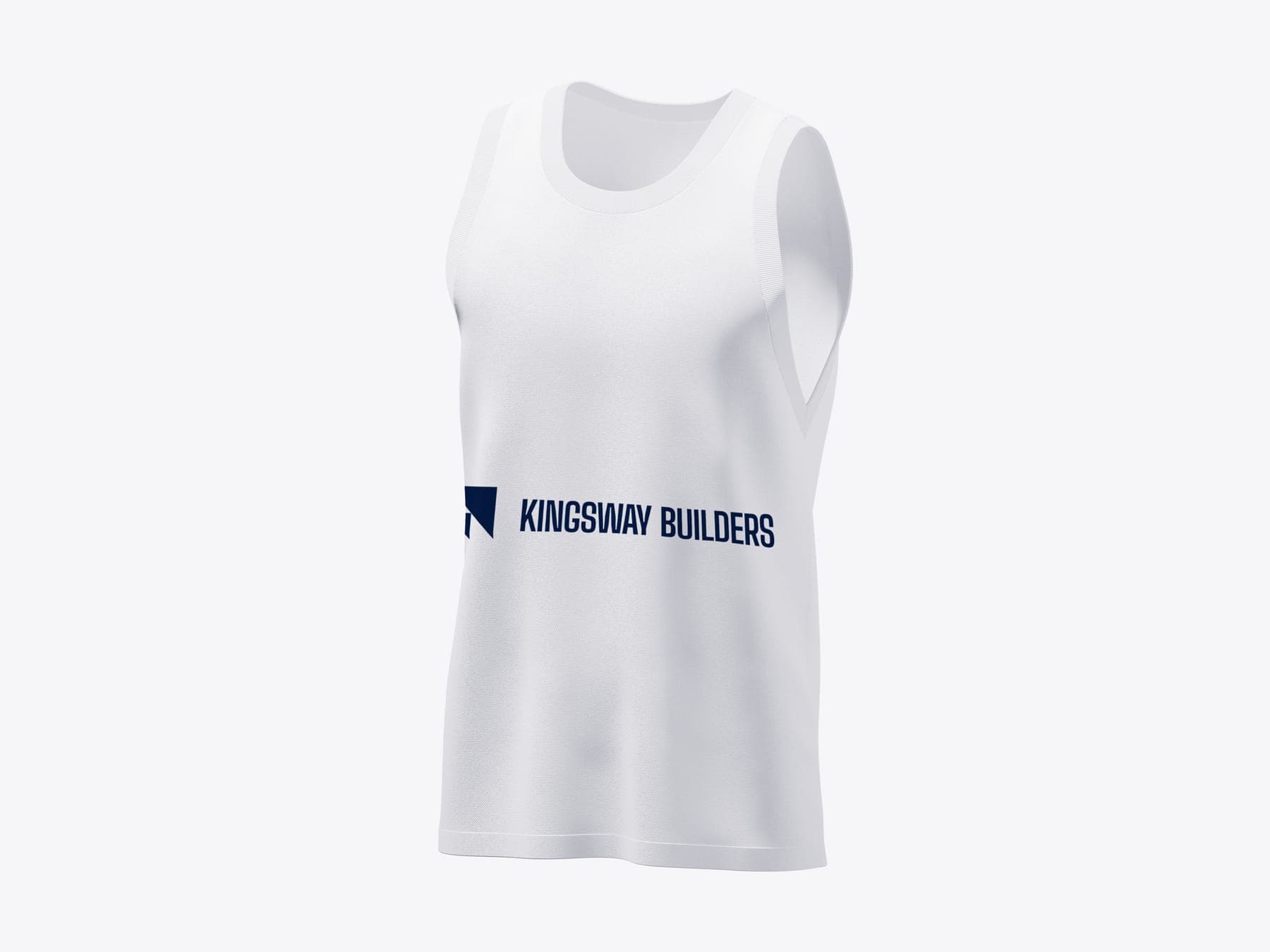
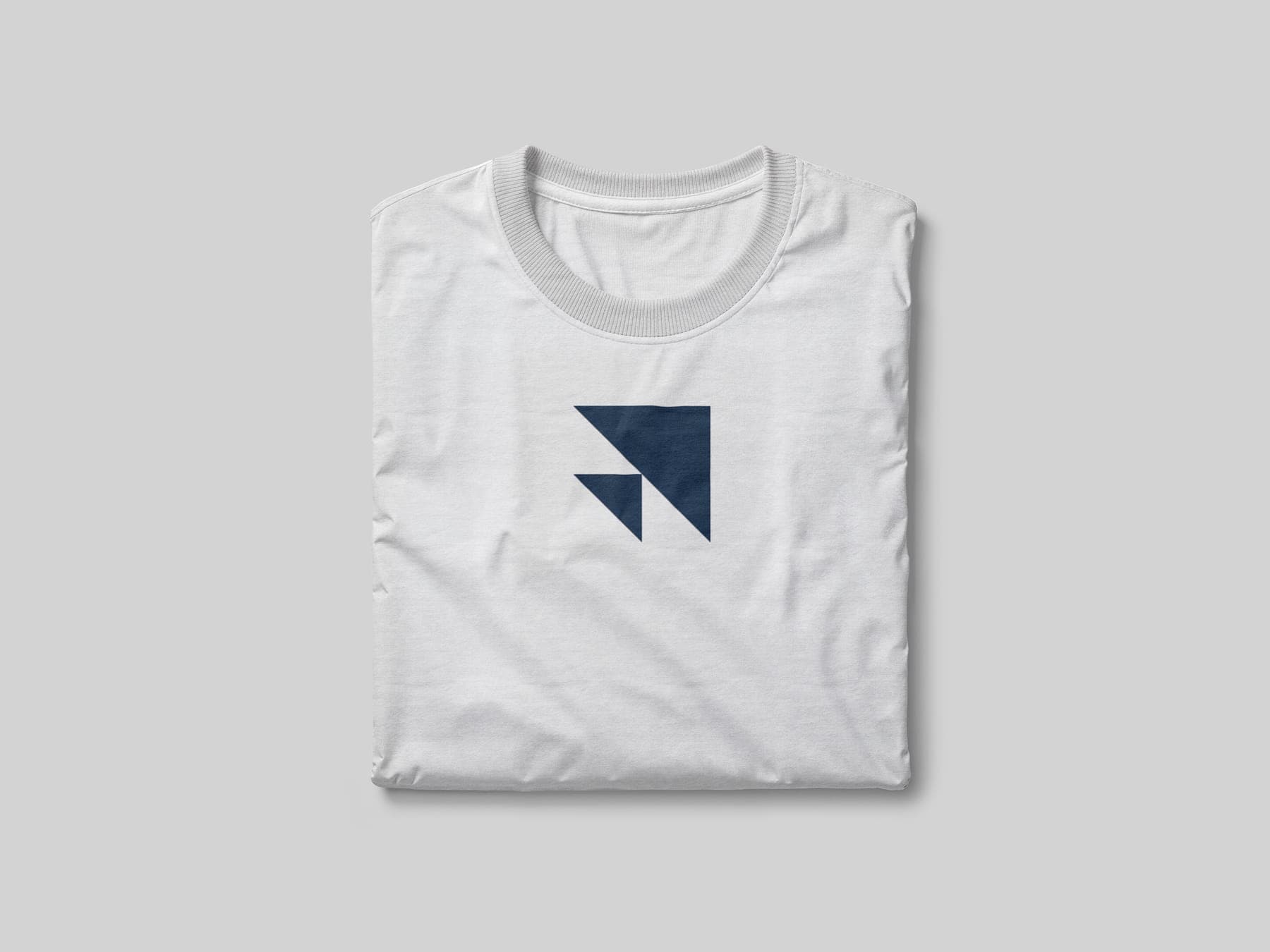
A hard hat, stationery, mugs, coffee and tees. If the crew touches it, it carries the arrow.
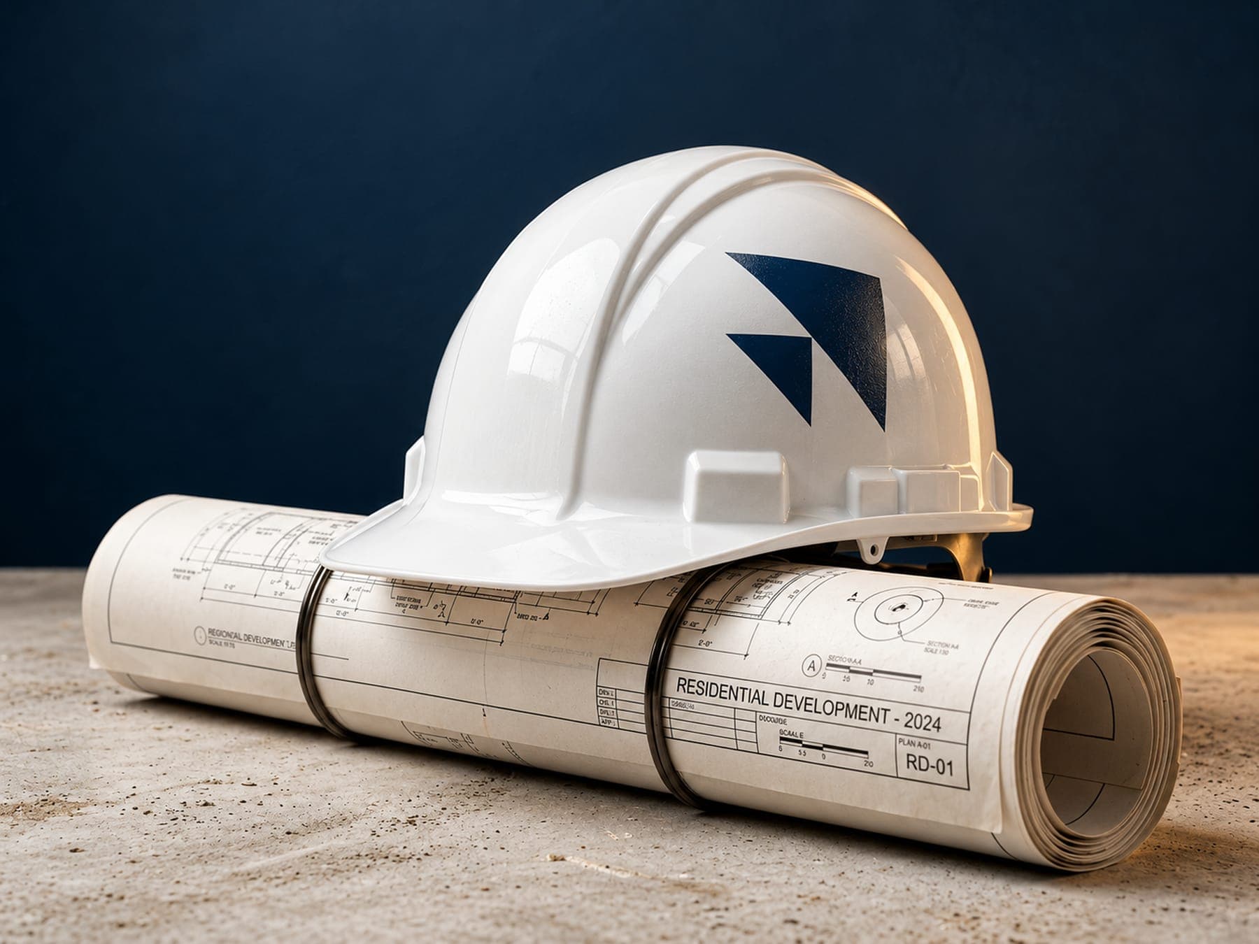
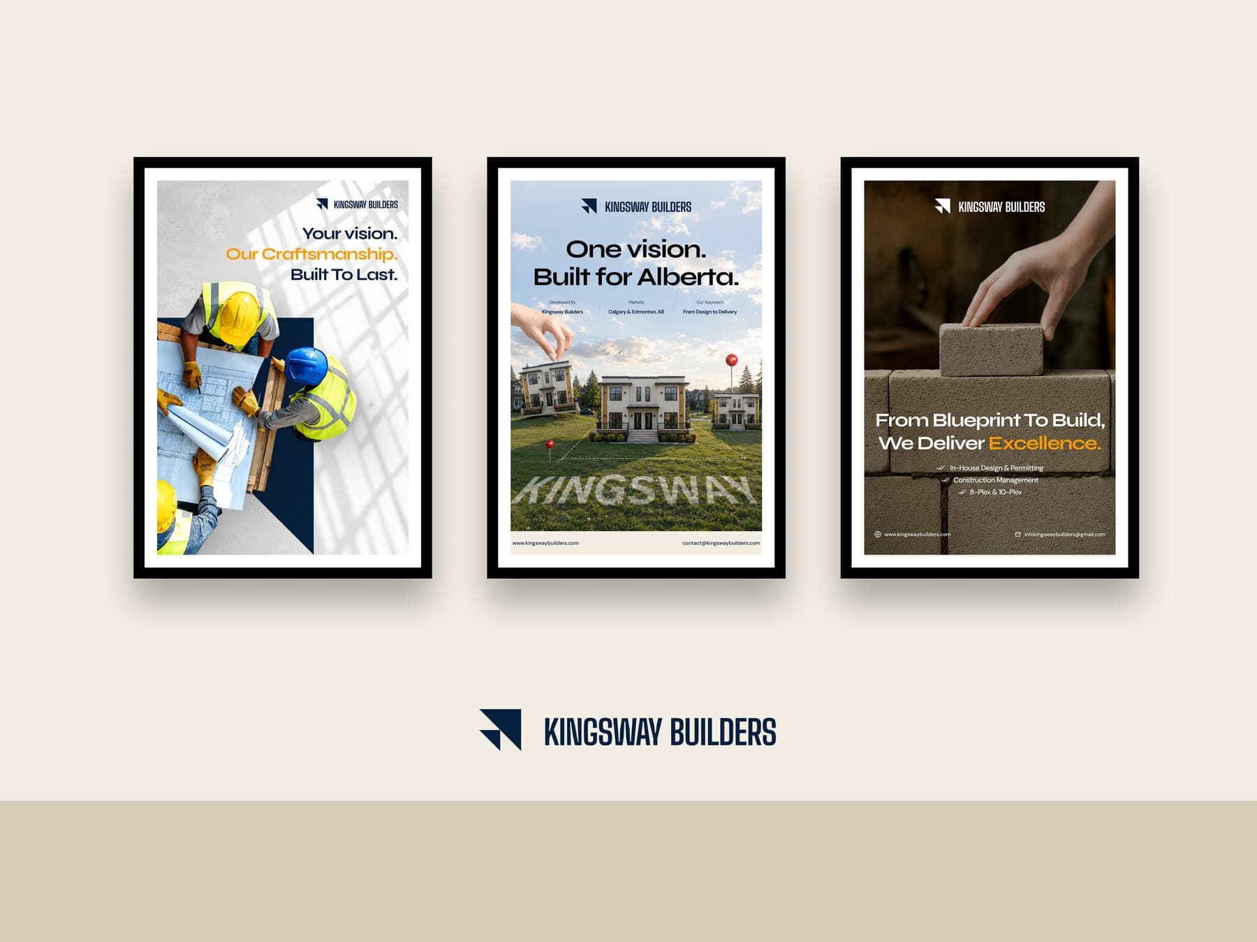
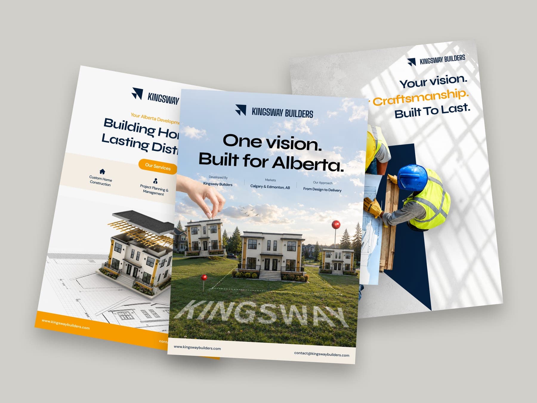
Your land, built right.
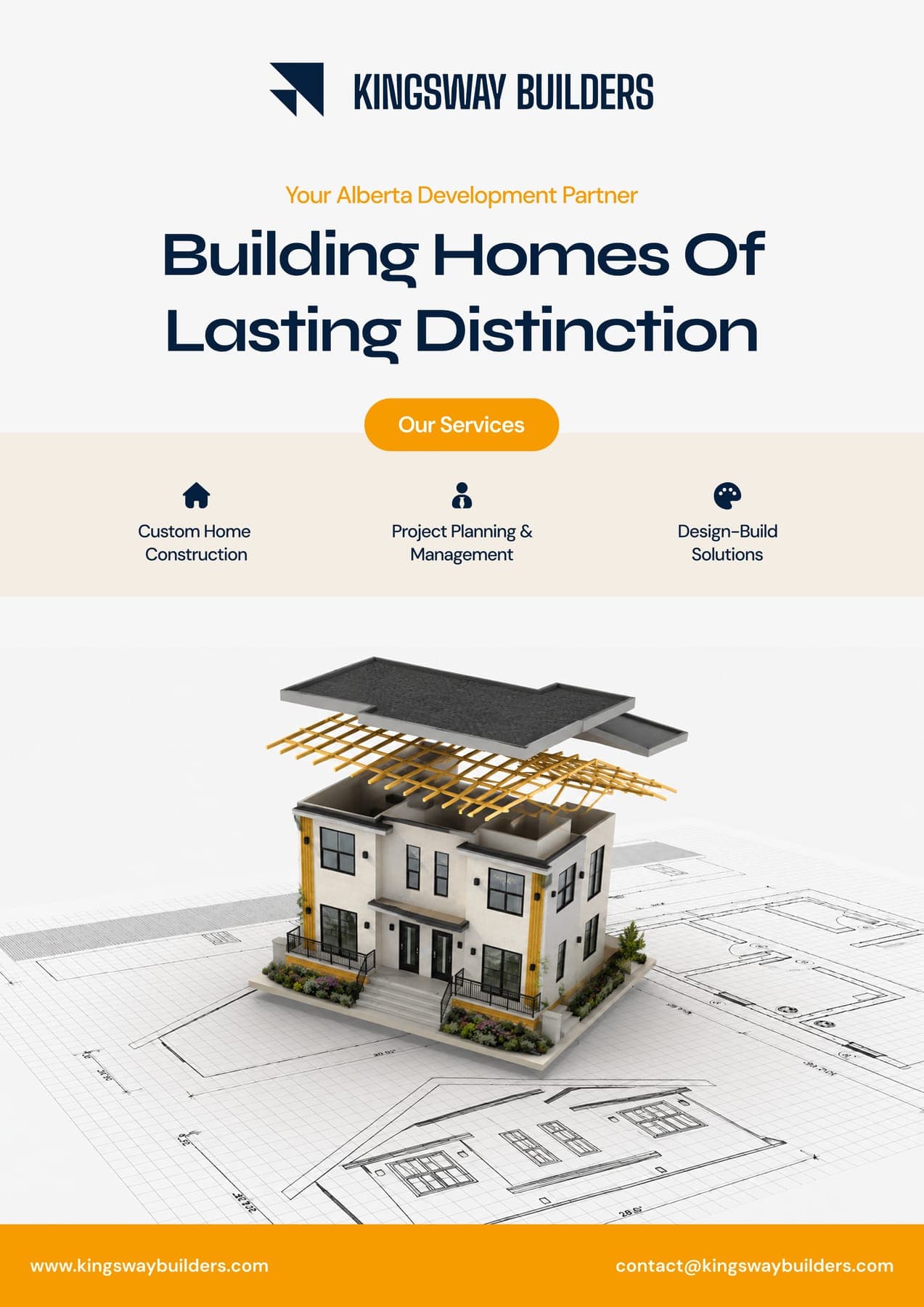
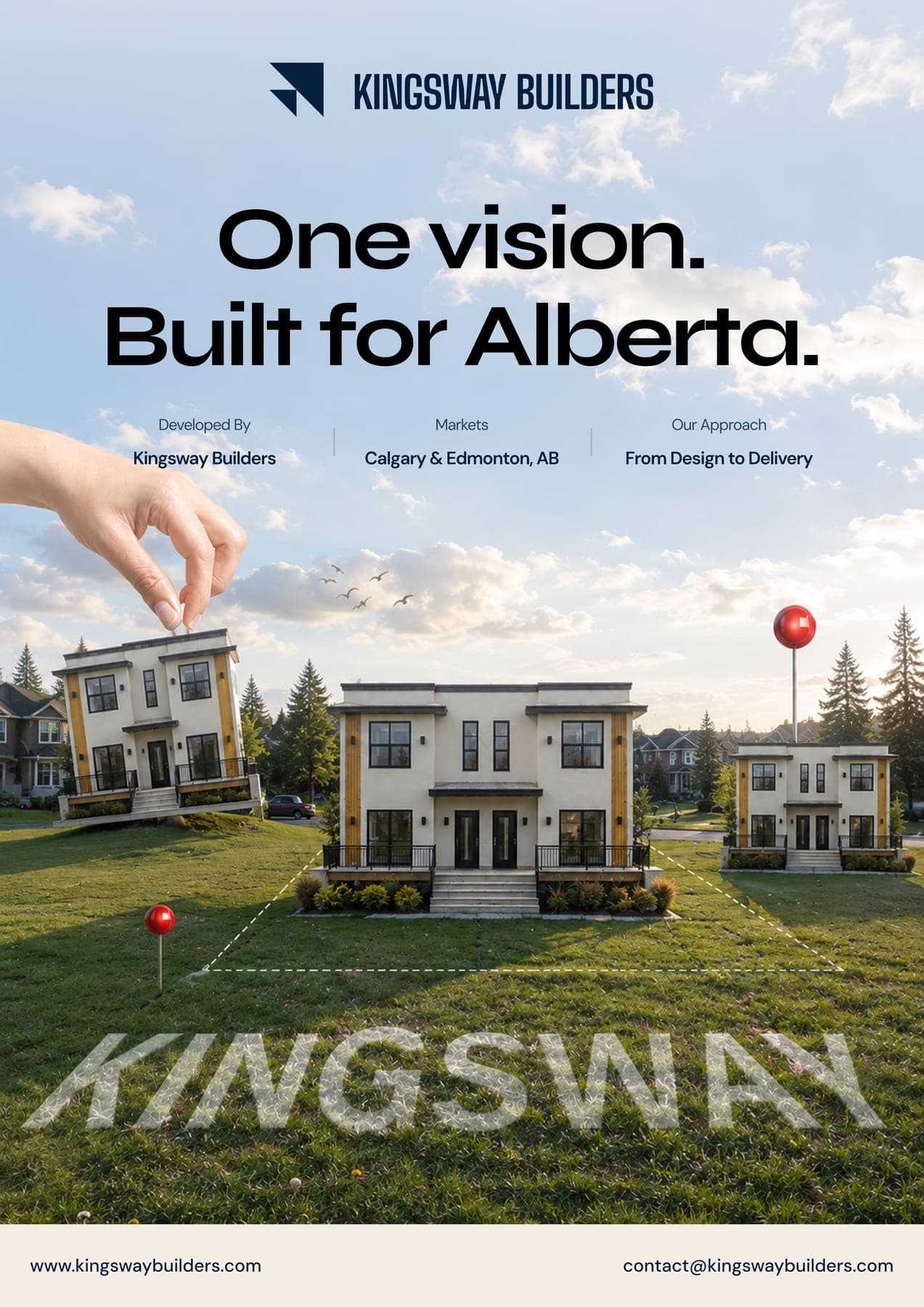
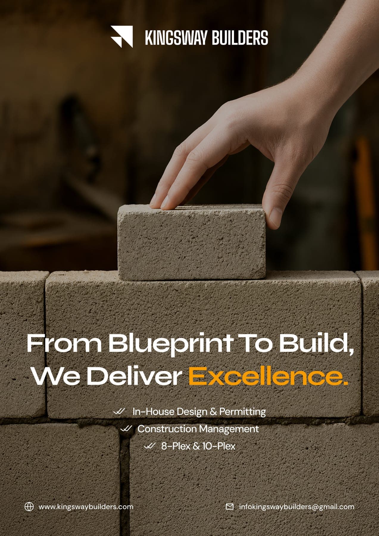
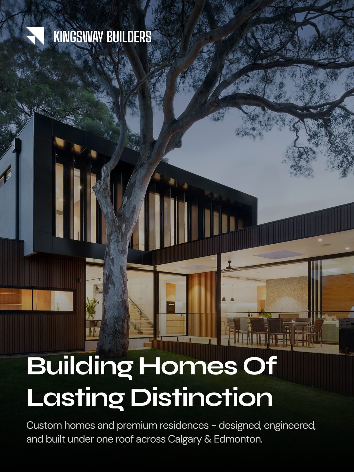
Four flyers and three posts, from custom homes to rental income. Navy, beige and a little gold, saved for the words that count.
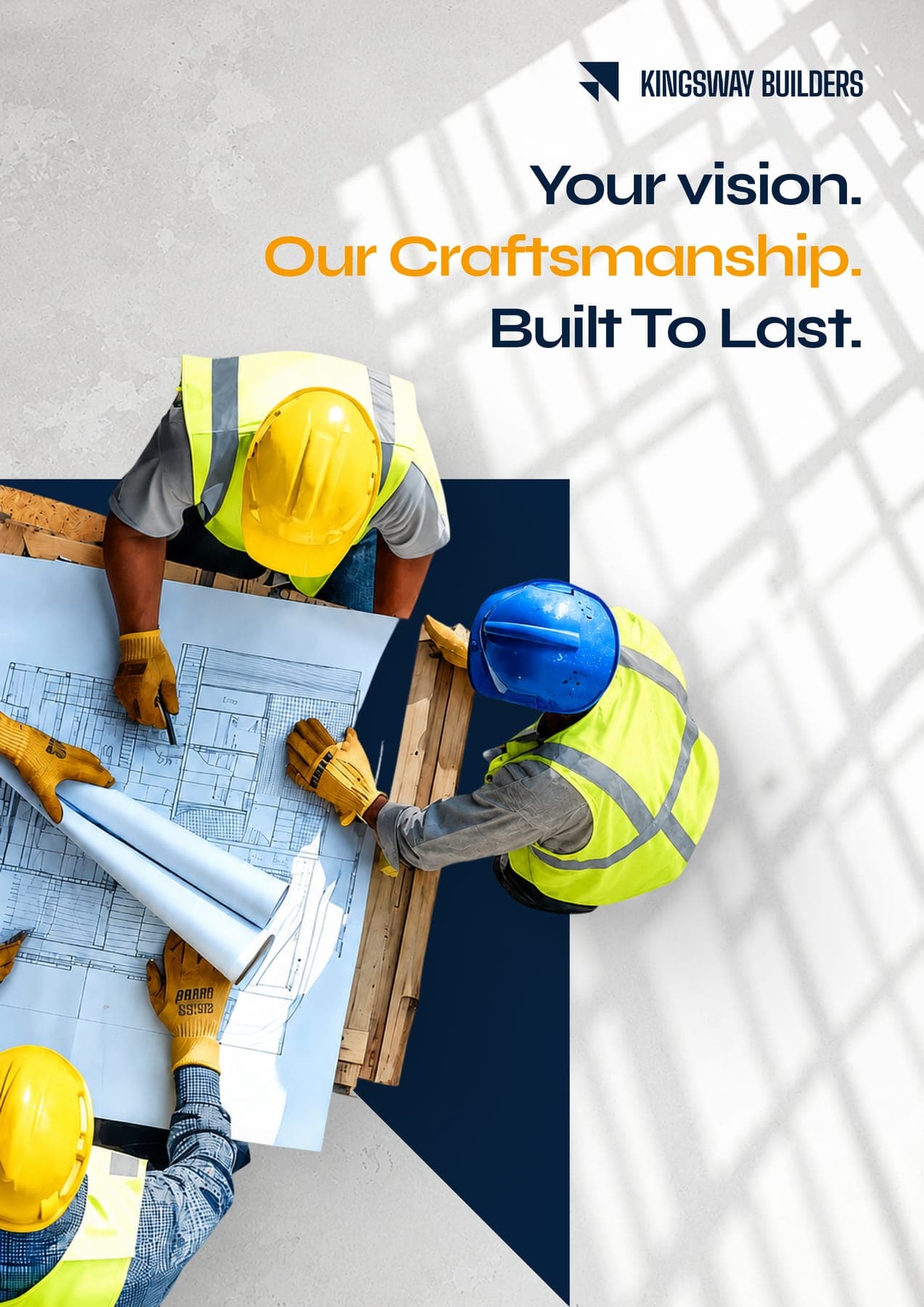
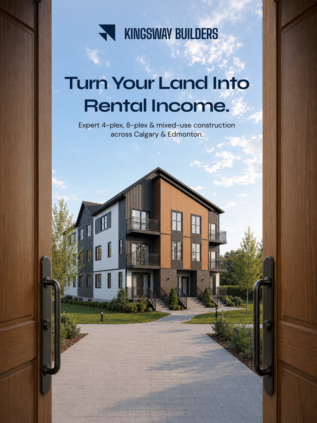
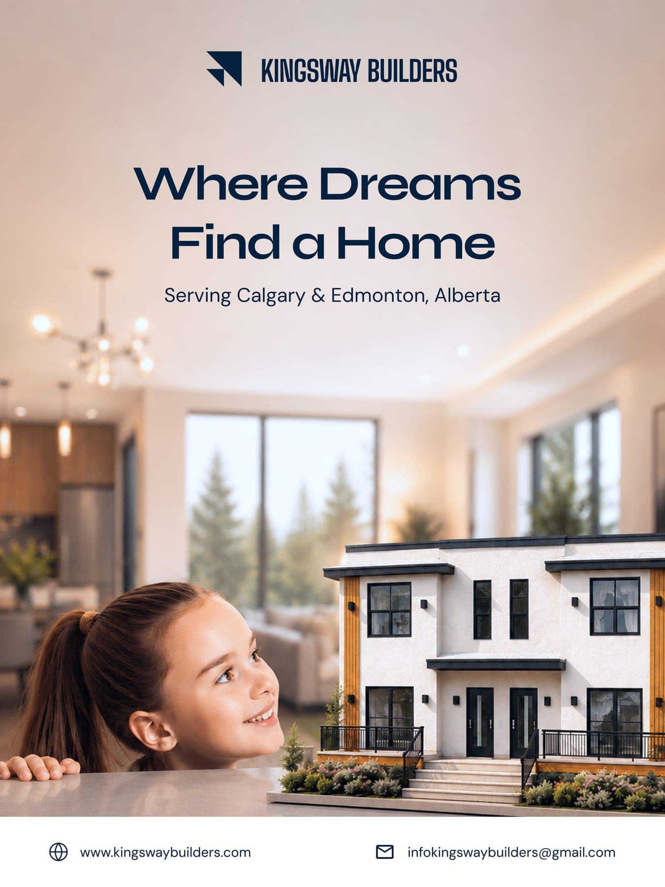
Two triangles, built to last.
0guideline pages
0colours
0typefaces
03D renders
0flyers
0social posts