
In this note
In short
We run a component library that 55K designers use. The usage data is humbling, and it quietly changed how we design.
We run a Figma library on the side called 'UI Wiki'. 55,000 designers use it, around 14,000 in any given week. We started it to share components. It turned into something better: a weekly, unfiltered vote on what actually helps people ship interfaces. The votes did not go the way we expected.
The boring screens get copied
We assumed the showpieces would lead: splashy heroes, animated cards, the stuff that does well on social. Instead the files that kept getting pulled were settings pages, empty states, login flows, tables, and error screens. The unglamorous screens every product needs and nobody enjoys inventing from scratch.
It makes sense once you sit with it. Nobody needs help making the screen they already love designing. They need help with screen forty-three, the one that has to work, will never make the portfolio, and stands between them and shipping.
Applause and usefulness are different metrics
The components that collect likes and the components that end up inside real files are two almost entirely different lists. Applause rewards novelty, motion, and surprise. Usage rewards clarity, familiarity, and edge cases handled. A concept shot never has to survive a stakeholder review, a legal disclaimer, or a real dataset with a fourteen-character German word in it.
We fell for it ourselves. Early on we'd add whatever was getting attention that month, then watch it sit untouched while a plain date picker got pulled into thousands of files. The data was almost rude about it.
“Applause rewards novelty. Real products reward clarity.”
Patterns survive, styles don't
Watch what stays in heavy use for a year and a pattern emerges: the survivors respect what users already know. Clear labels beat icon-only buttons. Standard navigation beats reinvented navigation. Visual styles rotated through the library like seasons, and underneath them the plain, well-labeled versions kept quietly winning.
Our theory: a component that survives is one that already survived somewhere else. The patterns designers reach for again and again are the ones their own users never complained about. The library is less a collection of ideas than a record of what made it through contact with real products.
The humility lesson
We'd love to tell you we knew all this from the start. We didn't, and for a while we resisted it, because we're designers and we like being clever. But the library keeps teaching the same lesson: your users have seen a thousand interfaces before yours, and the kindest thing you can do is not force them to learn a new one. Cleverness belongs in the few moments that deserve it, not smeared across the whole product.
It changed how we design for clients, too. We spend the taste budget on hierarchy, spacing, and the one moment worth remembering. Everything else we make boring on purpose, and we mean that as the highest compliment.
The library lives at uiwiki.co if you want to poke around. And if boring on purpose sounds like the kind of discipline your product could use, we should probably talk.
 Detail study
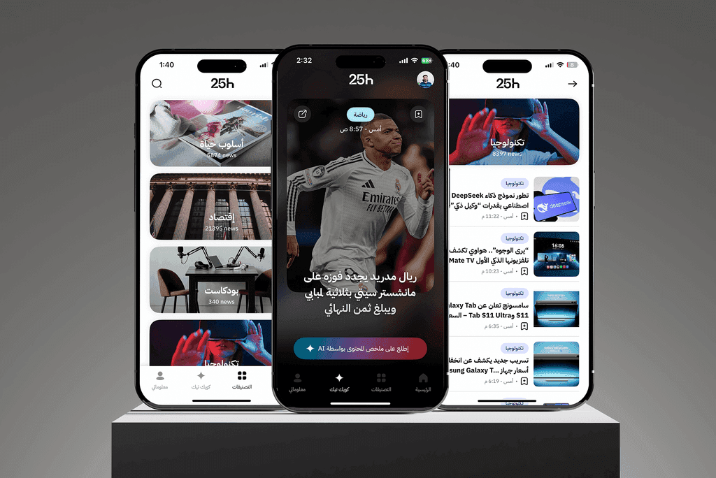 Detail study
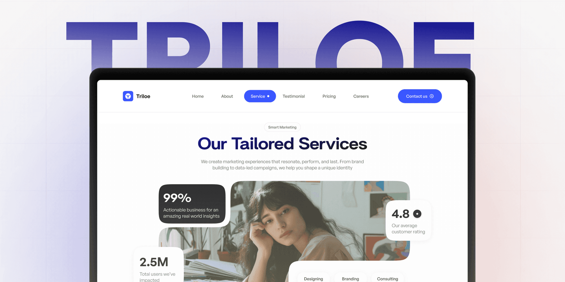 Triloe
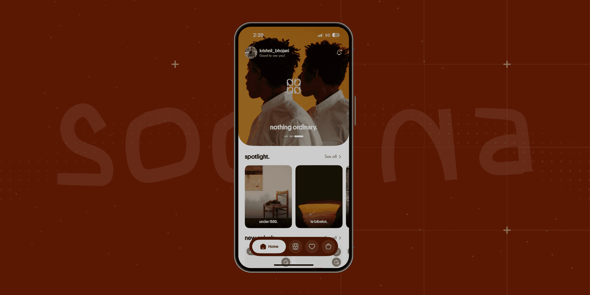 Sooqna